|
By Steven Peay, Community GIS Student in Spring 2024
I am a fourth-year geography major at the University of Georgia with certificate programs in Geographic Information Systems and Urban and Metropolitan Studies. This is my third semester at UGA. One of my classes is “Community GIS” and we are currently learning about the city of Athens outside of the university and downtown, specifically East Athens. Despite living on East Broad Street for over a year now, I have never visited East Athens until our class took a trip to Triangle Plaza last month in January. Rashe Malcolm, a local business owner and resident of East Athens, spoke to our class about her personal experience with studentification, housing prices, property taxes, and racial zoning. East Athens, located immediately east of Downtown Athens, seems cut off from the rest of the city, even though Triangle Plaza in the center of the community is less than two miles from the UGA Arch. The neighborhood has a lot of old houses that could use some renovation, roads full of large cracks and potholes, with two small strip malls in the middle of the neighborhood. While some major roads of Athens go through this community, like East Broad Street and Arch Street, I saw very few people driving through East Athens, and Google Maps always directs me to take either North Avenue or Lexington Road when driving to either Atlanta or Lavonia. Most of the ACC bus routes drive around East Athens with few stops in the actual community, which is odd, as East Athens has a low median household income and likely also a low car ownership rate. I don’t want to jump to conclusions or make unreasonable claims, but it feels like I’m not supposed to know about this neighborhood and it is being hidden from people who live outside of Athens. When I first heard “East Athens” I originally thought of places like Georgetown Square in the eastern part of Athens-Clarke County near Winterville, rather than immediately east of downtown. Rashe is the founder and CEO of Rashe’s Cuisine, a Jamaican soul food joint. She has run this small business for over 30 years and since not many people drive through East Athens, most orders are deliveries and takeout/pickup orders. During her speech to our class, she stated that many old houses are being destroyed to make space for new student housing, as the community is seen as “ghetto”, while most of the rest of Central Athens is seen as historic. Rashe wants a community garden and a grocery store in or near Triangle Plaza, as East Athens is a food desert, meaning there is no easy and affordable access to fresh fruits and vegetables, lean meat, bread, and dairy products. She also advocates for tax breaks on life-deed houses, or houses willed to their current occupants by previous generations. Most houses are owned by the current residents, but they can’t afford the rising property tax caused by gentrification, studentification, and inflation. East Athens is a majority-black neighborhood and is a result of historic redlining and racial zoning, which has led to the community’s status as a food desert, poorly funded schools, little public transportation access, and poor infrastructure, leading to the high poverty rate, keeping the community underdeveloped. There is hope for this neighborhood, as people like Matthew Epperson and Imani Scott-Blackwell run non-profits to help integrate the isolated community with the rest of the city of Athens. They both work for Hivemind, a cooperative that strives to fight poverty and elevate low-income communities in Athens and surrounding counties. I hope that using open-source and easily accessible GIS information the people of East Athens can make their voices heard and achieve funding for affordable housing and mixed-use business and apartment buildings for residents to live and work, more access to public transportation through East Athens, slower gentrification in the area to allow them to build wealth and afford to live, and eventually break barriers and “invisible walls” dividing them from the rest of the city. With the spread, popularity, and increasing access to the internet and public information, it has become much easier to find out more about how to find resources for rent/tax assistance, location of affordable housing, and local nonprofits. I am very optimistic that these goals can be reached, not only in East Athens, but in every low-income community in the United States still suffering from racist political and financial decisions made nearly a century ago, creating more integrated and united cities and localities, at the cost of no one’s life or financial prosperity.
0 Comments
By Brandon Latimer, Community GIS Student in Spring 2024
Community GIS is a class offered at the University of Georgia each spring semester and is taught by Dr. Jerry Shannon. As described on the Geography Department website, it is a course designed around a service-learning project that “[provides] GIS support for a group in the community.” I signed up to take the Community GIS class this semester with little idea of what it actually entailed. I was excited to apply GIS, a field I have been interested in throughout my time at UGA, to local issues. However, I had a poor understanding of what that work might look like. I came in eager to hop on the computer and begin to map whatever it was I needed. I quickly learned that this is just one small part of what community mapping projects, and research projects in general, look like. I will use the concept of knowledge co-production as an example of how my understanding of research has shifted. Co-production emphasizes the importance of collaboration in order to create knowledge that incorporates a diverse set of information and experiences within relevant contexts. It is a holistic approach that attempts to limit partiality and maximize the positive impacts of knowledge production. Norström et al. (2020) write about the four fundamental aspects of knowledge co-production, noting that research should be context-based, pluralistic, goal-oriented, and interactive. Pluralistic and context-based work results in the implementation of a variety of skill sets and information to address a specific problem, along with the many contexts in which that problem exists. The research is goal-oriented in order to create a clearly defined objective for all involved parties to work towards. In order to do this, the work must be interactive, ensuring that everyone is involved throughout the entirety of the project. This guarantees that each party’s voice and expertise are accounted for. As our class read about and discussed this concept at the start of the semester, I appreciated its emphasis on transdisciplinary research. However, it was still very early in the semester, and I was a little unclear about its role in our work. Once again, I was looking forward to just sitting down with some music and mapping out some local topics of interest. As the semester has progressed, we have learned more and more each week about what a community-based project entails, including our role in knowledge co-production. One of the most essential elements of this type of work is learning how to properly engage with community members in order to understand how we can best help each other. Our specific task in the Community GIS course is to work with Rashe Malcolm, a business owner in East Athens. East Athens is a community that has long been neglected and mistreated. As the University of Georgia continues to grow practically across the street, East Athens remains less developed than other surrounding neighborhoods. With the student population expanding each year, studentification creeps into East Athens. Studentification is a form of gentrification with social, cultural, and economic changes that are specifically related to the influx of college students (Pickren, 2012). Broadly, Rashe is attempting to redevelop East Athens for locals to enjoy, not for a constantly overturning student population. Included are plans for apartments, a grocery store, and a community garden. Rashe is encouraging entrepreneurship and improving the community’s access to healthy foods. Our role is to provide Rashe with any data and information she might find useful in this process. While I could always read about these issues, my understanding would be insufficient without our class's partnership with Rashe. As a longtime business owner in East Athens, Rashe is an integral part of our work. Throughout the semester, our class has remained in touch with Rashe through Dr. Shannon, including visiting her in East Athens. Listening to Rashe’s perspective and vision for the community was far more informative and inspirational than anything I could read or hear in a classroom. This trip helped me learn more about the context in which studentification and the uneven development of the city occur and more clearly outline the goal of our collaboration. Currently, the class is preparing to interview local individuals, including members of the East Athens community, East Athens representatives, and more, to further our understanding of the neighborhood. Additional interviews will expose us to new perspectives and concerns regarding the East Athens community. This process is one of the ways in which we can stay engaged throughout the project, as well as providing us with a variety of valuable viewpoints. Co-production of knowledge is a concept that applies well to what we are doing in Community GIS but is also a valuable tool in many types of research. As the first half of this semester has flown by, I am learning more and more each week about how to properly engage with community members to conduct ethical and impactful work. I now see an incredibly important side to research that I had previously been overlooking, and I am excited to discover anything else that I might have been ignoring. Brandon Latimer is an anthropology and geography major, graduating in May 2024. Brandon is working on Urban Studies and GIS certificates and will be getting into the field of global development after graduation. References Norström, A. V., Cvitanovic, C., Löf, M. F., West, S., Wyborn, C., Balvanera, P., Bednarek, A. T., Bennett, E. M., Biggs, R., de Bremond, A., Campbell, B. M., Canadell, J. G., Carpenter, S. R., Folke, C., Fulton, E. A., Gaffney, O., Gelcich, S., Jouffray, J.-B., Leach, M., & Le Tissier, M. (2020). Principles for knowledge co-production in sustainability research. Nature Sustainability, 3(3), 182–190. https://doi.org/10.1038/s41893-019-0448-2 Pickren, G. (2012). “Where Can I Build My Student Housing?”: The Politics of Studentification in Athens-Clarke County, Georgia. Southeastern Geographer, 52(2), 113–130. https://doi.org/10.1353/sgo.2012.0019 By Peyton Gunn, Community GIS Student in Spring 2024
For our Community GIS class this semester, we are studying the area of East Athens. This area is relatively east, but not in the way I was thinking when I first joined the class. Personally, I thought it was referring to the area near where I lived off of Barnett Shoals, and when I first heard the words East Athens used, I thought “Whoa, this is awesome! I know this place so well!” Little did I know that I was completely wrong, and that the area we were talking about was one I had never even heard of before. East Athens is actually very close to campus, but seems very isolated when driving around. Some places other people might know are near it are the North Oconee River Parks and Firefly Walking Trail. There are many ways to get to it, but I would say the most common ways people get there is by turning off Oconee Street or North Avenue. From there, many roads can be used to traverse the area in what is considered East Athens: Peter Street, Vine Street, Arch Street, First Street, and Nellie B Avenue. We had talked about the area once our class really got more involved in studying East Athens, and it seemed like a decent place. We had been looking at the area to hopefully help Rashe with some government funding for the area, but exactly what she wanted to do I wasn’t sure of yet. A nice shopping area with Rashe’s Cuisine and a barbershop, plenty of houses for people to live in, and a police station nearby to keep the area safe. These were my perceptions of East Athens before I went there, but now it was time to see it for myself. On a Friday in late January, a few different classes made the trek over to Triangle Plaza, the shopping center to which I alluded before, and it felt a lot different than the picture online. Lots of people walked around the streets like they were sidewalks, which struck me as fascinating just because that wasn’t something I had not seen on Google Maps (which would be hard to depict, but that was my only frame of reference). Once most of the people had gotten there, we went into one of the rooms of Triangle Plaza, which looked like it was being used as a community center. Rashe, our East Athens tour guide for the day, told us that in the past it has had multiple different uses. It was originally a barbershop, hence the raised flooring at the front. Afterwards, it was a laundromat, hence all the outlets along all of the walls. It has had other uses, but those were the ones that had lasting impacts of the room. It was interesting to learn this, as it was kind of learning about the history of the geography of just that room, with so many uses showing what was important to the people at the time. Once we left the community center, we went up to the outside of the building to a mural that had been painted by Broderick Flanigan of some of the most important advocates and civil rights activists from the East Athens area. Jessie Barnett, Evelyn Neely, Miriam Moore, and Virginia Walker were all very important black women of Athens civil rights, and them being on the main business building in East Athens shows that they were very important to not just the progression of Athens as a city, but East Athens as a community. After this, Rashe had a wonderful proposition for us. She said she wanted to build a multi-use building outside Triangle Plaza that had a laundromat, grocery store, and apartments on top of them. She explained how she would keep the rent of those apartments low by using the potential renter’s income to see if they make enough money to pay it, but not enough to where the rent would increase to where no one else could afford it. She said she needed our help, though, with maps and diagrams to show county commissioners and other important government officials to get grants to pay for the ideas she had for the area. This is very exciting, as what we will be doing is going to have a real life and long term effect on the community for the better, such as helping the process of having a central place they can go to do their everyday needs, as well as add living space that would not be there unless we were, which can help people live where they want that is affordable. Learning about East Athens has taught me a lot about being aware of where I live. Certain aspects of East Athens definitely stuck out to me, such as the strong African-American pride exhibited in a lot of businesses and murals as well as a strong community with people everywhere talking and walking together. The goal of this project is to help the people of East Athens grow more as a community, as well as adding amenities that currently are not there, such as a grocery store and laundromat. Using public opinion and GIS work could help figure out exactly where amenities can go to have the most impact on the people that live there. Personally, I believe this will definitely move the community in the right direction going forward. Like I said, I had never heard of or seen this area before, so it was interesting getting to know the place and learn more about it, and I cannot wait to be more involved in the community as we move further towards the project. Peyton Gunn is a third year geography student at the University of Georgia pursuing a degree in geography with a minor in geology. In summer 2023, Jai and Peyton--two undergraduates at UGA--worked as research assistants in the lab through UGA's Center for Undergraduate Research Opportunities. They were contributing to our continuing project to digitize the 1958 Athens city directory. This included both doing some data cleaning and also using the directory to profile two historic Black areas of the city: Linnentown and Hot Corner. More specifically, they used the employment information provided by the directory to map the labor geographies of these neighborhoods. For the residential neighborhood of Linnentown, this was documenting where residents worked. For the commercial district of Hot Corner, it was where they lived.
You can read more about this project in the storymaps Peyton and Jai created, linked below. We're glad they could spend the summer working in CML!
 By Maya Rao, Community GIS student in Spring 2023
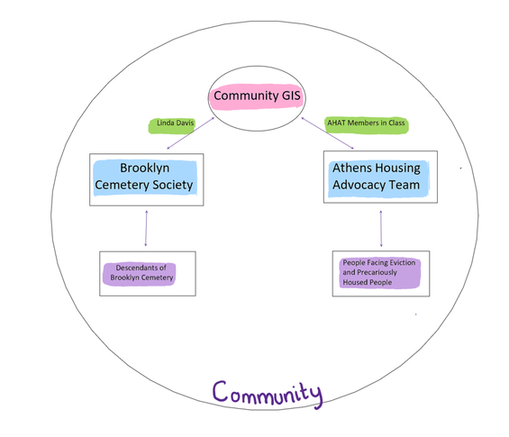
Earlier this year, I had a conversion with Dr. Jerry Shannon (my advisor, the professor of Community GIS, and director of the Community Mapping Lab) about project ideas for my Master’s thesis. As I spoke about wanting to do a community-based project, Dr. Shannon asked me “What do you mean by community?” This simple question made me start to think more about the heterogeneity of communities. As the field of community geography evolves, it is important to not equate the word “community” as always the same group of people. When I pictured the word “community” prior to this class, my mental image was of individuals belonging to some kind of shared identity. I did not think of community as including organisations or an amalgamation of different groups and positionalities. Additionally, I failed to recognise how a person can be a part of interacting communities. My approach to the idea of community was extremely narrow, and I have been working to broaden my understanding of this term through the projects in Community GIS. Community GIS Currently I am a student in Community GIS, a class where we learn how to use GIS in community-based projects. In this class, we are working on two projects - first partnering with the Brooklyn Cemetery (a historic black cemetery in Athens, GA) and second looking at eviction in Athens. However, we have also spent time looking at the disciplines of Community GIS, Public/Participatory GIS (P/PGIS), Participatory Action Research (PAR), and community-based projects. Scholars differentiate these fields into their subcategories, but the idea of community still remains a central tenet. Although researchers from the articles we have read discuss the communities they have worked with, few detail a description of who makes up a community. In our class, we are working with two different communities. What is the community we are talking about these projects? Brooklyn Cemetery Project Our first Community GIS project this semester was with Brooklyn Cemetery. This cemetery started housing graves in 1882, making it a final resting place for some former slaves in Athens. This place is full of history, and yet it is not given the public stature that similar historic white cemeteries have in the city. Brooklyn Cemetery has several unmarked and sunken graves. Of the graves that are marked, some markers have fallen over or are no longer visible. For this class, we wanted to make Brooklyn Cemetery and the graves visible. By mapping the graves at Brooklyn Cemetery, we are making a conscious effort to think of these graves as permanent resting places of those marginalized in the past. Our work for the cemetery included making a physical and digital map of visible graves at Brooklyn Cemetery. We also created section markers for the cemetery to better understand how to locate the graves. So who is the community here? We are a community of student-researchers from various backgrounds approaching this project. But who is it that we are helping? Our primary contact for this project was Ms. Linda Davis, the president of the Brooklyn Cemetery Society. Ms. Davis was a great partner to have due to her love for Brooklyn Cemetery and her dedication to preserve and upkeep the space. She provided us with ideas and feedback about our project. She was always appreciative and happy with the work that we completed. As a trustee of the Brooklyn Cemetery, she spoke about things that would help the cemetery and ways for us to assist with their vision. However, we didn’t meet with other members of the board of trustees of the cemetery until the end of the project, which limited our ability to interact with more people comprising the community. The question arises then if this was truly a community based project. One of our class goals was to support not only the trustees of the cemetery, but also the descendants of those buried at Brooklyn Cemetery. Since we only spoke with Ms. Davis for the majority of this project, did we put too much focus on her as the sole representative of the cemetery? Or was this the best thing to do because of the obligations that other people who represent the community have (work, school, etc.). Fitting with discussions we had earlier this semester in class, we discussed how doing community projects is a balance between the researchers and the community. We recognise that as students, we have more time to dedicate to this project compared our community partners. Forcing the other trustees to participate in more of this project may have been inappropriate and contractual. Doing this project made me understand that the rosy idea that UGA students and Brooklyn Cemetery have constant dialogue with each other is not the only way to do a community-based project. We provided deliverables (the maps and data) that the board of trustees of the cemetery were happy with. And, ultimately, this project is the first step in a long term relationship between the UGA Community Mapping Lab and Brooklyn Cemetery. We worked to establish trust and sow the foundations of future collaborations. Eviction In the second half of this class, we are working with the Athens Housing Advocacy Team (AHAT) to clean up data detailing evictions in Athens-Clarke County. We haven’t gotten too far into the project as of now, but our current goal is to clean and validate the data collected by undergraduate researchers and AHAT. Through engaging with this project, I am better understanding the complex “community” we are working with. We have three members of AHAT either in or attending our classes, including one of the founders of the organization. AHAT is the group that we have been in correspondence with, but I question if our community with this organization or with the evicted tenants? If our work is with people facing eviction, what does it mean for us to be working through this middle organization? Prior to this class, I may not have considered working with AHAT a community project, since we aren’t interacting with those directly facing eviction. Earlier in the semester, we read a piece about the Anti-Eviction Mapping Project in San Francisco. This is a project that I can clearly see the community angle, since the researchers are working, organizing, and mapping with people facing eviction in San Franscico. However, for the project that we are doing in this class, working with AHAT may be the best way for us to facilitate a community partnership. Our class has about twenty people (most if not all of whom are not currently facing eviction), so it may have been misguided if we were having conversations with evicted (or precariously housed) people. It may have created a dynamic and hierarchy between us as researchers and our community partners. Working with AHAT allows our class to still provide assistance to this project which will help illuminate the eviction problem in Athens. I’m still struggling with the idea of a community not including evicted people in this project, but I can see how we are indirectly connected through AHAT. However, since we are still new to this project at this point in the semester, I am aware that my ideas may change as we move further in this project. Overall Reflections This class has helped me understand how the communities included in Community GIS are not amorphous and homogeneous. Additionally, the idea of “community” should not be imposed directly by the researcher, because the context of each project will necessitate different relationships between the researcher and the community. This is particularly important to acknowledge in our predominantly white group of students who are not facing eviction. In our class, I’ve had to wrestle with these ideas of who is included in our ideas of community and consider this word in a new setting. So, my original question of who is our community in Community GIS is more challenging than I originally thought. The communities we are working with are multifaceted groups of visible and non-visible members. By Reyd Mahan, Community GIS student in Spring 2023
Mapping and Geographic Informational Systems (GIS) have always interested me because they have significant practical use for me as an archaeologist. However, before taking this Community GIS class, I saw GIS as checking a box for my career. I never really thought about the applications of GIS outside of what I needed to do for class or work. As an archaeologist, I typically use GIS to create basic maps of an archaeological site and overlay different forms of data on top of it, such as artifact density or ground penetrating radar (GPR). While these maps are helpful for archaeologists to find where artifacts might be, the public will never see these maps or even know where the archaeological site is located to prevent looting. GIS in archaeology is private and not typically community oriented. Since I started working on the community-based projects for this class, I have gained a new appreciation for the positive impacts GIS can have in local communities that I never thought possible before. I engaged with Community GIS because it allowed me to gain valuable, practical skills and improve soft skills in working with others while also improving the local community through various projects. The first project I worked on was at Brooklyn Cemetery. Brooklyn Cemetery is a historically black cemetery important to the local Athens community. Unfortunately, several graves were damaged over time or lost their marker entirely. Our job as a class was to record the points of each marked grave along with the grave’s information and then create a map that would be useful to cemetery visitors. During the project, we made trips to the cemetery to determine the accuracy of the data we already had from previous projects. Visiting helped me connect with the project by seeing the graves I recorded in person. It gave my work more meaning because I saw its impact in person, not in a spreadsheet. I saw my work as helping to preserve the memory of the people buried there. By recording the location of each grave, descendants can utilize the map to pay their respects for years to come, and we can dignify the deceased by recognizing their burial location. The project also presented some challenges along the way. After we visited the cemetery, we realized that much of the data concerning the location of each grave was inaccurate. On top of that, the GPS on our phones was not the most accurate in recording our active location. To update the data, we went back and personally recorded each point that we could find at the cemetery to make a new accurate point layer that could be used in the final map. The GPS issue was annoying but tolerable since we needed the points around the grave, and pinpoint accuracy was not required to make a helpful map. Much of the project was devoted to sorting our recorded data and correcting discrepancies or duplicates. I’m beginning to understand that much GIS work involves spreadsheets and data management, which is necessary but also tedious. By working with the Brooklyn Cemetery directly, this project showed me that my GIS skills could be used to make positive community impacts and not just for private research-related use. I saw the people I was helping directly, giving my work a purpose. Work in archaeology is far from purposeless, but there are not typically people that are a direct connection to your work unless you are working in consultation or collaboration with indigenous communities. Furthermore, to ensure the protection of an archaeological site, all maps and data concerning the site are private and only accessible to professional archaeologists, which was the antithesis of what we were doing at Brooklyn Cemetery. We wanted the maps and data we made of the cemetery open to the local community so they could be best used. I hadn’t worked with GIS and mapping in a public way before, so it was amazing to see how our work as a class could directly help community members. As of writing this post, we are getting into our second-semester project with the Athens Housing Advocacy Team (AHAT) to better identify and map housing evictions in Athens, GA. While the previous project utilized GIS through community service, the AHAT project focuses on using GIS for social change and advocacy. I am interested in seeing the maps we create at the end of the project that visualize the eviction problems in Athens. This class has shown me how public GIS can benefit the local community, which differs from the typically private GIS utilized in archaeology. More importantly, it has taught me skills that help build stronger community connections that I can use for the rest of my life. By Constanza Urresty Vargas, Community GIS student Spring 2023 Community GIS is a service-learning course in the Department of Geography at the University of Georgia, where students from different backgrounds and from different years (both undergrad and graduate) converge. This means that as students, we come to the course with diverse skills, knowledge, and interests; although we are all in the same class, we are not learning the same things or in the same ways. During the semester we have engaged in two projects, contributing with GIS tools to local community organizations. The first was with the Friends of Brooklyn Cemetery, a local organization in Athens that works for restoring and rebuilding this cemetery, which is a resting place of former slaves. Their aim is to commemorate the individuals laid to rest there and bring their stories to the present. For the second project we have been working with the Athens Housing Advocacy Team (AHAT), a grassroots activist group that collaborates with renters and allies to fight for the right to affordable, healthy, dignified, stable housing as a human right. Course activities have involved lectures, mapping, discussions, and sessions with several visitors talking about their experiences as researchers, practitioners, or organization members engaged in issues related to the projects. We also had various class discussions attempting to reflect on the purpose and meaning of our work as a class. What do we want to achieve in our projects? Why mapping? How are we contributing to community organizations through maps? Many of these discussions involved collective agreements about the goals of our work and how to address our questions. So, this is a lot about “we” and “our”. Most of the course activities were collective, not individual. In my opinion, this is particularly meaningful, as many of us enrolled in this course because we think community is important. Community mapping processes need skills for working with, thinking with, and learning with others. Co-learning and knowledge co-production is what allows us to be co-producing maps. As an international student in my first year in UGA and in the U.S., collectivity has been vital for my academic experience. Particularly in the Community GIS class, collectivity has been important for my learning process and for contributing to our projects. This is a community-engaged course, which means we are collaboratively working with local non-academic organizations or community members. Consequently, it requires an understanding of the context of these organizations/communities and learning about the problems they are facing. 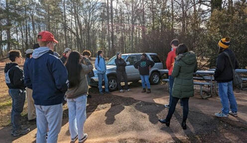 Community GIS class at the Brooklyn Cemetery, in a meeting with Linda Davis (co-founder of Friends of Brooklyn Cemetery) Community GIS class at the Brooklyn Cemetery, in a meeting with Linda Davis (co-founder of Friends of Brooklyn Cemetery) In the case of the Brooklyn Cemetery project, it was necessary to have some understanding about the history of both Athens ant the U.S.; it demanded familiarity with the past in this place, the role of slavery and how this shapes the present in diverse and complex ways. Furthermore, Athens eviction project requires understanding about the social context of housing access in the city, some basics about the housing and eviction legal framework in Georgia, and additionally understanding the nature of available data from local institutions and organizations. All these issues might seem simple, but they are not when you come from a different context, history, and culture. This means new administrative structures, specific concepts, and sometimes different worldviews and social problems. Even more so when you approach these issues not in your first language.
This can be complex and challenging, maybe unfeasible in a short time for international students, as we usually have lived a short time in the U.S. when starting a study program. In those conditions the course might be difficult, as it is highly contextual. However, rather than being an obstacle, all these issues become an interesting and meaningful learning process thanks to the collective. I’m not an individual foreign student navigating an incomprehensible context and struggling to complete the course work. I’m part of a collective, where different knowledges and skills contribute to a common project. Listening to others, being part of group discussions and asking many questions to my classmates is how I could gain some understanding about these issues and shed light on how local communities address their projects. Collaborative and supportive relationships inside the classroom are what makes room for foreign students. It allows us to be part not only of the classroom community, but also the Athens community. This creates space for us, it opens the opportunity to learn from local communities and organizations, while contributing with our work. Sometimes we can also contribute with novel perspectives. coming from the amazement of observing and knowing a new place. While learning from other students about local context, as international student I can contribute with viewpoints as an outsider, which although has some drawbacks, it might be a “fresh” view, in some cases complemented with experiences from different contexts as well. From this perspective the “co” prefix becomes applicable beyond community GIS. This means as a class, we are collaborating not only when creating maps with organizations outside academia (which is the key in this class), but also when doing collective work, co-learning, and co-producing knowledge inside the classroom. Community mapping becomes an intertwining of relationships of collaboration occurring inside and outside the classroom. Community mapping is not only about mapping, but also about collective learning and knowledge co-production, where different skills, knowledge and ideas have a space. By Nick Taborsak, Community GIS student in Spring 2023
Over the past several weeks, our Community GIS class has been hard at work researching various questions concerned with housing and evictions across the Athens community. Working in conjunction with the Athens Housing Advocacy Team (AHAT), the Athens-Clarke County Geospatial Office, and other community actors, our collective goal is to attain a deeper understanding of housing-related issues that plague our community. Our research questions include:
Athens, historically categorized as a traditional “college town”, is home to over 120,000 permanent residents (not including the transitory student population) as well as a poverty rate upwards of 30% per acc.gov, nearly three times the national average. Additionally, the household median income in Athens is just over $38,000 annually, which represents approximately 54% of the national average. These statistics alone demonstrate the need for affordable housing across the county, something which is and has been severely lacking. The community is currently facing a shortage of affordable housing - a crisis - and the issue is perpetuated by the very nature of the city itself. The displacement of neighborhoods comprised predominantly by people of color at the hands of the university, such as Linnentown (see UGA Community Mapping Lab), in favor of student housing developments, the prioritization of new housing developments for the much more affluent student and university demographic, and the failure of local policymakers to provide assistance for its most vulnerable of groups, are all influencing factors which have led to where things stand today. With this being the current situation in Athens, our class has set out to find which landlords and property owners own the most rental properties across the county, and which are evicting the most. We’re also interested in precisely where these landlords are located - be it other parts of the country, world, or from within our community - to shed light upon the role inside/outside investors may play across the landscape of property management and displacement of evicted persons. Additionally, we’re researching which parties participated in the Eviction Prevention Program (EPP); specifically who received assistance, where they were located, and how this relates to the outcomes of those eviction filings. Our final area of focus is concerned with the relationship between housing price, housing stress, and patterns of eviction. Through these analyses, we hope to articulate how these processes tie back into the overall eviction landscape of Athens. The spatiality of this project depicts the applicability that GIS has to work of this nature, as well as to the multitude of other community-based projects that geospatial analysis may contribute to. I’ve been part of the group tackling the categorization of landlords by number of properties owned, amount of eviction filings, and their known outcomes; we believe this to be an important topic to research so that we may establish a “spectrum” of which landlords are the most prominent of property owners in our communtiy, and whom most perpetuate the displacement of tenants via eviction filings. While we’ve used GIS platforms such as ArcGIS Pro as part of our analyses, our research has largely consisted of data cleaning and analysis amongst the datasets provided by AHAT and the ACC Geospatial Office. As part of this process, we’ve seen the complexity that is extrapolating meaningful data from various large sets of data and drawing substantive conclusions as a result of those analyses. One of the more interesting facets of this research has been seeing the multitude of operating names these landlords and property owners have as registered LLC/LTD’s, and establishing a standardized “umbrella” title for these ownership groups for the sake of our analysis has comprised a significant proportion of our research time. For example, one single entity may have separate operating names such as “Elite Realty”, “Elite Realty (Hallmark)”, and “Elite Realty Services”, all which represent the same ownership group in various capacities. Interestingly enough, this is done to insulate individual property owners from personal liability for their rental property, as well as so that if a lawsuit is filed pertaining to one of their properties, the rest of their properties will not be affected by the lawsuit, which effectively separates and protects each of the properties. Practicing GIS in community-based settings as part of our class this semester has been an eye opening and enlightening experience for me personally. From our contributions to the Brooklyn Cemetery project to our work here with anti-eviction mapping, I’ve seen the role platforms such as Arc, QGIS, and R can play in work of this nature, and the applicability of many of my learned skills across GIScience in serving my immediate community. Geospatial analysis is oftentimes most needed by the most underserved and marginalized of groups, and it has been quite the holistic and fulfilling experience to take part in our work this semester. Through our efforts across this project and semester as a whole, we hope to leverage community-engaged work to promote a more inclusive and equitable community for all. Looking ahead, our class is most excited to share the results of our research with the community at the Athens-Clarke County Public Library on Friday, May 5th, 2023. By Lilia Shorrock, Community GIS student Spring 2023
My relation to geography has always been through the lens of the environment. I am studying ecology in school and took on the Certificate in Geographic Information Science here at UGA to add to my portfolio of hard skills. My advisor was the one to suggest it to me, as I had not heard of it before. When I started taking classes for it, they showed me how entrenched in my field of study GIS really was. I began to see the role of GIS everywhere. All of my classes use maps, aerial imagery, GPS tracking, and similar things to look at the climate, wildlife, vegetation, landforms, etc. Professional items like scientific journals and media for governmental organizations use the same. GIS is everywhere in the environmental sector, and so the environment is my basis for GIS. In the spring of 2022, I became very interested in urban places, when I began to think about the effects of urban places on the environment. Where before I would spend my time reading about new river restoration projects or conservation of endangered species, I began to learn about the power of public spaces, street design, housing, and transportation poverty. I became very passionate about these things and my passion has only grown as time has passed. It was in these spaces that I saw how GIS was being used outside the environmental sector: maps used to designate municipal zoning, instead of burn units; aerial imagery used to show expansion of the built environment, rather than deforestation; transportation planning instead of trail guides; etc. My new interests made their way into my schooling, and for this semester, I decided to take Community GIS. I did not know anyone who had taken the class before, so I was not exactly sure what it entailed, but it sounded like something I wanted to try. I wanted to have experience working with people in a community as a collective to solve a problem and to work on my own interpersonal, group project, and public speaking skills. The class itself is about what I was expecting. We have had two community-based projects this semester, one working with the Brooklyn Cemetery and one working with local housing advocates on eviction. The Brooklyn Cemetery is a historic Black cemetery in Athens that we aided through GIS by locating graves and creating physical and online maps. We met with one of the trustees of the cemetery, and heard about its history, why she wanted to preserve it, and the types of things she wanted from us. In this project, I learned how to use Arc Online, use Field maps, and create a searchable webapp. I also gained a lot of experience in data cleaning and experience dividing work among a team based on skill and interest. For the eviction project, we met with many different representatives to learn about eviction in Athens and the programs in place to help tenants. This project was more exploratory and data-focused. The outputs are not necessarily just for one community either; they can be used by many different groups, like the housing advocacy groups, tenants, and the government. In this project, I learned a lot about the subject of housing and eviction and more about the city I currently rent in. I cultivated more of my R skills, learning how to work with date and time data, how to create time series and graduated color bar graphs, and how to make csv files from data frames. On Friday, May 5th, we will have our public presentation event at the local library, where we will share our work. I have not done something like that, so I am excited. The mechanical aspects of GIS could be applied to every area of geography. We also learned about the subject of Community Geography. I did not know this was a subject to be studied, even going into the class. There are many different methods and practices of community geography, specifically in how academics partner and work with communities to solve a geographic problem. The theoretical distinctions among the different practices are minimal, but they can have a big impact on the accessibility of the work. There is emphasis in the literature that an academic should work with the community, viewing them as a partner with equal but different knowledge and stake in the project, rather than viewing themselves in a “superior” position to the community. I think academia has a superiority complex built-in to the institution, so consciously thinking about this when going into work can help equalize the process. Learning about this showed me that geography and mapping is more than just the outputs–the process and the relationship between partners really matters. So, how do I bring this knowledge and experience back into my chosen field? I believe there can be an intersection between the environment and community geography. Protecting the environment protects people, and there are many groups of people that rely on rural lands in order to make a living. The government has a long history of taking land from local people and establishing their own control without having local ecological knowledge or caring for the environmental health that would affect local peoples. I plan to work for the government, so using my experiences in this class, I feel more prepared taking into account the needs of the communities by working with them, rather than having the perspective that I am working for or against them. Community GIS is definitely more complex than the mechanical, environmental GIS I was used to going into the class. By Margaret Hersey, Community GIS student Spring 2023
The Community GIS course functions similarly to other GIS courses by strengthening students’ technical skills in popular software such as ArcGIS Pro, QGis, and ArcGIS online. However, the scope extends far beyond the glowing monitors and classroom walls. During this course students are given the rare opportunity to step out of the classroom and collaborate in meaningful and equitable partnerships for community-based research. Our course instructor (Dr.Shannon) provides students with theoretical frameworks that illustrate the context in which we work with the community and enable us to work collaboratively and meaningfully towards community empowerment. Topics include Critical GIS, situated mapping, community geography, and counter-mapping. This semester we focused on two projects, each involving members of the Athens-Clarke county community. For the second half of the semester, our class worked with the Athen’s Housing Advocacy Team (AHAT), whose goal is to empower the tenants of Athens-Clarke county to fight for housing justice by providing access to information and resources. Rather than simply documenting evictions, they actively challenge inequalities and the processes that produce them, leveraging maps to draw attention to and alter public perception of evictions within Athens, Georgia. AHAT team members spoke with our class and shared their experiences working with Athen-Clarke County tenants. Their willingness to share these experiences allowed us to gain new perspectives of social and spatial inequalities within Athens that an ‘objective’ map alone could not. We learned that AHAT emerged shortly after the COVID-19 pandemic, following mass evictions of immigrant communities within Athens-Clarke County. Three years later, in 2023, many community members are still dealing with financial instability and economic hardships caused by the pandemic–now, without the protection of the CDC’s eviction moratorium (An order that allowed additional time for rent relief and prevented persons from being evicted from their homes). In addition to COVID, the county has faced increased housing demands due to an influx of students enrolling in the town's local college, the University of Georgia. The university has, on average since 2014, admitted 625 additional students per year– and doesn’t show signs of slowing anytime soon. Despite this, the university has only built one dormitory since 2014– causing many students to seek housing off-campus and compete for homes with permanent residents. The community has seen drastic rent increases followed by the displacement of community members who cannot accommodate the rising prices. In recent years real estate companies have responded to this growing student market. One of these companies– Prosperity Capital Partners, purchased hundreds of working-class units in lower-income areas of Athens-Clarke County to renovate and sell at a higher price point. In some cases, they increased rent by as much as 93%. Many residents also received a 30-day notice to vacate their properties– a violation of Georgia law. Breaches like these are not uncommon in eviction cases, and AHAT aims to identify those violations and equip tenants to handle them through resources like their eviction defense manual. The eviction manual is designed to inform tenants of their rights and gives a brief walk-through of the eviction process. Our Community GIS class worked together to identify what questions we could answer with the data we had. From there, we decided which of those questions were the most relevant, helpful, and feasible. Feasibility was a factor since we had only two weeks to work on the projects. Each group was then given a topic that focused on either landlords, tenants, or the Athens Eviction Prevention Program. One group mapped how housing stress affected eviction patterns, while another worked on determining the cause behind most evictions and the average eviction timeline in Athens. My group examined the distribution of landlords at local and global scales, choosing to map the locations of landlords who own the most properties and landlords with the highest number of evictions. First, we filtered the Athens-Clarke County parcel zoning data to find parcels in residential zones without homestead exemptions. To be granted a homestead exemption, a person must occupy the home, which is considered their legal residence. So parcels without homestead exemptions were considered rental properties. For each remaining parcel, we obtained the owner's address and the number of properties they owned in Athens, Georgia. We then joined this dataset to our ArcGIS project and geocoded all owner addresses. We used a visualization technique referenced by Taylor Shelton in his article, “Situated Mapping: Visualizing Urban Inequality Between the God Trick and Strategic Positivism.” Using flow maps, Shelton mapped the relational geographies of vacant and abandoned properties in Louisville, Kentucky. We used flow mapping and proportional symbology to visualize the connection between landlord and tenant locations. Understanding the distribution of landlords can provide insight into housing and help inform decisions for zoning, housing policies, and rent control. It can also provide a source for future researchers to draw from. |
Archives
April 2024
Categories
All
|

- Home
- About
- Activties
-
Projects
- Athens Wellbeing Project
- ACC Black-owned businesses
- Athens bike routes
- Atlanta Community Food Bank
- Athens 1958 City Directory
- Athens bike routes
- Brooklyn Cemetery
- Evictions in Athens
- GA Hunger study: Proximity map
- Georgia Initiative for Community Housing
- Historic Cobbham Neighborhood
- Inner East Athens
- Hot Corner
- Linnentown
- Sparrow's Nest
- Blog
- Resources
- Calendar
 RSS Feed