|
By Nemin Wu, Student in Community GIS, Spring 2022 Imagine that you had to create an interactive map of points of interest (POI). What if that map had to have pop-up windows to display all the essential information? Where to find the base map? How to get the precise coordinates of the potential POI? What codes control the zoom-in and zoom-out functions of the map? How to publish the web map? If you’ve never had any open GIS experience, these may be all tricky problems. However, with open-source, you may be surprised to find that all the data and techniques are more transparent and accessible to the average audience than you thought. Towards the end of the semester, we started our final project in the Community GIS class: mapping businesses in the Unite Against Discrimination Movement (UADM) list in downtown Athens. Our goal is to update the list of businesses of the United Against Discrimination campaign and create an interactive map showing these businesses on the Athens Anti-Discrimination Movement (AADM) website. In this project, we leverage the power of data and techniques from lots of open sources such as OpenStreetMap, QGIS, Leaflet, and GitHub). OpenStreetMap To update the AADM’s business sites through field canvassing and confirm all these businesses are displaying AADM’s list sticker in their windows, the primary step is to get the locations of the relevant businesses. OpenStreetMap, as the name suggests, is a collaborative open geographic data source. Since it’s not owned by anyone, there are no legal restrictions on its use. Everyone has permission to download and employ the latest data of their research area. Fig.1 shows the codes we used to search for business sites in downtown Athens. The queries may be a little bit confusing to read, and you might be concerned about how to code these. However, the truth is that we didn't type a single line of code manually, because they were all generated automatically through the wizard window. 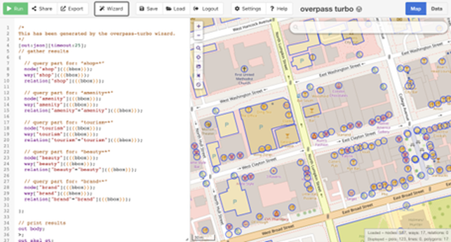 Fig. 1 OSM query of the business in downtown, Athens Editing the data in OSM is also incredibly user-friendly. After the field canvassing, we updated the OSM map since some stores have moved (Fig. 2a, Eye Candy moved to the South Milledge) and others were not previously displayed on the map (Fig. 2a, Rook and Pawn is newly added to the map). Once you are satisfied with your changes on the OSM website, you can upload them to the servers, and the map will be updated. It’s also very convenient for the users to check the editors and the version history on the history tab. In this way, OSM offers the public to draw the features efficiently and accurately on its map. 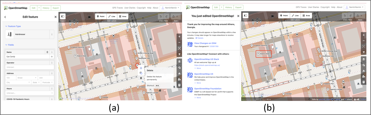 Fig. 2 Delete(a) and add(b) points in OSM QGIS Similar to the OSM, QGIS is not owned by anyone, so it won’t hold people back from using them in creative, productive ways like other GIS closed source software. In this project, we used the QuickMapServices plugin to find the appropriate base maps, we employed the QuickOSM plugin to import OSM data based on the Overpass API, and we installed the qgis2web plugin to generate web maps based on Leaflet from current projects. All the codes of QGIS are accessible on GitHub. In addition, free access is also very attractive for researchers with tight budgets. Leaflet At the end of the project, we needed to generate a web map of all the businesses listed on the AADM’s list. To get around this, we chose the open-source JavaScript library, “Leaflet,” to generate the interactive maps. It has tons of interactive mapping functionalities. Fig. 3 shows the readability and simplicity of the source codes in Leaflet. It also provides lots of base maps choices on the Leaflet Provider website. 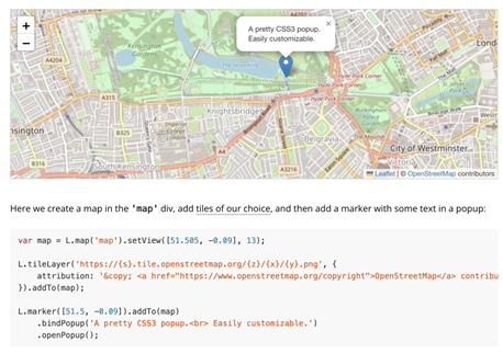 Fig. 3 Sample map with an interactive marker in Leaflet I used to be a little biased, assuming that open-source databases and services might be difficult to use and maintain because they are accessible to everyone. I had heard of and downloaded OSM data many times, but I had never tried editing it prior to this class. This project opens my eyes to open-source data and methods. The fact turns out that the "difficult registration, uploading, and updating process" that I had assumed took me only less than a minute. I realize open GIS has great potentials to foster collaboration and innovation; QGIS provides the same or even more flexible methods of publishing web maps as ArcGIS Pro. There are diverse open-source plugins available that provide great solutions to your problems. For example, we wanted to change the symbology of the points in AADM’s list and we discovered the SimpleSvg plugin written by other community members that supports for SVG icons; The Leaflet tutorials provides significant flexibility on the choices of base maps and the marker.
This also reminds me of the previous readings Being a ‘citizen’ in the smart city (Cardullo et al. 2018) and Citizen Science (Haklay 2013) because people show different levels of participation while using or contributing to the open GIScience, some participates in data collection(e.g., updating the features on OSM), some engage in the problem definition (e.g., posting thoughts/ issues in the QGIS repository on GitHub, some provides interpretation or solutions (e.g., pull requests/ upload plugins). As the article Opening GIScience: A process-based approach (Shannon 2018) says, there are some tensions and tradeoffs in open GIScience: between standardized and flexible tools, between expert driven and community driven designs; between single and multiple audiences; between established and emerging metrics. However, whether you're an enterprise systems integrator, a GISer wishing to share any geographic information, or a user looking to engage with others, open GIS provides a variety of options for getting your work done efficiently and effectively.
0 Comments
By Amber Orozco, Student in Community GIS, Spring 2022 What do you think of when you hear the word “open access” in relation to research or community-based work? Perhaps it brings to mind programs, tools, and academic publications that have no paywall? Or maybe you think of a community that shares resources, such as software code? But in what ways can the approach of open access be a way to support local community organizations? In our Community GIS class, we have spent the last few weeks of the semester thinking through these questions as we work to support the campaign of a local organization, the Athens Anti-Discrimination Movement (AADM). AADM “advocates for racial and social justice and strives to combat discrimination through education and activism”. Part of their efforts includes their “United Against Discrimination” sticker campaign where they ask local businesses to pledge to creating a more diverse and inclusive work environment. If the business decides to participate, they receive a AADM sticker (see photo below) to place on their business’s front window. As a class, our goal is to create a map that will be hosted on AADM’s website, showing the businesses in downtown Athens that are supporters of the campaign. 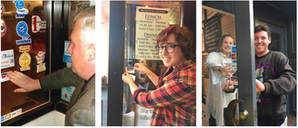 Local businesses in Athens supporting the AADM United Against Discrimination campaign (Photo Credit: AADM) For this project, open access can be understood in two different ways. First, open access for our work takes the form of a process-based approach (Shannon & Walker, 2018), meaning our class is working collaboratively with AADM to gather input on the project, including the timeline, goals, exchange of resources (i.e. AADM provides our class the list of business supporters of the campaign from 2019), and how the map will be both stored and accessed. Our collaboration with AADM is consistent throughout the process, which included us meeting with Denise Sunta (AADM Administrative Assistant and Events/Community Outreach Coordinator and also UGA alumna) at the beginning stages of the project and we will be ending the project with presenting our final map designs to AADM for their approval.
Second, our class is leveraging our technical skills to create this map through an open access mapping program (QGIS) and coding library (Leaflet). Our class was tasked with verifying whether the list of businesses provided by AADM were still participating in the campaign. To do this, our class divided up sections of downtown Athens to assess which businesses had the AADM sticker displayed on their front window. We used ArcGIS’s Field Map data collection application to update this information, including adding new business supporters of the campaign. Our class was able to utilize our university membership to access paid GIS applications, such as Field Map, for this project. Once this list was updated, our class added the geographic coordinates to each business. We were then able to upload this list through excel to QGIS and map out the businesses. Using Leaflet for codes to customize the functionality and appearance of the map, our task is now to develop a map that serves the needs and goals of AADM. Our class is currently divided into different teams, and we are working to develop different options for AADM. For example, my group is working to use codes from Leaflet to develop a pop-up label that will appear when someone clicks on a business that is a supporter of the campaign. We intend to include information on each business, such as the hours of operation, website link, a photo of the business. Additionally, we are developing an option on the map that allows a visitor to filter for the type of business, such as “restaurant, bar, and retail shop”. Once we decide on the format on the map, it will eventually be uploaded and hosted on Github. Personally, this process of transitioning from ArcGIS to QGIS and Leaflet has been challenging because some coding knowledge is required to format the map in my group’s vision. The last time I encountered html was in high school, but I think getting comfortable with these open access programs are a matter of practice and will require more time learning compared to more user-friendly programs, such as ArcGIS. From this experience, I have learned that open access is more than free programs and resources. It can mean leveraging technical expertise as students to support the efforts of community organizations, while engaging the community organization through the process to ensure the organization’s perspectives are centered as the tool becomes developed. Open access extends to the programs we used with no paywall and those programs that we had access to through our university membership. Each of these elements play an important role when partnering and supporting the GIS work of community organizations. Jerry Shannon A few weeks ago, I and roughly 8,000 other geographers attended the annual American Association of Geographers (AAG) meeting in Washington, D.C. While it can be exhausting--AAG has dozens of sessions going on at any given time--these meetings are a great chance to see friends and colleagues and meet new folks whose work I’ve only read or who I’ve only met online. (Despite the platform’s very real problems, I personally have benefited a lot from participating in #academictwitter). One moment that stuck out: I was talking with Peter Johnson, a faculty member at the University of Waterloo, a morning reception hosted by the Digital Geographies Specialty Group. Peter does great work with open data and governance. For example, here’s one of his recent articles on the costs of open data, including the ways it subsidizes private enterprise and corporate influence on policy. Over the last decade, there’s been a strong push for open data initiatives across multiple levels, from cities up through international bodies such as the UN, which makes this work particularly salient. Companies such as ESRI and Socrata have created platforms for hosting and sharing these datasets, and the rhetoric around these tools emphasizes transparency and community engagement. Socrata’s page, for example, references a goal of “fully connected communities,” while ESRI touts its “two way engagement platform.” In my classes, I’m particularly fond of letting students analyze NYCOpenData’s records of yellow cab taxi trips, including more than 100 million trips with details down to the tip given for each one. Peter’s work, along with many others including Renee Sieber, Muki Haklay, Rina Ghose, Taylor Shelton, and Rob Kitchin, has examined how these projects play out on the ground, focusing on whether they live up to claims of citizen engagement and empowerment. As one might expect, results have been mixed. The people most likely to use these data are the ones with the education, training, and expertise to do so--a fairly select group. In my Community GIS class, I use this article on Data Driven Detroit as one example of this dynamic, where open data records on housing only strengthened investors’ ability to buy up vacant property. The alternative model presented in that article is one I’ve been thinking through as well, community-based projects that facilitate residents’ ability to interact with and make meaning from public data. I asked Peter about this dynamic in our conversation, and he mentioned a project conducted by the Canadian government where trained staff would work with remote rural and indigenous communities, helping them interpret census and other government data and understand their relevance to local concerns. In recent years, the Canadian government has increased the online availability of these data, but it has cut the number of trained staff who can work with local communities. In effect, open data portals replaced these staff, providing more “access” to data but curtailing the work needed to understand and interpret it. Recent developments in both open source and proprietary software have provided a number of tools for community-based data collection and open data for government records. But, as Alex Orenstein said at our recent community geography workshop, you also need to “check yourself before you tech yourself.” These platforms provide interfaces for accessing and visualizing these data, but they cannot fully replace the important work of helping community members articulate how the data may (or may not) match their own experience. I’ve been thinking about this in light of my now years-long work with Georgia communities through the Georgia Initiative for Community Housing. Along with my colleague Kim Skobba, I have been helping develop a toolkit for community-based housing assessments, one that uses free and open source software such as OpenDataKit and RStudio’s Shiny platform. These technological tools make it possible for even small rural communities to collect and map out detailed data on individual housing conditions, identifying common issues and facilitating outreach to specific property owners. At the same time, communities struggle with what to do with these data once it’s collected beyond simply noting patterns on the map. Similar to Taylor Shelton’s work in Lexington, I’ve been thinking about ways to work with communities to visualize drivers of problems identified through these data. By talking about landlords, zoning, and other historical factors, we can beging to talk about the problematic history of blight as a metric and its ramifications for community development. 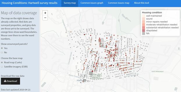 Screen capture from our GICH housing web app This isn’t work that can be solved by a platform or visualization software. It involves time and “soft skills”--listening, thinking, reading, and many conversations, before the work of data collection even gets started. Community members themselves often want to jump right into the technology, and so it is sometimes difficult to communicate the need to move more deliberately. This is hard labor, but as folks working in public participatory GIS (PPGIS) have long emphasized, it’s crucial to fostering sustainable, just change in communities.
Author Jerry Shannon is an Assistant Professor at the University of Georgia in the Departments of Geography and Financial Planning, Housing, & Consumer Economics. He is the director of the Community Mapping Lab. Exploring the boundaries of esri's web appbuilder: a reflection on what i lost and what i gained3/31/2019
Aileen Nicolas As the saying goes: you can’t have your cake and eat it too. In a project for the Community Mapping Lab, I worked with a representative for the United Way of Northeast Georgia’s 2-1-1 program to develop a web application that allows for visual interaction with services offered in Athens, Georgia. Along the way, I had to weigh the pros and cons such as reproducibility and ease of use of different web application development software. I found that it was impossible to have everything I wanted in a single web framework for software development. The United Way of Northeast Georgia is a non-profit organization that aims to ensure access to quality education, financial stability, and healthy lifestyles for residents of its service region. They work with stakeholders from different sectors such as schools, businesses, financial institutions, and local governments across the state to promote and improve community conditions. Their 2-1-1 program offers residents the opportunity to speak with or text a representative of United Way about services they may be looking for. In the fall of 2018, I worked with a representative for the United Way’s 2-1-1 program to develop a web application that allows users to locate services offered in Athens, Georgia through a map interface. Although the call line offers callers the ability to speak with someone who is knowledgeable about the services offered, a web application allows users to explore services at their own pace and see details about the services up front as opposed to hearing about them over the phone. The web application had 5 important requirements:
I looked for ways to meet the requirements listed above, managed data from United Way’s database, and researched the best way I could develop a web application. I did this through an internship with the Community Mapping Lab which actively works to provide students with the opportunity to work with community members as well as apply their knowledge to solve practical problems. It is important to carefully consider which software to use when developing a web application. In the development process of this web app, I considered using Leaflet or R Shiny. These programs would allow me the greatest flexibility in the development of the application, and it would be shareable for future use as well as reproducible. However, I don’t know JavaScript, so I couldn’t make a Leaflet map, and at the beginning of this project, I had no experience in R. To develop a web application using those tools would be to embark on a long journey of learning for which I did not have time. I chose to use ESRI’s Web AppBuilder to develop my web application because it was the best tool for me considering my skill set and complete lack of coding experience. I was able to develop a web application with unique visualization features and useful filtering tools. With this app, the users could explore the agencies in Athens, search for service by language availability, visualize the route(s) agencies are on, access contact information, and determine eligibility. One of the advantages of my web app is that all agencies which offer services for the general public are listed on its map. Unlike Google or other search engines, the web app shows all the services available from all service categories at once. Google is more likely to display agencies whose names match the keywords input in the search bar. Some of the agency names are not representative of all the services they offer, and because of that, a search engine can be limiting. Additionally, a search engine may not offer as much information as clicking on one of the service icons on my web application may offer. For example, by clicking on a service icon, I can see all the information shown in figure 1, and more. 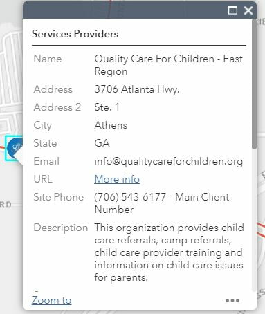 Image 1 In a previous blog post, Jiaxin developed her own web application using the Leaflet API to map areas in the state of Georgia that had high percentages of population eligibility for UGA SNAP-Ed programs. Like her, I wanted to develop a web application that allowed users to explore services and visualize eligibility geographically. I know about the importance of using open-source software for reproducibility of a project. I know that ESRI products are expensive to license and thus difficult to access for those who do not have hundreds of dollars to spend on licenses. So why did I choose the Web AppBuilder? In the end, we have to pick our battles. My app may not be easy to reproduce, but it had the basic features I needed. I wrote instructions on how to download data from United Way’s internal database. I used R to write scripts to prepare the data I had extracted. Even though I was not able to complete this entire project in a way that promotes accessibility to the entirety of my work due to limitations in my knowledge, I gained the skills that could help me produce a Shiny app in the future. It is interesting to consider how “open” open source data or software is if it requires a significant amount of time, knowledge, and experience to be able to use it. Some features I wish I could have expanded on with ESRI’s Web AppBuilder were fonts, the flexibility in positioning of certain elements and widgets, and further customization of widget features and capabilities (Figure 2). For example, the text below the filters blended in with the background of the filter widget, and I wish I could have chosen a darker color for the text to help it stand out. Additionally, I would have liked to have the legend be on the other side of the web application to allow users to more easily find that button. Finally, I had a difficult time with the filter feature since it only took data in the wide format instead of the long format. These are the sorts of limitations that we can experience when we don’t code our own applications. In conclusion, in developing a web application for United Way, I made the decision to use ESRI’s Web AppBuilder over R Shiny or Leaflet. There were benefits to ESRI that made developing the web app easy, but I missed out on the flexibility associated with coding my own web application. I struggled with the limits of the ESRI’s Web AppBuilder but learned valuable new skills that I can use to promote more reproducibility of my work in the future. 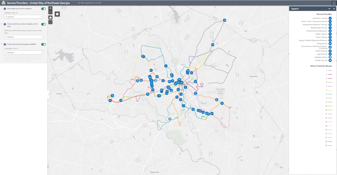 Image 2 AuthorAileen Nicolas is a fourth year Geography major at the University of Georgia. She will be pursuing her Master's degree in Geography starting this fall of 2019 also at UGA. Taylor Hafley We are more than a decade removed from the national foreclosure crisis. Homeownership rates languish near all-time lows. Housing prices have surpassed pre-Recession highs. And a crowd of corporate actors have entered the single-family housing market in the wake of more than 9 million foreclosures during the Great Recession. Yet, there is limited research on the intra-metropolitan geography of large corporate landlords (Raymond and Moore 2016, Abood 2017). In this blog post, I map the geography of one such corporation, Invitation Homes, in Gwinnett County. Specifically, I discuss some of the demographic trends in ten census tracts where Invitation Homes owns more than 1,000 properties. I find these neighborhoods are becoming less white, more Black, and exhibiting a decline in homeownership, offering a few examples of how the Great Recession continues to affect housing markets in suburban Atlanta. Single-family corporate landlords are one example of a broader trend in post-Recession housing markets. The single-family rental (SFR) rate in Atlanta (i.e. the number of single-family homes occupied by renters compared to the total number of occupied single-homes) increased from 11.5% to 19.2% between 2006 and 2016, one of the highest increases among large metropolitan areas (Immergluck, 2018). Immergluck suggests the growth of SFRs may expand the housing options and neighborhoods available to renters in Atlanta. The geographic concentration of land by a single corporation, however, creates problems for jurisdictions at multiple scales and complicates assumptions about who is benefitting from the current housing price recovery. Invitation Homes: What and Where? Invitation Homes is a subsidiary of private equity giant Blackstone. It markets itself as offering quality homes in “desirable neighborhoods across America”. Classified as a single-family Real Estate Investment Trust, Invitation Homes is part of an emergent group of corporate landlords active in the single-family rental market. Invitation Homes owns 12,500 homes in Atlanta – their largest market. They are active in 19 counties in the Atlanta metropolitan area. In this post, I focus on Gwinnett County, where they own more than 3,000 properties. According to Dr. Elora Raymond’s analysis in the popular Atlanta Studies blog, Invitation Homes owned 983 properties in Gwinnett as of 2013 (Raymond and Moore 2016). Thus, Invitation Homes acquired more than 2,000 units between 2013 and 2018. 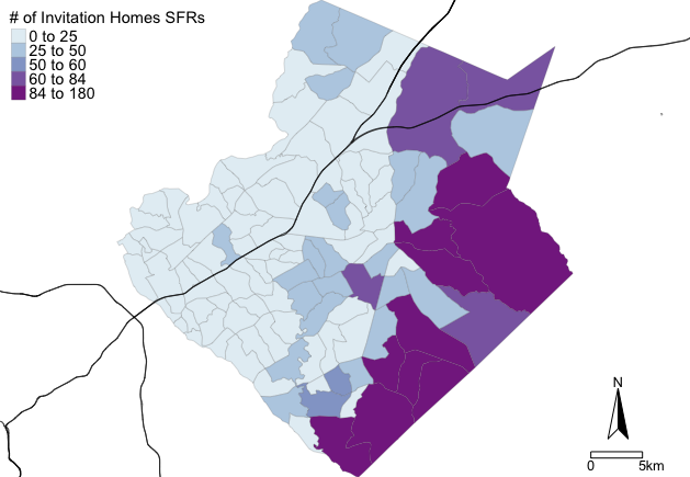 Map 1: Total Invitation Homes' properties by neighborhood Of their more than 3,100 parcels, 1,147 are concentrated in just ten census tracts along the county’s eastern border. In Map 1 above, you can see these neighborhoods near Dacula to the south of Loganville. There are 113 census tracts in Gwinnett County. Meaning, more than 35% of their Gwinnett County portfolio is concentrated in fewer than 10% of the census tracts. Additionally, these tracts contain only 15.5% of the county’s population. 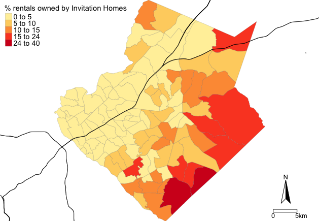 Map 2: Invitation Homes rental market share by neighborhood As one attempt to, “uncover stubbornly persistent blind spots in geographic research,” I compare the number of Invitation Homes properties to all occupied rental housing in Map 2. Invitation Homes owns more than one out of five rental units across four contiguous census tracts in the southeast corner of Gwinnett County. The demographic changes happening in these census tracts suggest IH neighborhoods are becoming less white, more Black, and exhibit an above average but declining homeownership rate. Based on data from the U.S. Census’ American Community Survey, the median Black share of the population of these tracts increased nearly ten percentage points from 36.6% to 45% in the past seven years, while the median white share of the population decreased 11.7 percentage points, from 54.3% to 42.6%. Finally, the average homeownership rate declined roughly five points from 85.1% to 79.9%. As a diversifying suburb, these trends aren’t necessarily surprising to anyone familiar with demographic changes in Gwinnett County, but the geographic concentration of land ownership by an institutional investor is a post-Recession reality that impacts communities across the Atlanta metropolitan area, many of which are dealing with a lack of affordable housing. The similar trajectories of demographic change among the IH neighborhoods along Gwinnett County’s eastern edge suggests that the concentration of corporate landlords is an important component in evaluating the post-Recession housing geographies of Atlanta. As a part of my dissertation, I’m thinking about how landlords at this scale can manipulate housing markets, shift demographics, and transform metropolitan spaces (maybe a future post!) References Abood, M. 2017. Securitizing Suburbia: the financialization of single-family rental housing and the need to redefine risk. Massachusetts Institute and Technology. Department of Urban Studies and Planning.. http://hdl.handle.net/1721.1/111349 Immergluck, D. 2018. Renting the Dream. The Rise of Single-Family Rentership in the Sunbelt Metropolis. Housing Policy Debate. DOI: 10.1080/10511482.2018.1460385 Raymond, E. & Zaro-Moore, J. 2016. Financial Innovation, Single Family Rentals, and the Uneven Housing Market Recovery in Atlanta. Atlanta Studies Journal. https://www.atlantastudies.org/single-family-rentals-in-atlanta AuthorTaylor Hafley is a PhD student in the Department of Geography at the University of Georgia. His dissertation focuses on how single-family REITs influence urban-suburban change. Michelle EvansOpenStreetMap (OSM) is an open-source map, an alternative to the ever present Google Map. But it is much more than a data source. OSM is community driven, and its community members host mapathons, participate in FOSS4G and OSGeo activities, and get together to talk about maps, from cartography and aesthetics to the political ramifications of delineating boundaries. These discussions are highlighted at OSM’s State of the Map (SOTM) conferences. State of the Map is the annual, international conference organized by the OpenStreetMap Foundation that brings OSMappers together from across the world. In addition to the international conference one, there are intra-national SOTM conferences that bring mappers within a region together to discuss pertinent regional topics. I had the opportunity to attend the regional SOTM-Asia conference in Bengaluru, India from November 17 -18, 2018. Over 200 people attended the conference, from students and governmental agencies, to NGOs and academics, to more tech-based companies such as Grab and Facebook. There were country representatives from Indonesia, Nepal, Bangladesh, Japan, and the Philippines (and I’m sure many more that I am forgetting!), with a panel highlighting the work happening in each country. The true highlight, however, was seeing the dynamism and diversity of the community. Talks ranged from critical geography to AI-based image recognition, with stimulating conversations at the chai breaks in between. 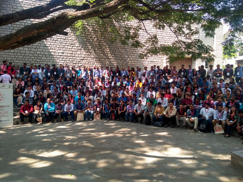 Group photo of SOTM-Asia 2018 attendees. Photo credit: Jinal Foflia. In the US, the OSM community is technologically-driven, with few recognizing the critical geography theory behind their actions or the societal consequences. This mirrors a similar split within the discipline of geography itself (Wilson 2015). And so, it was refreshing to hear discussions on participatory mapping, empowerment, and how to democratize maps and knowledge at what I had expected would be a tech-centered conference. In fact, this was the final message of the opening keynote address, recognizing that open maps aren’t necessarily democratized maps. Historically, maps have been used as a tool of colonization, with the methods to create them and the resulting knowledge only available to a select few. An infamous example of this is the resulting map of the African continent following the Berlin Conference, in which European powers divided the a whole continent into colonies under their control. But we needn’t look to the 1800’s for examples of exclusionary mapping. OSM itself was founded in 2004 in response to the UK’s ordnance survey, a government-run project that created a map of the UK which was not freely available. Since then, OSM encourages “the growth, development and distribution of free geospatial data and [provides] geospatial data for anybody to use and share.” (OSM Wiki) An OSM map is ‘democratized’ in that anyone can contribute to or edit it and the resulting data is free to use for all. Relative to other sources of geospatial data and technologies, this is certainly true. However, we should question who is included in the idea of ‘all’. While the SOTM-Asia conference had a wider diversity of participants than OSM activities in the US, we were all educated, spoke English (in fact, this is a big issue in OSM in Asia in particular, and was brought up by multiple speakers), and boasted a relatively high digital literacy, representing a small portion of the global population. In order to contribute to OSM, one must not only have an internet connection, but also the computer skills to use the editing software. Actually downloading and using the data represents another technological obstacle. The recent development of more open-source, user-friendly software tools has helped reduce this digital divide, but technology still determines who are the mappers and who are the mapped. In this age of rapidly accumulating open data, there is a concurrent call to engage critically with emerging technologies and question how it is changing how knowledge is produced and valued. One session focused on an older ‘technology’, the role of Helavaru storytellers as the archivers and narrators of families’ histories in Karnataka. Helava communities travel with centuries old documents detailing the history of a family and a village, and share the story of a place through a narrative or song (you can see the video from SOTM-Asia here). Following the presentation, a discussion unfolded about how this data could be recorded, and whether computerized technologies such as AI could contribute to an automated process. However, there was push back to this suggestion. What would be lost in the translation of this narrative style into numbers and GPS points? As TB Dinesh said, “Maps are denotational, but storytelling is connotational.” Whose knowledge is this and who has a right to capture and/or disseminate it? And perhaps more importantly, what would this mean for the Helava community if the records become digitized, and telling stories is no longer sustainable? 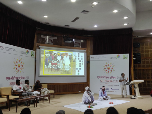 TB Dinesh speaking about Helavuru as sacred geographers. Photo credit: Rasagy Sharma I spent a large portion of the conference wrestling with these questions and, based on my discussions with others, I was not alone. Like other FOSS communities, OSM aims to democratize data and the tools to create and analyze the data. ‘Open’, as discussed above, can be a relative term, and ‘putting people on the map’, so to speak, is not always in their best interest if they are not involved in the process or have access to the data that is created. OSM and other open GIS systems, particularly Humanitarian OpenStreetMap (HOTOSM), are often critiqued for a reliance on remote mapping (Palmer 2012), whereby those in the Global North map out the Global South, meeting Pickles’ prediction of a ‘new imperial geography’ (Ground Truth, 1994). OSM chapters and contributors in Asia are working against this critique through their use of participatory mapping and field-based projects. However, even within a chapter, inequality exists, particularly around gender. OSM has a reputation for being dominated by men, which translates into maps that are not representative of everyone’s landscape. During the SOTM Asia country panel, this issue was brought up, and OSM chapters are working hard to ensure their meetings and mapathons are safe spaces for women and others. In fact, this reputation may be changing. As OSM chapters are moving from simply documenting the world to responding to natural disaster crisis and creating data specifically to address social injustices, new members are getting involved. Programs such as Youth Mappers and Let Girls Map are working to improve inclusivity in the OSM community, and show those working in social justice and advocacy how OSM can be a tool for change. OSM’s creation caused a radical shift in mapping, opening up control of the map to a much wider audience than had previously been allowed. Over a decade after its creation, however, the community is reflecting on just how ‘democratized’ open data is. I’m optimistic that a combination of FOSS-based tools and community-driven critique and discussion, such as took place at SOTM-Asia this year, will continue to expand our notion of ‘all’ in the effort to democratize the map. Note: In addition to these more theoretical discussions, there were also some workshops on cutting edge software and tools and presentations highlighting innovative applications of OSM to a range of societal issues. Once the slides and videos are made available, I will post a link to them here, and I highly recommend checking them out. AuthorMichelle Evans is a PhD student in the Integrative Conservation and Ecology program at the University of Georgia. Her research explores the ecological, social, and political drivers of spatial inequalities in mosquito-borne disease burdens. |
Archives
March 2024
Categories
All
|

- Home
- About
- Activties
-
Projects
- Athens Wellbeing Project
- ACC Black-owned businesses
- Athens bike routes
- Atlanta Community Food Bank
- Athens 1958 City Directory
- Athens bike routes
- Brooklyn Cemetery
- Evictions in Athens
- GA Hunger study: Proximity map
- Georgia Initiative for Community Housing
- Historic Cobbham Neighborhood
- Hot Corner
- Linnentown
- Sparrow's Nest
- Blog
- Resources
- Calendar
 RSS Feed