|
By Kali Lyons, Community GIS Student Spring 2024
When deciding which course to take, this class stuck out to me as it was focused on providing a real-world experience. We would be building a project from the start and would responsible for data sourcing, creating deliverables, and working with one another and community members to create useful projects. I expected most of our class time to be spent working independently on computers with occasional communication with community members to guide us. I was wrong. Before we even started talking about the topic of our project, Dr. Shannon helped build our knowledge of research methods. Rashe Malcolm, a local entrepreneur and proponent of East Athens, helped build our knowledge of local history, introduced us to East Athens, and helped direct our goals. As an Athens resident, I was aware of gentrification in Athens but was not aware of the concept of “Studentification,” or even the full extent to which gentrification had taken place. I have only lived here for three years and hadn’t visited much prior to moving here for school so, I had no concept of what had changed. In the time that I have lived here, though, there have been apparent changes made for the benefit of those that attend the University. Apartment complex after apartment complex has been built. Many of these places are only available to those who can afford them, namely students who receive financial help from their parents. In Athens, historically underprivileged communities that are predominantly occupied by people of color have been the most affected by this process. The Lodge, for example, located on North Avenue was once a mobile home park. Residents were forced to relocate, or even worse, ousted from their homes that were deemed unfit by local zoning ordinances as they did not meet the codes at that time. These displacements caused compounding negative effects that community members are still striving to overcome today. The severity of studentification has been a major focus in this class. In one of our very first labs, we used house sales data to track how the price per square foot of home sales in Athens-Clarke County has changed over recent decades. Although prices generally increased across Athens-Clarke County, there was an increase of at least $50 per square foot in Inner East Athens specifically, with some homes selling for at least $500 per square foot. Increasing property taxes have added to the burden, forcing many residents to sell to developers. This can be detrimental to a community that is already under so much stress. The loss of familial homes and affordable housing from local residents to temporary students as rental homes can have a trickling effect leading to distrust and disengagement with the community. As we visited Rashe Malcolm at the Triangle Plaza, the heart of Inner East Athens, she emphasized how a once thriving business community has been lost in recent decades. Options to purchase foods are limited, as convenience stores are the primary sources for purchasing foods and most grocery stores require travel by car or bus. Travel time, time allotted for cooking meals, and the cost of fresh food may also be factors discouraging IEA residents from consuming nutritionally dense foods. Affordable available foods are usually restricted to processed foods that provide almost no nutritional value. A local grocery store (developed for community members), a thriving community center and garden, and affordable housing will hopefully restore Inner East Athens. Her hopes are to reinvigorate her community and to increase community engagement. My team is working to create deliverables that accurately reflect the current and historic demographics of both Inner East Athens and Athens-Clarke County. Changes in demographic variables, like income, renter/homeowner status, and rent burden over the past 20 years might indicate how the draw from the University is affecting different areas of town. We have yet to produce a final product, but I am excited to aid in the development of supporting materials for Rashe’s plans. Aside from creating real usable material as a final project, this class has also been heavily group oriented. The research questions, methods, and plans have all been meticulously made through the course of the semester by the students (with guidance of course). It is challenging but has also been a valuable experience that I feel will be applicable to real world GIS work. Kali is an undergraduate student at the Odum School of Ecology pursuing a GIS certificate. Keywords: studentification, community GIS, housing
0 Comments
By Paige Robinson
As an ecology major, my perspective on engaged research is perhaps a bit different from some of my fellow geography students. In my previous experiences working on research projects, I am used to taking a very traditional scientific approach. We come up with a hypothesis, create an experiment to test it, and then interpret results. It is very logical and straightforward with everything being guided by previous research. I have enjoyed that approach in the past because of how straightforward it is; there is no outside noise to worry about, and it’s all up to you and your small team to work towards the results you want. I will say there is of course ecological research that involves social science and there are different methods in ecological research that may mimic this class more, but they are projects to which I have not been exposed. For our specific project in Community GIS, we have been tasked with assisting Rashe Malcom, a business owner in Inner East Athens, with her goals of building a community garden, a new grocery store, and more affordable housing in this community. Rather than the traditional scientific approach of question-answer, this project is far more nuanced and open ended. We will get quantitative results, sure, but what to do with them will be a very complex answer that isn’t up to us. We are serving as the grunt work for Rashe to research her questions about the Inner East Athens community to better inform her decisions moving forward. Her input is part of the process of co-production, which involves ensuring that researchers and the people being researched both have a voice in the production of the research and how it is used. This is an important concept for this project, as it's meant to ensure that people aren’t taken advantage of. These questions are: What is the business demographic of Inner East Athens(IEA)? What does food access look like in IEA? What are the demographics of the people in IEA and how does that compare to the rest of Athens? Who owns property in IEA? What areas of IEA are gentrified and which areas are most susceptible to future gentrification? Doing a whole project working towards what we know will be a complex answer rather than black and white results will take some getting used to. Over the course of the semester, I have shifted my mindset from being used to the satisfaction of a definitive answer, to more of a satisfaction from knowing our work will eventually be used to help inform future decisions out of our control. It’s more hands-off in the long run but I am excited to see where these results take Rashe’s goals and how she will use them to uplift her community. Another aspect that is perhaps a bit less familiar for me is having our work split up so much into smaller groups. It can almost feel like we are working on entirely different projects at times, rather than just working on different aspects of the same project and working towards the same goal. The scientific research I am used to can also involve a team aspect of course, but it is usually on a much smaller scale. Working with such a large group and coordinating so many different people’s opinions and ideas on the best way to perform our tasks has been overwhelming at times. However, I think having multiple perspectives is also useful, especially when the results of our work will not directly affect us. Most of us do not live in IEA, and will likely not be involved in this project once we leave this class. Therefore, hearing out everyone’s opinions and making sure we do this right is very important. In comparison, working on ecological research in a lab feels different because the stakes often feel more personal; it feels as though since there are fewer of us working on a project, we are all more personally tied to its results- especially because the projects are usually not tied directly to another group of people (as is the case with our research on IEA). While there are pros and cons to both methods/types of research, I think co-production is extremely beneficial for this project. I have really enjoyed learning how to incorporate other people’s perspectives from outside of our group into this project, and I understand its immense importance. Working with animals or plants or any other non-human part of ecology, it is rare to see a perspective like this that is so conscious of the impact of research results and processes. Having experience with both during my time at UGA has already changed the way I think about research and will only continue to improve my skills in the future. I think more ecologists should be aware of concepts like co-production and be better about division of labor, impacts on the people living in study areas, etc. I hope that as I enter my career, I will be able to take what I have learned about these things from this class and improve my research going forward. Paige Robinson, a third year Ecology student with a minor in geography and certificates in GIS and Sustainability. Keywords: Scientific Research, Research Methods, East Athens, Co-production addressing food access in East Athens: A Conversation with district commissioner Tiffany Taylor4/25/2024 By Nishad Kute, Community GIS Student Spring 2024
Intrigued by the intersection of community development and Geographic Information Systems, I decided to enroll in the Community GIS course taught by Dr. Jerry Shannon at the University of Georgia. As a 4th year ecology major completing the Geographic Information Science certificate, I was drawn to the opportunity to apply my newly acquired GIS skills to real-world challenges facing Athens. I had never taken a service-learning course before, so I was not entirely sure what to expect. My initial expectations for this class involved fine-tuning my pre-existing skills in GIS and learning how to apply them in a real-world environment. I quickly discovered that this was not the case, as I found myself having philosophical discussions and interviewing local political figures. The core of Community GIS focuses on the co-production of knowledge by working collaboratively with community partners to contribute to positive change in underserved communities like Inner East Athens. Located roughly a mile from downtown, Inner East Athens seems to be in a central location in the city but in reality feels much more isolated than the rest of Athens. East Athens has a long history of neglect from Athens Clarke County, leading to issues regarding food access, education, public transportation access, and poverty. Our project focuses on the area in and around the Triangle Plaza in Inner East Athens. Triangle Plaza currently has several small businesses, including a grocery store and liquor store, as well as a police precinct. Also located in the plaza is Rashe’s Cuisine, a Jamaican restaurant owned by Rashe Malcom, a local business owner and community partner for our class project. Rashe’s vision for East Athens involves the redevelopment of the area in the Triangle Plaza, including plans for affordable housing units for residents, a grocery store, and a community garden. Our role as students in this course is to assist Rashe by providing any data and maps that supports her vision for redevelopment of Triangle Plaza. Rashe recognized the lack of access to healthy foods in East Athens, and her plans for redevelopment aim to encourage entrepreneurship and increase access to affordable, healthy food within the community. Recently in this class, we have started the pre-proposal phase of our class project. Students have been grouped into different issues that are impacting East Athens, such as gentrification, demographics, food access, and more. Food access was something that had piqued my interest, especially after interviewing District 3 Commissioner Tiffany Taylor. My interview with Commissioner Taylor provided me with valuable insight and context to the issue of food insecurity in East Athens, inspiring me to choose it for the topic of our group projects. Commissioner Taylor is an East Athens native and has deep ties to the community. She currently serves as the director of the Mothers of Black Sons Development Program, a non-profit organization aimed at mentoring young men and boys in East Athens to learn work ethic, trades, and fostering a sense of brotherhood within the community. When asked about food accessibility and her role as district commissioner, she acknowledged the lack of access to affordable and healthy food, defining East Athens as a “food-swamp”. A food swamp is different from a “food-desert” in the sense that it is characterized by a wide availability and accessibility of foods with low nutrient density, often provided by fast food restaurants and corner stores. Food deserts on the other hand are simply characterized as areas with limited access to healthy food. Within Inner East Athens, the only close-by options many residents have for groceries are either the Family Dollar or the Pan AM Supermarket. Both stores sell mainly overly processed foods, and don’t have many options for fresh produce and meat. Commissioner Taylor reflected on her childhood growing up in East Athens when there were many more options for fresh produce and meat. She mentioned that the Pan AM Supermarket sold fresh food in the past, but now she claims that it’s more of a hair product store than a supermarket. She also mentioned a grocer called the Quality Market, which sold fresh food but was unfortunately torn down for the construction of the Firefly trail, a recreational walking and biking trail that spans from downtown into East Athens. Learning that healthy food was more accessible in the past made me realize the scope in which the city's government has failed this community and has highlighted the need to create resources that provide healthy food to residents. Commissioner Taylor was also in full support of Rashe’s plan for a community garden, placing emphasis on the importance of creating a community initiative to teach children sustainable gardening practices and cultivating relationships through shared work and collaboration. The benefits of building a community garden go far beyond providing affordable and healthy food to the community, as they also provide opportunities for education and skill development, promote physical and mental health, serve as local sources of economic empowerment, and revitalize the neighborhood. I am learning a lot from this class about how large-scale community projects are carried out, and I hope to one day see the results of our efforts come to fruition. Nishad is a 4th year undergraduate student pursuing a bachelor’s of science in ecology along with a minor in landscape studies. He is working on finishing his GIS certificate this semester and plans on starting his master’s program in landscape architecture following graduation in May. Keywords: food accessibility, food justice, community engagement, East Athens A step out of my comfort zone: a reflection on the process of public and community engaged4/25/2024 By Peyton White, Community GIS Student Spring 2024
Stepping out of one's own comfort zone is just as it sounds: uncomfortable. This was what I chose to take on as an Ecology major adding a GIScience certificate, with which I was largely unfamiliar with, yet eager to experience. I am currently enrolled in “Community GIS” at the University of Georgia, where the focus is to put geographic tools to use in real-world problem-solving applications. Putting these GIS skills that I have only recently learned into practice through collaborative research has been new territory for me. Prior to this class, I had no experience in community engagement or service-learning projects. In my GIS certificate classes thus far, I had felt as if I was just going through the motions of downloading data, making maps, and turning them in for a grade. I can fairly say I had a sense of imposter syndrome, as people around me had dedicated their entire majors to Geography and I felt as if I was just jumping in and skimming by. This differs from Community GIS in the sense that we routinely meet as groups for collaboration with our classmates and occasionally with community members via interviews, and most of our work is a team effort towards one final goal. Now that our deliverables are to be used for a purpose rather than merely a grade, I feel as though this is the step up to the plate I had been preparing for. The community service project for this term involves assisting Rashe Malcolm, a business owner in Inner East Athens (IEA), in her plans to revamp the area surrounding the “Triangle Plaza” by constructing a grocery store, laundromat, community garden, and affordable apartment-style housing for the community. We intend to create demographic, economic, and business profiles of this area and provide what we create to equip Rashe with information to use as she sees fit. The most impactful part of this class to me has been our interactions with Rashe and going out to see East Athens as a class. Crossing over the North Oconee River felt foreign, and being met with turned heads and stares from residents, I felt out of place in a way I had never experienced. Upon stepping out of my car, and other students stepping out of theirs, we were met by Rashe with warm greetings and inviting energy. She spoke with us about her plans, and walked us to the site where she intends to make it all a reality. I love learning of Rashe’s ambitions and goals for the community, and I am so glad our class can support her endeavors. Furthermore, the impacts of this project could reach not just Rashe, but the whole community. Although we are only creating deliverables for Rashe herself, the materials we provide could potentially lead to the broader impact of Rashes proposed plans being executed. Rashe is also currently running for Commissioner of District 6, and the information we will provide could be meaningful for non-IEA residents to understand IEA and how it compares to Athens-Clarke County. It makes me so grateful that she is placing her trust in our class’s budding expertise, and it is refreshing to know our work is going to a purpose far more meaningful than just a grade. Having spent four years in Athens completing my undergraduate degree and never hearing of East Athens until this semester, I can say this class has been such an eye opening experience. Looking back on how I would tell others that I live in Athens makes me feel like an imposter – I never truly understood the disparity between college student life and resident life of Athens. Just two miles from the renowned UGA Arch and less than a mile from high-rise student housing, infrastructure and demography undergoes a sudden change. With my newfound knowledge of Athens and the new meaning of GIScience I hold, I am becoming comfortable with being uncomfortable. Breaking free from the imposter syndrome I felt throughout my progress in this degree certificate, I no longer feel like my major is a hindrance to my ability to succeed in my GIS classes. I no longer feel behind, out of the loop, or less than. This step of taking Community GIS has given me such vast and valuable knowledge of my community, and ties together what all of those tools I learned are meant for. Wrapping up this certificate with this course and project makes all of that learning come full circle, and I can not recommend this course enough. Peyton is a 4th year B.S./M.S. Ecology DoubleDawg student at the University of Georgia, pursuing a certificate in GIScience. Her current research is a multidisciplinary approach of genetics, biogeography, and physiological ecology to understanding the North American Atlantic coast mussel species, Geukensia demissa. Keywords: Community projects, engaged scholarship, imposter syndrome By Radu Casapu, Community GIS Student Spring 2024
I think we’ve all done class group work in the past where no one can work together and no good ideas come out of the discussion. You leave the class wondering, “Did our group just not mesh well?” or “What is the professor even asking of us?” It can certainly be frustrating to propose group work and end up with a less-than-ideal end result. While I don’t claim that there will always be a solution to this, I found that through our collaboration and group discussions, we were able to overcome these issues in our UGA Community GIS class. So how were we able to do it? For context, our Community GIS class took on a challenging project this semester, working with East Athens business owner Rashe Malcolm in researching and analyzing data involving the neighborhood as she hopefully looks to build a grocery store and community garden for the historically Black neighborhood. Her idea is not simple - it will take into account food accessibility, gentrification, and business ownership, among other things. Rashe’s got plenty on her plate, so we as Community GIS students accepted the challenge. First and foremost, we had to make sure that our project does all it can to be to the utmost benefit for Rashe and gets her approval through every step. We applied a valuable method known as co-production of knowledge, which would best help us work in the environment of multiple parties being involved. After all, “High-quality co-production requires frequent interactions among participants to occur throughout the process” (Norström et al., 2020), therefore taking in the input of everyone involved. The strategy of co-production emphasizes that both parties involved should bring knowledge and ideas to the table when possible. That way, the final product brings more value to everyone, including both Rashe and us students. Before even asking the questions for the project, we made sure to collect as much experience and knowledge as we could through various means, whether it be interviews with community leaders or on-site exposure. With all that under our belt, we reached the most daunting part yet: the planning process. We allotted ourselves multiple class periods to work through this process. As the saying goes, Rome wasn’t built in a day. We needed time to disassemble the pieces of the project and then put them back together in a way we could handle. Our first task was brainstorming questions. These questions involve what we are trying to find out through our project. The goal here was to come up with as many as possible - we would make them more defined and concise later - but at that moment it was best to simply get everyone to ask questions. This way we can see our project through every perspective. Through our multitude of questions we practically got to see the thought process of every group member. There are no wrong questions, but there are very many right questions that could be asked. After a lot of discussion between each other and together with Rashe, we steadily narrowed down some questions, combined others, and got to a few solid ones that encompass all that we want to research. Next, we brainstormed potential data and methods. For every question we thought of the different ways it could be answered. These methods don’t necessarily have to be directly answered by GIS, since even though our class is centered around GIS software, not every student comes in the class with the same knowledge or background. Technical skills vary, college majors vary, and obviously our personal experiences are all different so we will have different ideas. This is an important value of Community Geography in general, which as Fischer et al. (2021) point out, promotes flexibility and diversity of methods when approaching a project’s goals and research questions. We worked through our ideas and assessed how feasible they were and which were our favorites. We went around and identified our favorites from other groups and gave edits or suggestions on how to improve them. Finally, with questions and strategies established, we could come up with centralized goals that we want to achieve. We had to do many rounds of categorizing and dividing up the questions and strategies but ultimately we found five paths we could take to address all our goals. These five paths would become our 5 groups in which we take on different aspects of the project. And so, within a few rounds of brainstorming and discussion in our groups, we were able to get a good start on our project. This was simply possible through the cooperative effort of everyone, making sure that it made sense for us as researchers splitting up this work and for Rashe, who will benefit from a well-organized final product which provides just as much valuable information from each of the five aspects of the study. My conclusion from this experience is that there are a few things we can take on how to have more productive group work. Firstly, use your groups’ differences to your benefit through different experiences and perspectives which allow for entirely different solutions which you might have never thought of otherwise. Stressing the importance of contributions from all parties involved is a crucial point of co-production, whether it be through asking questions or discussion. In addition, don’t go into the discussion expecting a final product. It can take a while, and it might not come through in the way you expected it, and that’s perfectly fine. Refining our questions or goals was a very steady process which we did over time by involving everyone. Finally, be willing to take risks or unexpected approaches. Bringing a completely new question to the table might spark discussion on something that had not come up at all before. Once again, the power of involvement in co-production allows for this to come from anyone engaged in this research on any side. Radu is a third-year undergraduate student majoring in Geography and pursuing a certificate in GIS science, interested in urban planning and mapping. Keywords: Co-production of knowledge, research planning, community projects, Inner East Athens References: Fischer, Heather, et al. “Doing Community Geography.” GeoJournal, vol. 87, no. S2, June 2021, pp. 293–306. https://doi.org/10.1007/s10708-021-10457-8. Norström, Albert V., et al. “Principles for Knowledge Co-production in Sustainability Research.” Nature Sustainability, vol. 3, no. 3, Jan. 2020, pp. 182–90. https://doi.org/10.1038/s41893-019-0448-2. By Jake Ferus, Community GIS Student Spring 2024
I am a fourth year Ecology major at the University of Georgia currently enrolled in GEOG 4385 “Community GIS'' taught by Dr. Jerry Shannon. Not having previously taken a service learning class, I was ecstatic to get this experience even though I wasn’t sure what to expect going in. All that was known was that my skills in GIS, Geographic Information Science, will contribute to a community partner in Athens. I was surprised when the first half of the class focused on the relationship between the researcher and community partners instead of going straight into work. The many readings we discussed helped us think through the positives and challenges of doing community engaged research. One concept we discussed really put in perspective what it means to be part of this relationship, the idea of strategic positivism. Positivism is the concept that there is an objective truth that can be derived scientifically. Often, this is proven mathematically through empirical observation and models, which creates laws. Scientists in the search for truth are disinterested, meaning they observe outside their own subject matter resulting in conclusions without personal bias. This theory seemed to align with my own personal values because I believed science shows the truth of the world through research and fact-finding. An objective perspective in research seems like the best way to learn about the world around us. However, as we discussed in class, I learned that looking at the world through universal truths can be dangerous and limiting to progress. This is because knowledge and truth is context-specific. What is true for one time and space is not necessarily true across all time and space. Everyone, whether they want to or not, has a bias they look at the world through. This is something that can’t be avoided and is beneficial in the context of service learning. Consider a community that was forcibly removed so new stores could be built: Using objective numbers would not be able to correctly display the effects this had on those families. The quantified data would highlight the increase in economic revenue instead of correctly showing the hardships put on the families since it is hard to quantify emotional weight. Correctly showing the afflictions on communities is why Strategic Positivism is essential when doing community service work. Strategic Positivism is the realization that science can’t be objective and that subjectivity in science can be intentional in helping those studied. Realizing that everything has subjectivity allows researchers to create emphasis on their claims to guide the information collected to a desired outcome. Let's return to the thought experiment given earlier about the families being displaced. Using strategic positivism, information can be collected and presented in a way that could benefit those families by presenting the extent of the wrongdoings and earning reparations. In hindsight, this concept of presenting data with a goal in mind makes sense, but it was something I never really considered before considering my very objective mindset. In the second half of the class we learned about our community partner Rashe Malcom, the owner of Rashe’s Cuisine located in the middle of Triangle Plaza. She is a community member in East Athens and is proposing a plan to revitalize Triangle Plaza into a commercial center where the community will be able to invest in themselves. She plans on adding a grocery store, a community garden where people can learn to grow their own food, and an open kitchen which allows for people to gain the skills necessary to start their own business in the area. This plan is vital to the health of the community as Inner East Athens is in a food desert, a community where their nearest food source is an unreasonable distance away. Our class is tasked with providing Rashe with local geographic information of Inner East Athens so she can present the information for further grant money. Grant money previously has been given to Five Points and Downtown Athens in large amounts while Inner East Athens has been grossly overlooked. The Inner East Athens is not considered commercially viable and is at constant threat of gentrification from the ever growing UGA student population. The information we can provide can help Rashe showcase the area as a viable center for commercial business to not only improve the lives of the people living in the area but also help strengthen the community as a whole. A large portion of our class was trying to figure out the parameters of our project with Rashe. Besides the frequent talks on what information we should provide, we as a class have been wrestling with how we should compile and use the information we collect. This falls onto strategic positivism to guide our research to meet Rashe’s goals instead of a removed objective stance that positivism would create. As students at the University of Georgia, we have an outsider's perspective that also can be seen as perpetrators to the gentrification in the area. It is important to present the information in a way that not only helps Rashe and her goals but keeps locals informed and benefiting from our information. Some ways our class is trying to put emphasis on our research is by making sure to explore how people in the community are affected by mapping out food sources, walking distance to stores, percentage of ownership of land, and other ways to show how the population demographics is faring compared to the rest of Athens. Highlighting and presenting this information is strategic positivism as it focuses on presenting the side of Inner East Athens that was being neglected with the goal of benefiting the area. Hopefully, the information we will provide will result in Rashe getting the grant money she is aspiring for the betterment of the Inner East Athens Community. Keywords: East Athens, Strategic Positivism, Inner East Athens References: Wyly, E. (2009). Strategic Positivism. The Professional Geographer, 61(3), 310–322. By Paige Overmyer, Community GIS Student Spring 2024
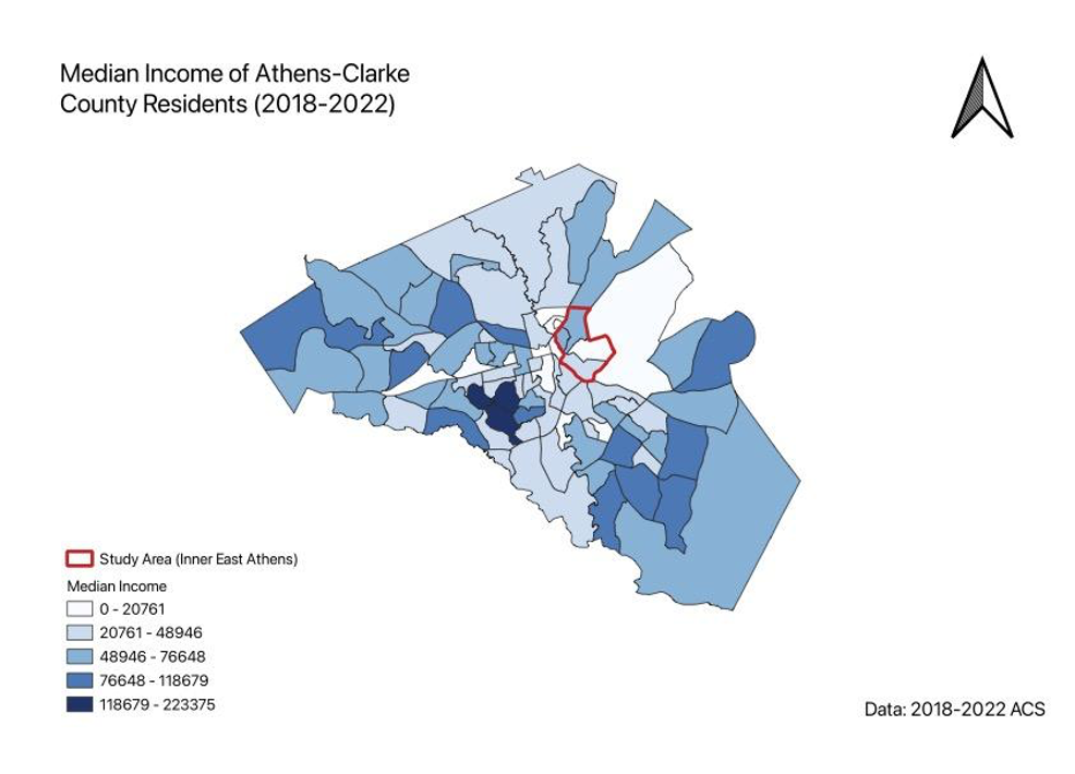
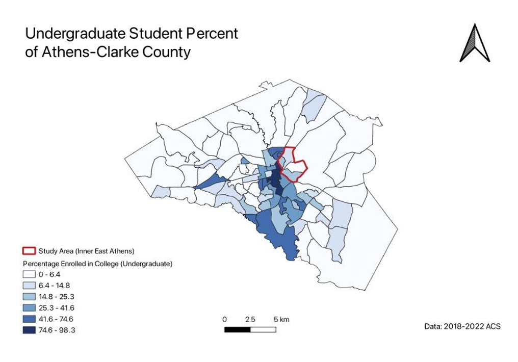
As we are over halfway through the semester in my Community GIS class, a collaborative research course studying a section of Athens, I have gained a better understanding of what it means to be an intentional researcher. We’ve spent weeks reading about the science of displacement, positionality, and ethical mapping, and have just finished the planning phases for making a detailed profile report on Inner East Athens (IEA). Over the years, IEA has been experiencing demographic shifts and housing pressure. Due to this, it is critical to make maps and charts displaying businesses, food access, and demographic dynamics that can properly aid future development plans and maintain the core community structure of this area. The concept of studentification introduced in this class from a reading by Graham Pickren has deeply resonated with me, and I strive to use this newly found knowledge to be a better researcher both in this class and in the future. To understand studentification, it’s critical to first understand gentrification: the process of displacing people from an underserved community to bring in wealthier inhabitants and thriving businesses, without sharing that wealth with the original community that was driven out. Studentification involves displacement driven by the needs of students, leading to changes in community dynamics through the repurposing of housing, amenities, and recreation to better accommodate growing student populations from nearby colleges. These go hand in hand because studentification “builds a student’s cultural capital that leads them to be gentrifiers later in life” (Pickren, 2012). As I read Pickren’s paper on studentification, I was immediately uncomfortable. That discomfort stemmed from being confronted with my own actions that promoted students dominating an area when I went to college in Milledgeville. I was complicit and even advocated for nearby housing to be more accessible to students when I lived in a historic home with four other women and was faced with city fines from having too many unrelated roommates in a single home. My thought process was that since my college was the driving force in tourism to the city (it is not), students should be able to have housing that is close to campus. I felt so threatened that locals didn't want us there, but I didn't consider the fact that students have been slowly pushing them out, deteriorating their sense of community. I tried to fight for something I didn’t fully understand because I was clouded by my own wants, but I am thankful that I have been more exposed to inner workings (and impacts of) studentification and gentrification through readings and community interactions. Studentification isn’t as simple as students deciding to slowly migrate into underserved areas, it’s a complex process that has political and environmental components. As one of the largest universities in the state, University of Georgia has an immense amount of money and power, enabling it to prioritize serving students’ educational needs by acquiring land to enhance school programs and accommodate a growing student population. This puts the university in conflict with the Athens community as both fight over the best utilization of the same land. Other key stakeholders include environmentalists, who prioritize the safekeeping of greenspaces around the community. From the reading, I learned that this group largely helped in developing the 1999 comprehensive plan for Athens by keeping rural areas rural to preserve the community’s rich greenery. This meant that redevelopment would have to be located in urban areas where services are already in place. Areas that are underserved with affordable housing are now targeted since they’re seen as the cheapest to redevelop. Though this process is meant to benefit students, the reading made me realize that it’s not (completely) student-led. Our class has spent this semester learning how to properly research the East Athens Community with the help of Rashe, a community member who owns a restaurant in the area. Being intentional with researching the East Athens Community means delivering a report while understanding the biases we may have considering our position as students at an institution that promotes gentrification. Though gentrification may happen in this area regardless, it’s critical to this community that the changes are beneficial and do not drive anyone out. Since we are outsiders in this area, we are continuing to talk to those in and around the community to get a better sense of what they want out of this research. I was part of a group that interviewed Broderick, a community organizer, artist, and Executive Director of the Economic Justice Coalition in Athens. Listening to his journey on making positive change within the city reinforced my thinking that the university has a lot of power over the community, so a lot of decisions that are made are driven by the goal of university prosperity. As an institution, it’s crucial that we do everything we can to be intentional and understand how our expansive actions affect locals. I’m in a group within the course working on mapping gentrification and studentification in Inner East Athens and how it compares to the county as a whole. While this is a daunting task, it’s one that will be able to highlight demographic variables over the last decade or so to provide a clearer picture of trends. We are planning to build a matrix that quantifies the susceptibility of an area to gentrification using prior research models. Throughout this process, I aim to be both inquisitive and considerate, as we map out and make visuals of the changes East Athens has experienced as well as its future potential. Both residents of the Athens community and students deserve to know the impact of gentrification, especially since student needs are what drive these changes that inevitably affect the entire community. Paige is a 2nd year graduate student studying Disaster Management and Public Health. She is interested in hazard mapping and infrastructure resiliency, with a focus on prioritizing protection for vulnerable populations. Keywords: Studentification, Gentrification, East Athens, GIS REFERENCES: Pickren, G. (2012). “Where Can I Build My Student Housing?”: The Politics of Studentification in Athens-Clarke County, Georgia. Southeastern Geographer, 52(2), 113–130. https://doi.org/10.1353/sgo.2012.0019 By Catherine Campbell, Community GIS Student Spring 2024 You might notice a Starbucks popping up where a local restaurant once stood and see economic growth in a low-income area. On the other hand, you may view this change as a warning sign of dangerous community displacement. Either way, you’ve likely witnessed the effects of gentrification. Less familiar, however, is the concept of studentification. This semester, I am taking a Community GIS service-learning course during which we’re exploring the ways we can apply GIS to better understand and address issues in our local community. So far, our primary focus has been studentification and how it’s affecting communities in the East Athens area. Throughout the past few weeks, we’ve been learning different GIS tools and methods through the lens of exploring these effects. 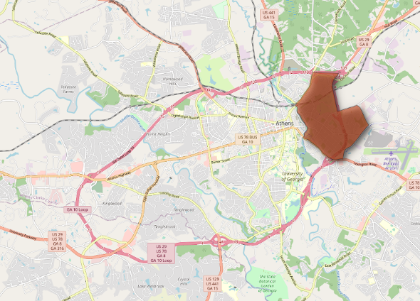 Study Area of Inner East Athens In my short time here at UGA, I’ve watched Athens rapidly change. Luxury apartment complexes seem to pop up like weeds, and chain restaurants replace local cuisine. In the beginning of the semester I learned that this phenomenon is called ‘studentification’. More specifically, studentification refers to the gentrification-like effects of student residencies in communities neighboring Higher Education Institutions. Like gentrification, studentification has impacts on economic, social, and cultural aspects of neighborhoods with a high density of student residents. The consequences, by nature, tend to have disproportionate impacts on low-income and marginalized communities. In class, we learned how to map U.S. census data in QGIS as a facet for establishing a baseline understanding of such conditions in Athens. This allowed us to visualize the distribution of undergraduate students in comparison to the demographic characteristics of the areas in which they’re located. Using data from the 2018-2022 census, we calculated variables such as race, income, and number of undergraduate students as a percent of the total population and mapped them in QGIS.
Something I hadn’t considered before this course was how the recent changes in student lifestyles exacerbates gentrification in college towns. In the past decade or so, it’s become increasingly common for students to move into apartment buildings specifically designated as student housing, rather than living in dorms or renting local houses. This is especially true in Georgia where residents of high academic achievement have access to the Hope and Zell Miller scholarships. While they generously cover a large portion of tuition, this means that UGA students tend to have more money to spend on amenities like expensive student-oriented apartments. As a result of a larger student demand for luxury apartments, property taxes increase in nearby neighborhoods. Often, local residents can no longer afford housing and/or are more susceptible to being bought out by private developers. Property management companies repackage single family homes as multiple occupancy student housing or rebuild the property entirely. Unfortunately, these are rarely equitable transactions. Residents are frequently unaware of their property’s real value or have been desperately rushed into the sale. In our Community GIS lab, we explored these changes in property sales prices through the process of learning how to perform point pattern analysis techniques in ArcPro. Using housing data from the county tax assessor, we georeferenced residential properties in Athens and mapped their sales prices per square foot using ArcoPro. To more effectively visualize the patterns in this data we then overlaid the map with a hexagonal grid and aggregated values into a mean sales price per square foot for every property within each hexagon using the Generate Tessellation and Summarize Within tools. In addition to calculating average sales price per square foot for 2010-2012 and 2020-2022, we created maps showing the difference in averages between these two time periods, as well as the percent difference. 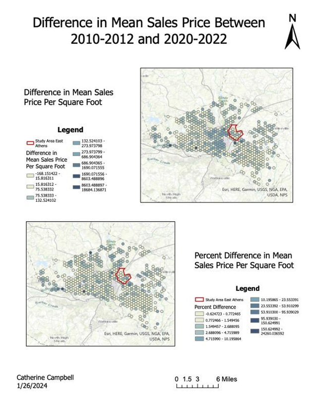 Locations like our study area in East Athens, conveniently located nearby college campuses or downtown areas, are disproportionately affected by studentification. Affluent student populations are able to congregate in large numbers in these areas, not only raising property prices but occupying areas with highest access to necessities like public transportation and grocery stores.
The scarcity of access to basic needs only makes things harder, costing valuable money and time for residents forced to find housing further and further from optimal locations. Like gentrification, the effects of studentification are compounding. These first few weeks of class have allowed me to practice using GIS software while beginning to understand what studentification is and how it’s impacting Athens. This has opened my eyes to the deeper ramifications of the changes I’ve noticed around me throughout my time as a student here at UGA. Not only did our class learn useful techniques and programs, but we built a foundational understanding of the conditions in our study area. By Jamie Jordan, Community GIS Student Spring 2024 Through reflection on the initial six weeks of our Community GIS class, I noticed several things that have stood out in our project working with East Athens. Our project will mutually benefit students and community members. Given my intrinsic longing for structure, I have appreciated Dr. Shannon loosely sequencing the course through a series of conceptual frameworks with which to interface and better understand community-engaged research. Regularly revisiting these concepts has proven useful in planning our project. One major through-line in our course is the co-production of knowledge. In community-engaged research, developing co-produced knowledge involves a collaborative, inclusive approach to generating knowledge. It demands active and equitable participation of researchers and community members throughout the research process, from defining goals and questions to interpreting findings and implementing solutions. Co-producing knowledge emphasizes mutual learning and shared decision-making, recognizing the expertise that researchers and community members bring to the table. By breaking down traditional research hierarchies, we aim to create meaningful knowledge by respecting diverse perspectives. In our specific project in East Athens, we believe involving local residents will help us produce research that better addresses the community’s needs and visions, integrating their firsthand knowledge with our analytical skills as community geographers. Early in the semester, Dr. Shannon challenged us to understand “strategic positivism,” which involves carefully considering power imbalances, cultural differences, and community details in research. This approach is great for community-focused research because it examines the bigger picture of social, cultural, and power structures. Unlike purely objective views, strategic positivism acknowledges that community partners’ personal experiences matter. It aims to balance thorough research methods with an understanding of the complex dynamics within a community. By using this approach, we can create a more inclusive and relevant research process, specially tailored to East Athens. Another important concept is praxis, which, in community-engaged research, means combining theoretical knowledge (from the strategic positivism approach) with practical application. Praxis is a cycle where theory guides action, and critical reflection helps refine and question existing ideas. For our research, praxis highlights the relationship between abstract theory and context, recognizing that enlightenment and adjustments will arise from this interplay. By using praxis, we will bridge the gap between community research principles and practical engagement in East Athens, rendering our approach more comprehensive and reflective. Ideally, our project will benefit from both archival research, conducted in Dr. Kurtz’s supplementary course studying local historical geographies, and input from East Athens residents. 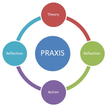 Praxis | Lifelong Learning Matters (annwalkerwea.wordpress.com/2013/08/04/praxis) The importance of maintaining awareness of researcher positionality in community-engaged research cannot be overstated. Positionality refers to a researcher’s social orientation, including their identities, characteristics, and roles as they influence their perspectives and interactions within the research process. Acknowledgment of researcher positionality in the context of our analysis of East Athens is crucial for several reasons. For instance, positionality informs the design of the research and often the format of the deliverable. Scrutinizing researcher positionality ensures that methods, structure, and stylistic choices are culturally appropriate, and that data collection and analysis techniques are sensitive to the community’s context and needs.
In the context of my engagement in researching East Athens, I have reflected on my status as a student of GIS, rather than a professional geospatial analyst, which has made me realize that the way I understand and utilize GIS software is different from that of, say, someone working in supply chain management. This awareness encourages a more nuanced approach to integrating GIS analysis within the community, respectful of local context. Recognizing positionality also prompts researchers to critically reflect on their own biases, preconceptions, and potential power dynamics. The reflexivity achieved through examining my positionality helps mitigate the risk of imposing outsider perspectives that otherize the community, fostering a more equitable research process. Beyond the scope of research design, positionality is fundamental to building trust and nurturing relationships within the community. Transparency about our backgrounds and intentions as researchers is paramount for establishing credibility, allowing community members to understand our perspectives better. Responsible researchers consider positionality frequently to ensure the research process is collaborative and respects the autonomy and agency of community members. For example, it has proven useful for our class to consistently remind ourselves that as students, we are in fact complicit in the gentrification of East Athens through our patronage to student housing complexes. Embracing positionality is needed to conduct ethical, sensitive and effective community-engaged research, as it contributes to the development of genuine partnerships, enhancing the sustainability and applicability of research outcomes to the community. This does not mean I should feel guilty for attending the University of Georgia, but that I should expect my enrollment status to affect my relationship with East Athens and its residents’ disposition toward our class’s research. I trust that the class time spent this semester interpreting the relevance of various research concepts in the context of East Athens will render our deliverable and analysis more comprehensive, tactful and socially impactful. Jamie Jordan is fourth-year geography major interested in urban planning and housing inequality, exploring the intersection of archival and analytical community-engaged geographic research. Keywords: Collaboration, Engagement, Participatory, Positionality |
Archives
March 2024
Categories
All
|

- Home
- About
- Activties
-
Projects
- Athens Wellbeing Project
- ACC Black-owned businesses
- Athens bike routes
- Atlanta Community Food Bank
- Athens 1958 City Directory
- Athens bike routes
- Brooklyn Cemetery
- Evictions in Athens
- GA Hunger study: Proximity map
- Georgia Initiative for Community Housing
- Historic Cobbham Neighborhood
- Hot Corner
- Linnentown
- Sparrow's Nest
- Blog
- Resources
- Calendar
 RSS Feed