|
By Rachael Glenn, Community GIS student in Spring 2022 I was introduced to the Athens Anti-Discrimination Movement (“AADM”) the summer when the Black Lives Matter movement was in full force. They hosted multiple rallies that successfully culminated in the removal of a confederate monument that once stood in front of the UGA Arch and only feet away from the Holmes-Hunter academic building, named after the first African Americans to attend UGA. There is still a sign behind the Arch naming the Civil War a “war for southern independence,” but I digress. I was happily reintroduced to AADM through our Community GIS course to partner in support of their “United Against Discrimination” sticker campaign. This campaign in particular was sparked by reports of downtown bars racially discriminating against students and local residents of color back in 2016. AADM is a local non-profit here in Athens, GA that focuses on initiatives to advocate for racial and social justice. Some of their work includes hosting community discussions, events, workshops, and resources designed to help people protect their civil and human rights (AADM). Currently, AADM has a sticker campaign called “United Against Discrimination” where businesses in Athens are able to participate with 3 easy steps laid out on their website. 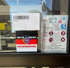 “United Against Discrimination” Sticker on the CVS Downtown Athens “United Against Discrimination” Sticker on the CVS Downtown Athens
The point of the campaign is to commit business owners in the downtown and surrounding area to stand in solidarity against discrimination regardless of race, gender, age, sexual orientation, or immigration status. This campaign highlights a simple yet outstanding way that businesses can create a more inclusive culture. Displaying the sticker, as pictured above, is a physical reminder that everyone is welcome in their establishment. Our Community GIS course has partnered with them to help with the campaign data and to create a web map of the downtown area of businesses that have joined the campaign. Our first step in getting this sorted was verifying which businesses were still participating in the campaign based on the list they provided us. In order to create an updated list for our map, we participated in canvassing downtown, speaking directly with businesses and seeing if they were still participating. Canvassing involves soliciting people, often by going door-to-door for personal contact in an effort to raise awareness, fundraise, politically campaign, and, in our case, collect data and support a local movement. The Athens downtown area is comprised of 170+ businesses, so in the spirit of collaborative work, each student received a block to complete. We used the ArcGIS field maps app so we could directly update business information. The field map app lets users directly update and edit data as they are collecting it during fieldwork. I quickly learned how useful canvassing could be to get accurate data about a community and, in the same vein, how important it is to ensure everyone is on the same page when it comes to community work to produce accurate and usable data. Before starting this process, our class took class time to plan the canvassing. When engaging in collaborative community work, this is such an important step so that 1) everyone understands the goal and definitions involved in the project, 2) knows the process, and 3) how the technology works. In our case, the process was visiting each business in our block, checking who was participating in the campaign, and marking their status. Using the field maps app, I was able to directly update the data into the app for my block, “block 2021.” This is where the planning from before came in hand. I was able to understand which types of businesses we were including, what verified meant, how to add new businesses, what to do with old ones, etc. 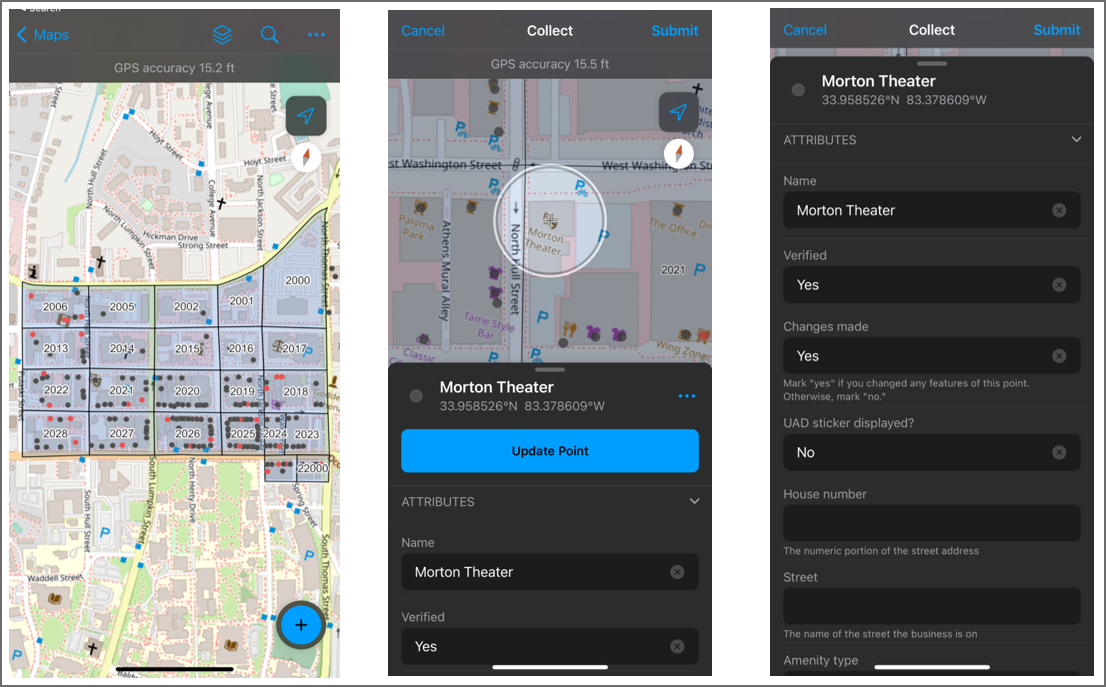 ArcGIS Field Maps App Data Collection Going from business to business was a bit daunting, thinking I could face rejection and even worrying about saying the right words to market the campaign. However, my worries were settled after proposing the campaign to the first business. I found they were open and eager to hear about the campaign and how they could join.
Moreover, from this process, I was able to understand how fieldwork and collaborative work can be managed and facilitated to benefit a community. Our class's work canvassing showed us an easy way to organize and reach many businesses in a short amount of time. However, for this small commitment, multiple people and community members will see the Anti-Discrimination stickers on businesses and perhaps see a more welcoming environment. As UGA students, I think it is incredibly rewarding to do work that is directly benefiting the local Athens community. In most cases, many of us come to Athens to enjoy the city and all it has to offer but fail to give back. This project enabled us to counter this imbalance and participate in a positive social campaign that benefits Athens to learn how to facilitate community work and all the mishaps that can come with it.
0 Comments
By Trevor Underwood
Student in Community GIS, Spring 2022 As a student in Community GIS, taught by Dr. Shannon, I’ve been faced with various readings and opportunities surrounding-of course-community GIS. Through exposure to the practices and ideas that have been taught, my approach to mapping (from idea conception to completion) has evolved. By education I’m an ecology major, and most of my experience mapping up until this course had been in mapping ecological phenomena like population dynamics, habitat ranges, and ecosystem boundaries. While those mapping focuses may seem different to the Linnentown storymap and Athens 1958 maps we’ve mapped throughout this course, I think there’s a bounty of approaches to mapping that could stand to be adopted in my niche of GIS. In this blog post, I want to talk about how I would have applied what I know now to past projects I’ve worked on; specifically, as a fisheries technician for the United States Forest Service (USFS) in Oregon. I want to focus on this experience because of the importance of the projects I did there, but also because of the community-project interactions that were present. There’s one specific project I was a part of that I think, if I had known what I know now, could have been handled differently by both myself and those in charge of the project. One of the largest things that struck me during my time in Oregon was the importance of PR. The public’s perception of the USFS in Tiller where I was working was polarized; some people loved you and others hated you. For some, the Forest Service was doing important work that would end up benefitting the public, for others, the forest service was a clandestine organization that was trespassing on “their land”. Our project I was a part of was doing snorkel surveys for the Umpqua Chub, a state-threatened fish species. We would get in wetsuits and hop in rivers/streams at public access points like bridge crossings, boat launches, and roadside pull-offs and record the number of fish we saw along with the coordinates to map later. People would come up to us during/after the surveys and ask what we were doing. After we gave them an answer as to what the surveys were for and why we were doing them, most people would respond with a friendly “cool!” or “that’s neat”, but sometimes people would say we had no business being there and, in a few instances, would harass us. I think if the Forest Service had involved the communities around where we were doing surveys more, we would not only have been on better terms with those communities, but would also see a higher degree of approval for that specific project. In this course we talked about community involvement in GIS, and broke down a figure (Arnstein’s ladder) showing different levels of this type of involvement. In a federally sponsored project, including citizens in a research project to the degree of letting them do GIS analysis would be difficult, but at least getting to the higher rung of “partnership” from “informant” on Arnstein’s ladder would have been satisfactory. In my experience there, the people that engaged in harassment seemed to feel undermined when being informed about what we were doing, maybe feeling as though they were being treated as unintelligent. Building a trust between the groups doing research and the communities in which the research is being done is mutually beneficial, and something I’ll always reflect on when performing work like that again. That shared vulnerability makes for a stronger flow of ideas, and a better product. In our Linnentown storymap project, the experiences and feedback of resident Hattie Whitehead were directly incorporated into the final product. Our project aimed at telling the story of Linnentown, both how it was, and how it’s been erased by The University of Georgia Urban Renewal Project. I was able to benefit from learning from a first-account of the story we were trying to tell. Getting to see and hear about her experiences and having feedback directly from her was extremely helpful, and largely the basis of the depth of quality for our finished product. There wasn’t any preconceived animosity between the parties working on the Linnentown storymap project like there was between the USFS and communities in Oregon, but just the action of communication and transparency like in the project our class worked on are enough to build a foundation of trust. This class has challenged me to think beyond a cartographic result; rather, it’s encouraged me to think of the process of reaching that result. By Phillip Jones
Student in Community GIS, Spring 2022 Imagine you were tasked with creating a map of your hometown. How would you go about doing this? You may start with popular roads, neighborhoods, and parks. Then, you may throw in some popular landmarks like the city hall, schools, and libraries. This may seem like a straightforward and fact-oriented task. However, you can’t possibly map everything in the town, as this would be overwhelming for the reader and impossible for you do to by memory. You may find yourself choosing landmarks that are most important to you. You may also find that the overall impression of your map reflects your perception of your hometown. The map may be dreary or dull if that is your perception of the town, or it may be brightly lit and exciting if you have fond memories of your childhood. Maps often give the impression of being concrete and factually correct. However, like any other form of media, they are narratives being proposed by their authors. In our Community GIS course, we have been introduced to theoretical frameworks that help us question the intention behind a map: Who created this map? Who is the intended audience? What biases may the author be influenced by? What narrative does this media promote? What voices are missing from this map? Ultimately, we have learned to be wary of the predominant narrative of maps, as they may be reflective of the loudest and most powerful. Most recently in our Community GIS course, we have finished a project about the Linnentown neighborhood in Athens, Georgia. Linnentown was a Black neighborhood along Baxter Street that was destroyed by UGA and the City of Athens in the 1960s through a federal Urban Renewal grant. All houses in the urban renewal area were torn down and all residents were displaced. In their place, UGA built three large dormitories and a parking lot to house freshman UGA students. Through their power, the city and the university characterized the neighborhood as run down and a “slum” to justify displacing a proud and close-knit Black community. Because of the efforts of first descendants of Linnentown and organizations such as the Linnentown Project, the neighborhood’s story has been told, and steps have been made to acknowledge the harms done and provide reparations. To support their efforts, the Spring 2022 UGA Community GIS class has created an ArcGIS Storymap to support the Linnentown Project and first descendants of the neighborhood to bring memories of the neighborhood to life. The Storymap synthesizes first-hand accounts from first descendants Ms. Hattie Whitehead and Mr. Bobby Crook, archived records from the UGA Special Collections Library, and research by UGA professors to tell the story of the Linnentown community, its erasure, and the resistance of its residents to their removal. For example, through a guided video tour, Ms. Whitehead and Mr. Crook share their memories of the neighborhood, which is a sharp juxtaposition from what the area looks like today. It also the process of UGA acquiring properties in the area, aerial imagery displaying the destruction and replacement of the Linnentown community, and evidence of the resident’s resistance to being displaced. The Storymap culminates with a timeline of advocates’ efforts to demand redress and resources on how to become involved. In Community GIS, we have learned that there is no one correct way to describe an area. Instead, many perspectives can all coexist at the same time. However, the perspective of the area around Baxter and Finley Street as just freshman dorms is incomplete and is an injustice to the community of people in Linnentown that were displaced from this area. Using digital storytelling technology, we can share memories, identify important landmarks, and explain how Athens and UGA used their institutional power to transform these areas at the expense of the Linnentown community. Doing so will not bring back what was lost, but this tragic history must be exposed. It is never too late to hold institutions and people to account for their actions, as doing so will communicate that the unjust destruction of people’s homes is unacceptable and prevent it from happening again in the future. By Will Harrison Student in Community GIS, Spring 2022 The process of georeferencing is very important and useful in many different disciplines of geography. Georeferencing is the process of giving a raster image a geographic reference by overlaying that image to the same geographic reference on the basemap so that the two images align. To do this, you will need to open up a geographic software. I’m going to be using ArcGIS Pro as an example. Once you start a new project, you will see a basemap of the world in front of you. The first thing you want to do is change the projection to a more precise projection. I have changed mine to NAD 1983 UTM Zone 16, because I am dealing with georeferencing within Georgia, which is in zone 16. I would also recommend you change the basemap under the map tab if you are dealing with buildings or parking lots. If you are just dealing with streets, keep it on the topographic basemap. 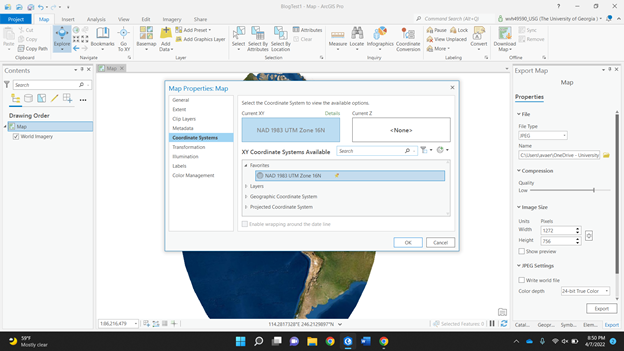 Next, you need to find the raster image. A raster image is a graphic that represents a two dimensional image as a grid of pixels. I am choosing a JPEG campus map of the University of North Georgia. I put the JPEG in the same folder as my ArcGIS project, so when I click add data, I know where to find it. Once it is added, your basemap won’t change. If I go to the UNG campus on the basemap, it will not be there, because the JPEG has no geographic reference. On the left of your screen, you can see the JPEG underneath the contents section. Right click on the JPEG and click “zoom to layer” to find your raster image. If you zoom in or out, you can see it is in a random spot. My image is in the Galapagos Islands. So, now you need to put it in the right spot. 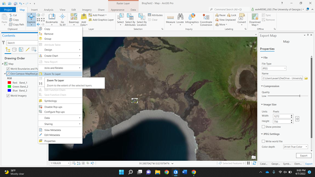 Under the imagery tab, click the “georeference” button to get started. There should be a box indicating so in the top right of your basemap. Then under the georeference tab, click “add control points” to identify a specific point on the raster image. It should show a red square where you clicked. There should also be a dashed line following your cursor. You need to then zoom into where that exact point is on the basemap. It will then show a red circle with an “x” through it to symbolize the completed control point created. Street intersections or building corners are a good reference to use. 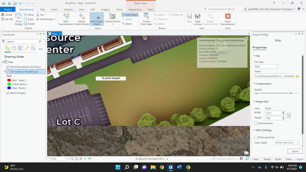 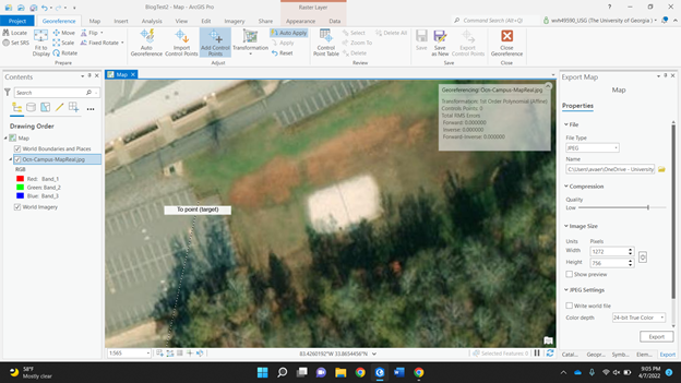 Once you do this, the map should now be in the same general area, except now your raster image is covering your basemap. To get around this, go to the appearance tab at the top. Mess around with the transparency of the image. This way, you can see both images at once. The more control points you create, the more accurate it will be. Trying to add control points on opposite sides of the imagery helps to place it more accurately, quicker. 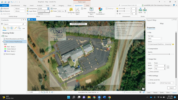 In just three control points, most of my map is placed correctly. If you go back and forth between transparencies, you can see how accurate it is. The buildings, parking lots, and roads will start to align perfectly. If they aren’t lining up, try looking at your control point. If there is not one created near where it is not aligned, try and create one. If there is a control point near and it is still not lined up, you may want to see if a feature has changed over time.
Once again, this can be useful in many different geographic ways. The use of control points, for example, is used by a surveyor on AutoCAD. AutoCAD is another geographic program. The surveyor needs control points to geographically reference himself in the real world to put points on a job site. In our class, we just use it to reference a boundary line JPEG that doesn’t have geographic information attached to it, but it is a relatively simple process if you’d like to do it yourself. By Molly Dunn
Student in Community GIS, Spring 2022 GIS has the ability to tell a powerful story by legitimizing the perspective of an individual or group that has struggled to be taken seriously. In Sarah Elwood’s book Qualitative GIS, she says “many of the powerful actors and institutions whom they seek to influence treat GIS-based data and maps as illustrations of what is real or true about a place, and as evidence of an expert (and therefore, legitimate) portrayal of that place” (Chapter 4: “Multiple Representations, Significations And Epistemologies In Community-Based GIS”, page 70). Throughout my time in our Community GIS class, I have learned the importance of making maps with caution and consideration, especially when they will be used to persuade or provoke. For the past few weeks, my class has been working on an informational StoryMap (a collection of public, multimedia web maps) about Linnentown, a Black community erased by UGA and the City of Athens to build dorm buildings in the 1960s. From the beginning steps of the project, it was evident that we had an important task to complete. We were not working with simulation data or practice labs. We were working with real stories, from real people, about real places. As the project developed and I heard more from Hattie Whitehead, a resident of Linnentown, I began to see the impact that our StoryMap could potentially have in aiding her mission to bring redress to the people who lived there. The importance of being cautious with each choice we made throughout the project was clear. In one of our meetings, she told us that when brainstorming the book she recently wrote about her experience, she wanted to compile the data together before she wrote and published it. It was then that I understood the point that Sarah Elwood was making - there is power in a visual representation with data behind it. It can be the tipping point that allows a movement or a story to be recognized as legitimate. One of the ways that a map can be made with consideration is by capturing the emotion in the place it is portraying. In Meghan Kelly’s article “Mapping Syrian Refugee Border Crossings: A Feminist Approach,” she walks the readers through the development of her map of Amal’s story, a man living through the conflict in Syria. She chooses symbology that alludes to the ways that he experienced the borders - for example, how difficult it could truly be to move from one place to another. This kind of information can be difficult to show through maps, but if done correctly it can add an entirely new layer that is meaningful and informational. She was able to transform his story into an immersive piece that showed the way he experienced life in Syria. She prioritized his voice over her own, a skill that makes a map center around individual experience within a physical place. We were able to use this in our own StoryMap by continuously meeting with Hattie Whitehead and others working towards Linnentown’s redress. We used their feedback and suggestions to ensure that the story we were telling was helpful, accurate, and focused. The point I want to make is that the work of people in GIS is important. It can inform people about issues that they were unaware of and inspire change based on their new knowledge. It can also provide evidence of reality to powerful people that have the resources to aid causes and fix problems. This is one of the first times that I have worked on a project with “real” data and the goal of being shared - the skills that I learned in classes prior to this only equipped me with technical skills. Community GIS requires the creator to be open-minded and adaptable. It is practical, it is effective, and it is real. It can back up the perspective of someone who may have gone a long time without it being taken seriously. In 2019, I went to the ESRI User Conference - an event hosted by the Environmental Systems Research Institute, a GIS company. They were launching a new campaign called “See What Others Can’t,” to promote the usefulness and potential of GIS. This phrase encompasses what I have learned in this class: when you can turn existing information into a compelling illustration, you are able to elicit worthwhile conversation and crucial change. By Matt Cassada
Student in Community GIS, Spring 2022 When we initially started the 1958 Athens Census Mapping Project, I had initially a good idea of what I wanted to do since I noticed two distinct features with the Athens Census Mapping Data: population of the entire area along with businesses around the area. Next, I considered the timing of when this mapping took place which was in 1958. During this time, segregation was still a lingering issue across the Deep South, and this was true in both major urban and rural areas. Finally, I noticed that this mapping data also included major businesses around the Athens area and this included pretty much everything that was a business: federal businesses, food, entertainment, religious groups, and many more. With these central ideas already placed for me, I decided upon the following observations:
With this plan, I decided to then form my central question/argument for the project which is: "Based on the location/concentration of either colored or non-colored owned businesses, does the population distribution of colored and non-colored residents seem different across Athens-Clark county area? Do you also see a population distribution difference based on if the particular resident was either a colored or non-colored resident? Is their a particular business that could be made out where we see the strongest correlation and is their one with the lowest correlation in relation to Athens population data and business location’s?" With these questions in place, I then progressed into making my own maps. We all started with a excel/point data of the Athens 1958 Census Data, which we got thanks to cleaning out the initial data. I knew that I had to create two initial data sets just for the residents of the area I made two different point data sets, one for colored residents and one for non-colored residents. This proved to be easy since each resident is listed out if they are colored or non-colored residents. I then inputted the point data into ArcGIS and I then signaling out/deleting the data that was needed for each point set. Thus, when I did this, I ended up with two different point data sets for both colored and non-colored residents. Initially, you do see some distribution differences in the point data. First, we see that the non-colored residents are more spread out across the Athens area and they are not as centralized. This is different for colored residents who were more centralized near downtown Athens and east of Athens. Colored residents were also less dispersed and more organized compared to non-colored residents. They we more organized in that they were more grouped together. When it came to making the business points, I must first start off and say that given that data wasn't 100% complete. We still had some business points that were not complete and plenty of businesses that were not registered in the excel data. But I still pressed on with my maps since I still had just about over 300-400 businesses I could look at. To make the point sets for the businesses, I first needed to make some distinctions between businesses. Since I wanted to look at what kind of businesses had the greatest correlation for residents, I needed to focus businesses out of each point data set and give them their own distinction. After looking through each business, I noticed four different business categories:
With these distinctions in place, I implemented the same overall process I did when it came for the residents in Athens. I cross referenced the points that were businesses and centered on those. I then went through each point individually to look at what category they would fall under based on the distinctions I made. I then repeated this process for all four different business categories. Finally, when it came to patterns that I noticed with the businesses and its correspondence to residents, the one business I noticed that had the most central concentration was near religious businesses, like churches. The one business that had the least appeared to be food businesses, with very little shown correlation between the two for either resident. In conclusion, this mapping project proved to be insightful to me. As someone who has never lived in Athens, its interesting to see how the demographics and businesses across the city has changed since the late 1950’s. This project showed not only how residential demographics has changed, but also how businesses across downtown Athens have shifted: from more of a rural area to a more college-themed town. By Elijah Humphries
Student in Community GIS, Spring 2022 When discussing topics of racial justice, generational wealth is a topic of utmost importance, and land ownership specifically is well explored. The “land as liberation” ideal and the historical factors surrounding different movements towards and away from the accumulation of generational wealth in the form of land ownership for the African American population in the South has been tested by various movements. For example, Fannie Lou Hamer’s Freedom Farms sought to return land to Black people in the South and achieve a level of autonomy and independence from a political and economic system that shamelessly segregated and disadvantaged them. But the benefits of land ownership are multiplicative. A landowner gains a larger stake in their community and the ability to slowly build that wealth, then pass it on to their children. By 2021, 27% of American wealth was in the hands of the top 1.0% of the population, this gap has only grown since then, and about 40% of wealth in the US is inherited (Source). So when we consider how, despite movements to fix the divide, generations of African Americans were denied the ability to buy and own land, there’s a clearly forced inequality in that sphere which allows people to build generational wealth. It was intentional, too. The Housing Act of 1949 cleared the way, quite literally, for a clean sweeping of the urban poor, because it allowed governments to do away with poor or substandard housing in urban areas, called urban renewal, as more affluent citizens moved to the suburbs. With the advent of urban renewal projects, governmental officials had the toolset to clear “blighted” or “dilapidated” areas in their jurisdictions, but these overwhelmingly targeted Black populations and other minority groups. In more recent years, urban renewal practices are viewed as discriminatory across the board. The U.S. Commission on Civil Rights published a briefing report in 2014 titled The Civil Rights Implications of Eminent Domain Abuse, which analyzed two Supreme Court cases, Berman v. Parker and Kelo v. City of New London, looking at the decisions, critiques, and several studies and briefings that identified cases of eminent domain abuse and its effect on poor and minority communities and how that might be interconnected with civil rights. The report noted a 2007 study titled Victimizing the Vulnerable: The Demographics of Eminent Domain Abuse which found a disproportionate impact on communities with the least power: “more residents in areas targeted by eminent domain-as compared to those in surrounding communities-are ethnic or racial minorities, have completed significantly less education, live on significantly less income, and significantly more of them live at or below the federal poverty line. Here in Athens, one such area was Linnentown, a neighborhood adjacent to the University of Georgia campus. Starting in the 1950s, the University and the City of Athens began making moves to condemn land so that the University could expand. The University of Georgia campus was almost entirely surrounded by residential properties, and had plenty of land to look at for expansion, including through buying it at a fair price, but instead worked to have the Linnentown residents forcefully removed from their homes. First, by making it a completely unsafe place to live, and followed by more aggressive measures, until they were told that they simply could not live in their own homes anymore, that they had been bought by the University at a pittance, and that they would have to find new places to stay. The University refuses to acknowledge its role in these proceedings, or that it participated in what is widely known to be racially discriminatory practices for its own benefit. As students, and people interested in doing what is best for our community, we should keep pushing for recognition and reparation. Our class is working to create more recognition for the people who seek to right these wrongs. By offering our time and capacity as students, we help put together marketable information that will help more people understand what the University and the City did, and why those actions were detestable and worthy of condemnation. As more and more of the information we consume is transferred over a digital medium, it becomes more important to make history more accessible and clear to others. By contextualizing and narrating the circumstances and proceedings of the urban renewal project that destroyed Linnentown, we bring the issue back to the attention of our peers and contemporaries. I’ve been working on a storymap, a web page that allows anyone to scroll through a narrative experience curated by myself and the rest of the class, that will display much of the information surrounding both the historical events and the contemporary actions we and others have taken. By Claudia White Community GIS student and CML research assistant, Spring 2022 This semester, I am taking Community GIS with Dr. Shannon and working with the Community Mapping Lab on various projects, including creating a StoryMap of Linnentown (a Black residential community in Athens displaced by urban removal in the 1960s), digitizing a street network, geocoding addresses, and cleaning data records from a 1958 Athens directory. One of our assignments was to create a map using the 1958 Athens directory and the street network that we digitized. The city directory included a listing of residents, businesses, and organizations in 1958 and their addresses. Data on residents included several variables, such as occupation, race, the number of dependents, home ownership status. Using the address data and resident data, I decided to create a map about the commute time of maids to look at patterns of travel (time, length, etc.) clustering of living vs working addresses. The current map is hosted on ArcGIS Online, but I first tried to make it in ArcGIS Pro. Here be the practical things I have learned while making this map. 1) Creating Maps for the Public There are a million tiny decisions to make when creating maps from scratch. Creating visualizations for yourself is one thing, but creating maps for the general public is another. When creating maps for others, make sure you are creating visuals that are both easy to understand and easy to look at. Keeping design principles in mind is key. My first map draft had colors that were difficult to distinguish, lines that were hard to separate from the background streets, and symbols that were too small to see (Figure 1).  Figure 1 With Dr. Shannon’s help, I thought about figure-ground, visual contrast, and legibility. To make the map easier to read, I made the background road network more transparent, set route colors to very contrasting colors and put a drop shadow on the routes to make them more discernible from each other and the background. I also made the symbols larger so they were more visible. I then made each maid’s route, living, and working address the same color, so that the viewer could easily see which route and addresses corresponded with each maid (Figure 2).  Figure 2 2) ArcGIS Pro a) Use snap when digitizing in ArcGIS Pro. Digitizing images in any GIS software can be tedious, but if you are using ArcGIS to turn an image into features. I highly recommend using the “snap” setting. Turning on snap allows you to minimize topological errors as you digitize (making sure your lines meet up and your polygons are closed. This setting was very helpful when digitizing the 1955 street network for Athens. It made sure that I only created lines that connected to a point on another existing street line. You can turn the snap setting on and off through the dashboard. b) Depots are origins and orders are destinations. When creating a driving route in ArcGIS Pro using street networks, you can use the Make Vehicle Routing Problem Analysis Layer. This function will only create a network analysis layer. After creating the layer, you then have to input points that you want to be used to create routes within the network analysis layer. When using sets of origin and destination points (ex: if you want to calculate your commute from your home address to your working address), it is important to note that “depots” are origin points and “orders” are destination points. c) You can create tiles from raster data using the Create Map Tile Package. This function uses data from a map pane and compresses it into a tile package that can be used in ArcGIS Online. Make sure the only data on your map pane is the data that you want to tile. Before using this function, you have to add a description, summary, and tags to the data that you are tiling. You must then input the corresponding summary and tags into the geoprocessing pane for the Create Map Tile Package function. d) You can share map layers as Web Layers for ArcGIS Online. If you right click on a layer in your map, you can share that layer as an online web layer that can be used in ArcGIS Online. This tool can be used on raster and vector data. You must add a summary and tag(s) of the layer. Once you share the layer as a web layer, the layer is automatically uploaded to your ArcGIS Online content and can be opened, viewed, and stylized in ArcGIS Online. This is particularly useful if you have styled a layer in a particular way because it maintains the layer’s symbology. 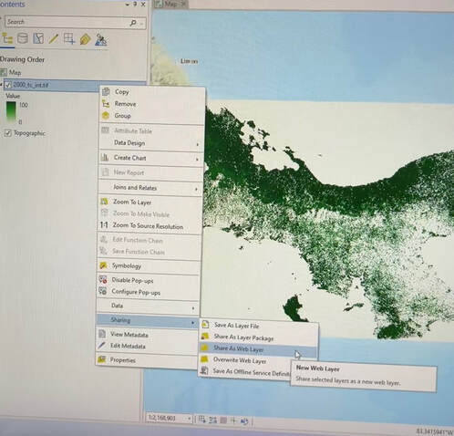 Figure 3 3) ArcGIS Online
a) Map Viewer Classic is picky about data users can upload. When using ArcGIS Online to create a map based on the 1958 Athens directory for this class, I learned that ArcGIS online only accepts certain types of data. In Map Viewer Classic, users can only upload a zipped shapefile, CSV or TXT files, GPX, or GEOJSON files from their files. Of course, users can also use data that is hosted by ArcGIS Online, but the types of data the user can add and manipulate is limited. b) Map Viewer Classic vs New Map Viewer: Uploading data In Map Viewer Classic, users are able to add data directly from a file. In the new Map Viewer, users have to jump through a couple more hoops. When using the new viewer, users must first upload their data from file to their content page in ArcGIS Online. When uploading data, you should check the box that adds the desired file AND creates a hosted feature layer. This ensures that you will be able to easily add uploaded data to the map viewer. c) It does not like raster data. ArcGIS Online is not a fan of raster data and is not compatible with tiff files. If you are using raster data, first look for any datasets that are already hosted on ArcGIS Online that display the information you are looking for. If you can’t find desired data and must upload an original raster dataset, the best way to do this is by converting your raster data set to tiles and then uploading the tiles to ArcGIS Online. Final thoughts In creating this map, I learned technical skills related to using different analysis toolboxes in ArcGIS Pro. I also learned how to navigate bounds of ArcGIS online. Most importantly I learned what factors to consider when creating maps for a public audience, including color contrast, symbology, and clear labeling. These skills will help me create more accessible and intuitive visualizations in the future. By Bryant Beall
Student in Community GIS, Spring 2022 I am currently taking a class called Community GIS. Community GIS teaches how GIS is used to research by local agencies, and community groups. In Community GIS we have mainly focused on a small former community in Athens called Linnentown. I always really enjoy learning more about local history because it can help explain why things the way they are today. History is even more interesting to me when it involves people or organizations that I know of or are physically close to. This is partly why I have found our study of Linnentown to be so encapsulating. Linnentown was a historically black neighborhood off of Baxter Street near the campus. In the 1960’s Linnentown was demolished by the University of Georgia so that they could build the dorms. The residents of Linnentown were forced to leave their homes and community as the University slowly acquired all plots of land through eminent domain or private sales. Residents were forced to leave their communities that they had lived with and trusted some for generations. In class one of our required readings was from a book titled Giving Voice to Linnentown. This was a story of what it was like to live in Linnentown from the point of view of a former resident Hattie Thomas Whitehead. This personal account struck me hard because it shows the fears and experiences that someone had when they were told they have to leave their community. She tells a story that the university had bought the land that their rented house was on so they bought a different Linnentown plot and built a house on it. The city approved the construction and said they would add plumbing to the house, but they never did. Soon after, the rest of Linnentown was acquired by the University, even the new house. The city knew that this land would soon be owned by the university, so that raises the question. Why did the city approve of this construction and waste this families time and money when they knew the whole time that it would soon be university property? After learning about this story I could not help but feel shameful about the school that I love. I love this city and I love this school but it makes me feel very sad to think about some of the extreme wrong doings done that they are responsible for. I wish that the University of Georgia would acknowledge what happened and issue an apology or do anything about this situation. I know a statement could never fix what they did and the families they uprooted, but it is at least a start and better than ignoring the blame like they are currently doing. In my Community GIS class we are currently working on a story map project covering the history of Linnentown. My hope is that when people come across this story map they will not only be informed of Linnentown and the hardships its residents experienced, but that it will inspire people to speak up and raise awareness for Linnentown and other communities that underwent urban renewal projects. By Emilie Castillo For the past two semesters, I have worked as a CURO Research Assistant in the service of the Community Mapping Lab and BikeAthens towards the goal of creating a comprehensive cycling map of Athens-Clarke County (ACC). While the project will most likely continue into next fall, as of the end of this semester we have succeeded in creating a web-based map of biking routes throughout the county with classifications noting the safety/preference level of each route, bike lanes, multi-use trails, slope, points of interest, and bus stops. This project was undertaken at the request of BikeAthens for the purpose of making cycling in Athens an easier and safer alternate form of transportation. Alongside Olivia Gilliam, a fellow CURO Research Assistant, I worked as an aid to Dr. Jerry Shannon, who headed up this project in the Fall of 2019. In recent years, Athens-Clarke County Government as well as several community organizations have been interested in building up and refining the cycling infrastructure and resources of ACC. BikeAthens in particular operates with the mission of creating equity in transportation; when they requested the Community Mapping Lab undertake this project, they hoped the map would assist both novice and seasoned cyclists in planning rides throughout the county. That being said, this project was not concerned with classifying the safety level of every existing road or path in ACC, nor was its purpose to showcase recreational rides. The web map, as it is today, displays and classifies those routes necessary for travel throughout the county along with destinations determined as useful or necessary for those using a bike as their main form of transportation. When Olivia and I began working on this project in Fall 2020, a former student, Regina Nasrallah, had already worked with Dr. Shannon to determine some points of interest and classify some existing road data. Olivia and I began our research by collecting more points of interest (POI). First, we had to determine what were “useful and necessary” destinations for the people in this community and for cyclists in general. Grocery stores, healthcare clinics, bike shops, bike repair stations, bike parking, pharmacies, dollar stores and coffee shops were some of the categories we discussed; we needed to make sure we were being as inclusive as possible when compiling this list because we did not want our map biased towards any particular demographic, rendering it useless to large portions of the Athens community. After determining this list, we needed to collect the location, name, and service type of all the destinations in ACC falling under these categories. I relied heavily on Reference USA, a database of businesses located in the U.S. available through UGA’s Library website. We also extracted several locations from OpenStreetMap. In some cases, a list had already been partially compiled for some destination types, but for the most part we had to search around to make sure we were getting everything. We then organized all these collected data points into a single spreadsheet and mapped it. At this point, we noticed how few points of interest are located to the East of the Loop/ SR10 and we added random location points occurring on the eastside in order to ensure our routes were not missing large chunks of the county. With the comprehensive POI data mapped, Dr. Shannon used R software in conjunction with Google, HERE, and Mapbox routing APIs to generate approximately 1,500 routes for each routing service between all our identified POI’s (over 600 points). We identified common streets used by those three services and aggregated them to make our first draft routes. At this point we began to classify the routes, relying heavily on speed limit as an indicator of safety. Later, BikeAthens helped us better classify routes as safe and unsafe from their personal experiences as cyclists in Athens. We were using Strava Heatmap data as a point of reference to determine if the routes we had were ones actually travelled by cyclists and to identify routes we may have missed entirely. I georeferenced screenshots of the Strava Heatmap for the entire county so we could easily compare and edit our data within QGIS. 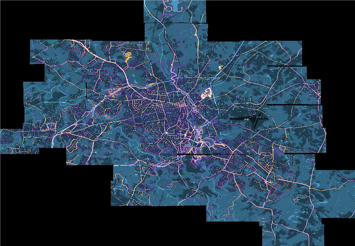 A large portion of this spring semester has been focused on editing the existing bike routes. Dr. Shannon generated slope data for all the road routes from elevation data provided by Athens-Clarke County. We attempted to gather public feedback through a Survey123 form that allows the user to comment on specific locations of our draft map; however, as the COVID-19 pandemic persisted, public feedback became challenging and often disappointing.
Once we had edited our draft routes to some degree of satisfaction, we began transferring our data from QGIS to ArcGIS Online to begin configuring the web app. We focused on cleaning things up to ensure the map would be easy and intuitive to read. We trimmed down our initial POI data to a smaller pool of points and set the transparency level of that data as smaller than that of the routes so as not to overwhelm the reader upon opening the WebApp. We also began to discuss the best way to color routes, bike lanes, and trails. Further, we determined the best symbols to denote our points of interest and slope. Daniel Sizemore, Bicycle, Pedestrian, and Safety Coordinator from ACC Unified Government, assisted us and is still in the process of organizing data to provide our map with a more comprehensive list of bike lanes. We reviewed several other similar bike route maps of other cities such as Vancouver, Portland, Madison, etc. to get a better idea of how to visualize the data. Dr. Shannon and I worked on creating a print map for BikeAthens staff and patrons to mark up physically, but again, community feedback was difficult and less fruitful than we hoped. Now, as the semester is ending, we feel that we have a solid draft to start distributing to the public, with the understanding that the routes will continue to be refined and updated throughout the rest of the year. In our final meeting with BikeAthens, we discussed the possibility of one more semester’s worth of work in collecting that much-need feedback from the community. BikeAthens is interested in creating some formats of the map that can be easily printed, possibly even some pocket size maps to be kept at BikeAthens and other biking resource locations. I really enjoyed working on this project and feel I learned a lot about GIS project management. It was extremely valuable to see first-hand what it is like to work with local organizations and utilize those available resources in showcasing data. Before this experience I would not know how to even start, and now I feel confident in my ability to organize the steps of a project like this and be a part of the construction. The COVID-19 pandemic kept us from meeting in person and facilitating more community events where we could have generated feedback and creative collaboration, and that setback was felt by all of us. Zoom fatigue and generally busy schedules made me feel like I did not engage with this project as whole-heartedly as I could have. A part of me wonders if we had been able to meet in person whether we would have gotten more done in that first semester, giving us more space for creativity in the second semester. All things said, I am really proud of our final product and I hope to stay in the loop about the future of this map and its impact. Emilie Castillo recently received an undergraduate degree in Geography alongside a certificate in GIS at the University of Georgia. |
Archives
April 2024
Categories
All
|

- Home
- About
- Activties
-
Projects
- Athens Wellbeing Project
- ACC Black-owned businesses
- Athens bike routes
- Atlanta Community Food Bank
- Athens 1958 City Directory
- Athens bike routes
- Brooklyn Cemetery
- Evictions in Athens
- GA Hunger study: Proximity map
- Georgia Initiative for Community Housing
- Historic Cobbham Neighborhood
- Inner East Athens
- Hot Corner
- Linnentown
- Sparrow's Nest
- Blog
- Resources
- Calendar
 RSS Feed