|
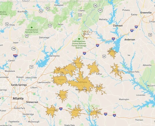
By Mary Farrell Link to Mary's public dashboard: https://public.tableau.com/profile/mary.farrell#!/vizhome/final_calcs/deliverable This semester, I worked as an undergraduate research assistant with Dr. Shannon and United Way of Northeast Georgia to better understand how well local non-profits were adequate to the needs of their counties. More specifically, United Way was interested to see how well agencies were serving the community during COVID since a lot of their agency information had now changed. They were hoping to see what areas did not have the adequate resources relative to community need, and potentially how accessible these agencies were to the community. I worked on this project with Mark Madison, Director of Community Impact at United Way of Northeast Georgia, and Dr. Jerry Shannon at the CML. We pulled our data from United Way’s agency database, ReferNet, and decided to create a deliverable with various visualization methods. We first had to wrangle the agency information from United Way’s database. From there, we decided to focus on only a few types of services; we started with 16 categories of service agencies and narrowed down to four: shelter, financial assistance, food assistance, and healthcare. Once we had our service agency data prepared, it was time to start calculating rates to better understand the number of agencies relative to an area’s need. We took information from the Census Bureau on different metrics of need for each category of service. For shelter and financial assistance, we chose the amount of people housing burdened (paying more than 30% of income towards housing) per county. For food, we looked at percentages of food insecurity, and for healthcare we looked at the amounts of those uninsured per county. We calculated final rates of agencies per capita among the population in need. Our final totals demonstrated a need for data quality inspection. In each category of service, Clarke County had extremely low rates and Oglethorpe County’s rates were extremely high. We suspect that this is due to the large population of Clarke County. As for Oglethorpe, I imagine that many agencies list Oglethorpe as one of their areas served since it is adjacent to Clarke County, but I imagine that these agencies are not very accessible to Oglethorpe County’s distant and small population. We also made ischrone (travel distance buffer) maps using the Mapbox API based on a 10 minute drive time. These showed that the number of agencies per county can be somewhat misleading in understanding a county’s agency coverage. The road network maps left large gaps in the map for each county. Better defining accessibility and an agency’s capacity could be an area for further research. I learned many prudent lessons and skills during my CURO assistantship. First, this project forced me to dive headfirst into R. It was my first experience with the language without the constraints of an assignment. I learned Python before, so it still felt somewhat intuitive.
Prior to this project, I had heard countless times that data analysis and research is largely data wrangling and cleaning, but I did not realize quite how right everyone was! I would say that roughly 70% of this project was cleaning data and making sense of it (which also happens to be the least fun part). It felt overwhelming at the time, but now that I know how normal my situation was, I feel more prepared for my next research project. This project also helped me understand how difficult it can be to work with VGI data. The data from United Way was not intended for our purposes. The information was not standardized in a way that would be easily comprehensible by a machine/ blanketed functions. There was quite a bit of fixing things manually and trying to search for data spread throughout multiple categories. This added to the time taken to clean and organize the data. Through this experience, I also learned the importance of maintaining a relationship and keeping close contact with community partners. A lot of what I struggled with Mark would have been able to help explain! He understood the data far better than I did. My assistantship felt somewhat like I was working for a client, though slightly different since the Community Mapping Lab is a collaboration between the university and the community. But I was working with a company who asked for me to work with data to produce deliverables to present. By the end, I feel way more prepared to potentially enter the workforce as a data analyst or geographer.
0 Comments
|
Archives
June 2024
Categories
All
|


 RSS Feed