|
By Anna Burkhart, Student in Community GIS, Spring 2022 What I have learned
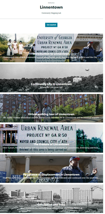
The course is rooted in the local “grassroots” approach to servicing the local community. It feels more personal and high stakes, unlike taking a passive approach from most classes, within the ivory tower. For instance, in a traditional classroom setting, I would usually study from a textbook or direct source and take assessments, possibly having discussions. There would be no assignments or activities that involved any direct, hands-on involvement that led to real change in the community like this class. Community GIS’s Linnentown project best encapsulates the major difference between a traditional class I have attended. I thoroughly enjoyed learning about Linnentown and providing real, tangible representation for this erased community from UGA’s past. The openness and freedom within the class itself allowed me to focus on what I was interested in so I had that innate motivation. Out of all the GIS courses I took, this class made the biggest impact in my outlook on activism of a group. It definitely feels like I am making a direct contribution at my school, and I will take it with me after graduation. Linnentown Project Prior to this course, I was unfamiliar with the history of Linnentown. This project has been incredibly enlightening. I have become acquainted with Esri’s story map application, and I am impressed by its capabilities. Esri’s specific collection generated a lot of inspiration for our own project, and I think this work so far looks very appealing. I think it accurately and fairly portrays this history to a public audience. My work in the Erasure group emphasized the darker aspects of Linnentown’s removal and attempt at blotting out its history. Although unhappy, it rightfully placed all parties in their appropriate roles, good and bad. My group wanted to accurately represent the events as well as talk about it clearly since this can be viewed by anyone. The most arduous process involved reading through hundreds of archival records (pdf) and trying to decipher the cursive handwriting in order to quote it. When convening with my group, we focused a lot on writing edits and mostly the format of our section. I liked the collaboration process, and I know that these projects will involve much more especially with tight deadlines and time constraints. I think, with the knowledge I have gained just in this semester, it has made my work more efficient and I feel confident in working with another group in the future Impact
This course provides a compelling start to the very real impact of GIS, and it provides a relevant foundation for my personal career goals. I want to pursue a land management, possibly environmental consulting, tract in which GIS skills will be especially beneficial. To elaborate, developing my skills and navigation around GIS applications (ArcGIS Pro, QGIS) will definitely help with future careers. I want to work in conservation as well and I know that GIS skills are sought after. In addition to the “hard” skills from class, soft skills from working with my respective groups are extremely helpful. I gained a lot from the Linnentown project and I am very proud about working on it. I feel better equipped for the future and excited to continue working in this field.
0 Comments
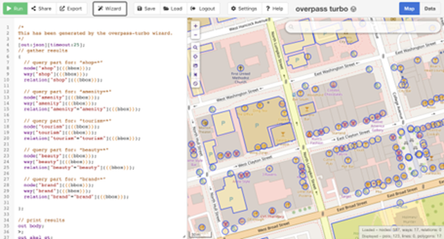
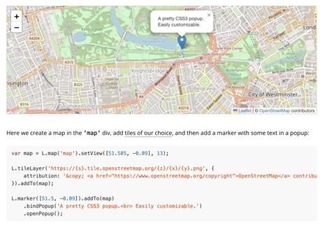
By Nemin Wu, Student in Community GIS, Spring 2022 Imagine that you had to create an interactive map of points of interest (POI). What if that map had to have pop-up windows to display all the essential information? Where to find the base map? How to get the precise coordinates of the potential POI? What codes control the zoom-in and zoom-out functions of the map? How to publish the web map? If you’ve never had any open GIS experience, these may be all tricky problems. However, with open-source, you may be surprised to find that all the data and techniques are more transparent and accessible to the average audience than you thought. Towards the end of the semester, we started our final project in the Community GIS class: mapping businesses in the Unite Against Discrimination Movement (UADM) list in downtown Athens. Our goal is to update the list of businesses of the United Against Discrimination campaign and create an interactive map showing these businesses on the Athens Anti-Discrimination Movement (AADM) website. In this project, we leverage the power of data and techniques from lots of open sources such as OpenStreetMap, QGIS, Leaflet, and GitHub). OpenStreetMap To update the AADM’s business sites through field canvassing and confirm all these businesses are displaying AADM’s list sticker in their windows, the primary step is to get the locations of the relevant businesses. OpenStreetMap, as the name suggests, is a collaborative open geographic data source. Since it’s not owned by anyone, there are no legal restrictions on its use. Everyone has permission to download and employ the latest data of their research area. Fig.1 shows the codes we used to search for business sites in downtown Athens. The queries may be a little bit confusing to read, and you might be concerned about how to code these. However, the truth is that we didn't type a single line of code manually, because they were all generated automatically through the wizard window. Editing the data in OSM is also incredibly user-friendly. After the field canvassing, we updated the OSM map since some stores have moved (Fig. 2a, Eye Candy moved to the South Milledge) and others were not previously displayed on the map (Fig. 2a, Rook and Pawn is newly added to the map). Once you are satisfied with your changes on the OSM website, you can upload them to the servers, and the map will be updated. It’s also very convenient for the users to check the editors and the version history on the history tab. In this way, OSM offers the public to draw the features efficiently and accurately on its map. QGIS Similar to the OSM, QGIS is not owned by anyone, so it won’t hold people back from using them in creative, productive ways like other GIS closed source software. In this project, we used the QuickMapServices plugin to find the appropriate base maps, we employed the QuickOSM plugin to import OSM data based on the Overpass API, and we installed the qgis2web plugin to generate web maps based on Leaflet from current projects. All the codes of QGIS are accessible on GitHub. In addition, free access is also very attractive for researchers with tight budgets. Leaflet At the end of the project, we needed to generate a web map of all the businesses listed on the AADM’s list. To get around this, we chose the open-source JavaScript library, “Leaflet,” to generate the interactive maps. It has tons of interactive mapping functionalities. Fig. 3 shows the readability and simplicity of the source codes in Leaflet. It also provides lots of base maps choices on the Leaflet Provider website. I used to be a little biased, assuming that open-source databases and services might be difficult to use and maintain because they are accessible to everyone. I had heard of and downloaded OSM data many times, but I had never tried editing it prior to this class. This project opens my eyes to open-source data and methods. The fact turns out that the "difficult registration, uploading, and updating process" that I had assumed took me only less than a minute. I realize open GIS has great potentials to foster collaboration and innovation; QGIS provides the same or even more flexible methods of publishing web maps as ArcGIS Pro. There are diverse open-source plugins available that provide great solutions to your problems. For example, we wanted to change the symbology of the points in AADM’s list and we discovered the SimpleSvg plugin written by other community members that supports for SVG icons; The Leaflet tutorials provides significant flexibility on the choices of base maps and the marker.
This also reminds me of the previous readings Being a ‘citizen’ in the smart city (Cardullo et al. 2018) and Citizen Science (Haklay 2013) because people show different levels of participation while using or contributing to the open GIScience, some participates in data collection(e.g., updating the features on OSM), some engage in the problem definition (e.g., posting thoughts/ issues in the QGIS repository on GitHub, some provides interpretation or solutions (e.g., pull requests/ upload plugins). As the article Opening GIScience: A process-based approach (Shannon 2018) says, there are some tensions and tradeoffs in open GIScience: between standardized and flexible tools, between expert driven and community driven designs; between single and multiple audiences; between established and emerging metrics. However, whether you're an enterprise systems integrator, a GISer wishing to share any geographic information, or a user looking to engage with others, open GIS provides a variety of options for getting your work done efficiently and effectively. By Eli Vinson, Student in Community GIS, Spring 2022
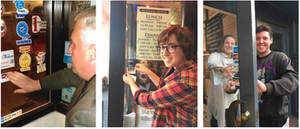
“I study Geography and Graphic Design; I know it’s kind of a random mix.” - A line I have used the majority of my time at UGA when introducing myself, until this year. For a long time, I failed to realize that two of my biggest interests were far more intertwined than I had thought. This semester I took a class called Community GIS where I actively learned real-world applications for GIS concepts and methods. One of these concepts was ‘qualitiative’ GIS. Qualitative GIS incorporates non-quantitative data into GIS in an effort to give perspective and narrative to a research topic. A great example of qualitative GIS that the class was first introduced to was a project by Meghan Kelly (2019) titled, “Mapping Syrian Refugee Border Crossings: A Feminist Approach.” In her project, Kelly wanted to provide a fuller representation of Syrian peoples’ border experiences using cartography, as opposed to Western media’s cartographic practices that aggregated refugees into flow lines, proportional symbols, and frequently simplified border experiences into homogenous, black line symbols. Kelly wanted to discover both how can the cartographic portrayal of Syrian border experiences be improved to more fully represent their lived experiences and further, how can a feminist perspective inform an alternative mapping of borders and border experiences. Kelly states, “Through a feminist lens, I have developed an alternative mapping technique that emphasizes borders as a theoretical and conceptual advancement in cartographic design and border symbolization.” At this point, while reading through Kelly’s methods, I began to recognize the deeper relationship held between Geography and Graphic Design. By projecting Syrian stories and experiences through cartography, Kelly’s qualitative GIS work gives Syrians a geographic voice unavailable to them through conventional cartographies. Up until this reading, I viewed design within geography/cartography as nothing more than functional, with little room for creativity. The kind of formulaic and simple, generalized designs that I had attributed to the whole of research-based cartography, did very little to grab my interest. I knew there could be aesthetically pleasing or thoughtful and uniquely designed maps, but I thought the only place for these designs would be on the wall above your couch rather than in a serious research paper. Kelly’s cartographic design wanted to give a fuller and unique value to borders. Kelly describes that, typically, cartographers place borders near the bottom of the visual hierarchy, receding into the background as part of the base map or reference material. The designs for borders typically default to thin, solid black lines and symbolize them homogeneously. These design choices remove the true image of a border including individual experiences, such as the danger and legal issues involved with crossing borders. To achieve a more robust symbolization of borders and to move towards qualitative/narrative GIS, Kelly presents a design technique that aggregates the border experiences of seven Syrian interviewees. After immersing herself in the stories of each experience, Kelly used ArcMap to create the design that served to symbolize a truthful and emotional depiction of the stories. Kelly defined spaces and borders abstractly by bounding them with an abstract square shape that could be easily applied to a variety of non-traditional borders found in Syria. Kelly describes that this design choice enabled her to bring both non-traditional space and non-traditional borders, such as the human body, into the maps. The most interesting design choices to me were that each border in the map is symbolized according to the intensity of individual experiences and the border’s passibility. A line of a border increases in size if the emotional toll of the experience increases and becomes thinner if the experience is understated or minimal. To distinguish her own voice and to elevate the voice of the interviewee, Kelly utilized different typographic choices. The interviewee’s voice was identified in a black, sans serif typeface called Myriad Pro, while Kelly’s voice was written in a gray, serif typeface named Garamond. I think the color and individual typefaces place each voice at different volumes and formalities, (Serif = more formal, gray = lower volume, black = higher volume/more importance). Discovering this combination of Graphic Design and Geography and recognizing their importance to each other in creating a meaningful research project was very impactful for me. I now have an entirely new thought process in creating maps moving forward where I will utilize my design experience and creativity more so than following a general map template. I hope that any geographers reading this will consider a creative and thoughtful approach to their map designs in the future as well in order to help create more engaging and impactful maps. By Amber Orozco, Student in Community GIS, Spring 2022 What do you think of when you hear the word “open access” in relation to research or community-based work? Perhaps it brings to mind programs, tools, and academic publications that have no paywall? Or maybe you think of a community that shares resources, such as software code? But in what ways can the approach of open access be a way to support local community organizations? In our Community GIS class, we have spent the last few weeks of the semester thinking through these questions as we work to support the campaign of a local organization, the Athens Anti-Discrimination Movement (AADM). AADM “advocates for racial and social justice and strives to combat discrimination through education and activism”. Part of their efforts includes their “United Against Discrimination” sticker campaign where they ask local businesses to pledge to creating a more diverse and inclusive work environment. If the business decides to participate, they receive a AADM sticker (see photo below) to place on their business’s front window. As a class, our goal is to create a map that will be hosted on AADM’s website, showing the businesses in downtown Athens that are supporters of the campaign. For this project, open access can be understood in two different ways. First, open access for our work takes the form of a process-based approach (Shannon & Walker, 2018), meaning our class is working collaboratively with AADM to gather input on the project, including the timeline, goals, exchange of resources (i.e. AADM provides our class the list of business supporters of the campaign from 2019), and how the map will be both stored and accessed. Our collaboration with AADM is consistent throughout the process, which included us meeting with Denise Sunta (AADM Administrative Assistant and Events/Community Outreach Coordinator and also UGA alumna) at the beginning stages of the project and we will be ending the project with presenting our final map designs to AADM for their approval.
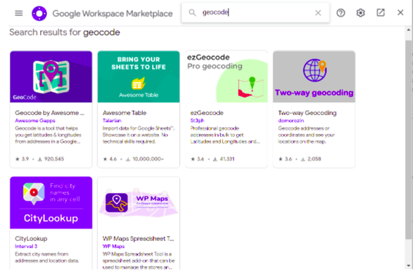
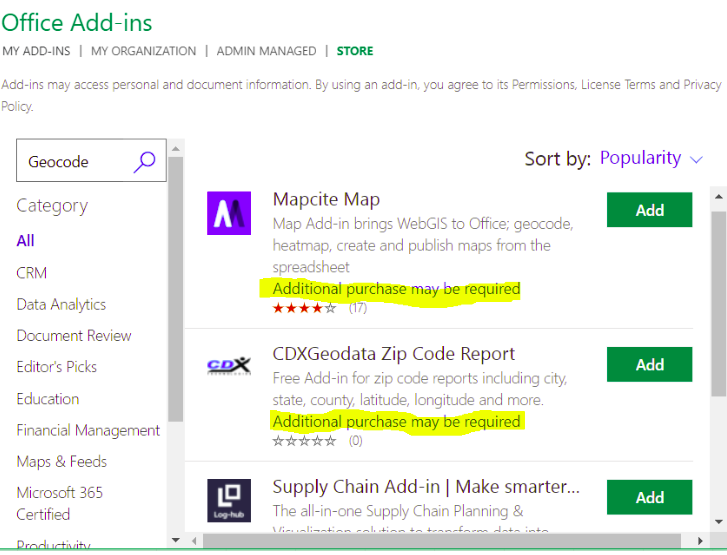
Second, our class is leveraging our technical skills to create this map through an open access mapping program (QGIS) and coding library (Leaflet). Our class was tasked with verifying whether the list of businesses provided by AADM were still participating in the campaign. To do this, our class divided up sections of downtown Athens to assess which businesses had the AADM sticker displayed on their front window. We used ArcGIS’s Field Map data collection application to update this information, including adding new business supporters of the campaign. Our class was able to utilize our university membership to access paid GIS applications, such as Field Map, for this project. Once this list was updated, our class added the geographic coordinates to each business. We were then able to upload this list through excel to QGIS and map out the businesses. Using Leaflet for codes to customize the functionality and appearance of the map, our task is now to develop a map that serves the needs and goals of AADM. Our class is currently divided into different teams, and we are working to develop different options for AADM. For example, my group is working to use codes from Leaflet to develop a pop-up label that will appear when someone clicks on a business that is a supporter of the campaign. We intend to include information on each business, such as the hours of operation, website link, a photo of the business. Additionally, we are developing an option on the map that allows a visitor to filter for the type of business, such as “restaurant, bar, and retail shop”. Once we decide on the format on the map, it will eventually be uploaded and hosted on Github. Personally, this process of transitioning from ArcGIS to QGIS and Leaflet has been challenging because some coding knowledge is required to format the map in my group’s vision. The last time I encountered html was in high school, but I think getting comfortable with these open access programs are a matter of practice and will require more time learning compared to more user-friendly programs, such as ArcGIS. From this experience, I have learned that open access is more than free programs and resources. It can mean leveraging technical expertise as students to support the efforts of community organizations, while engaging the community organization through the process to ensure the organization’s perspectives are centered as the tool becomes developed. Open access extends to the programs we used with no paywall and those programs that we had access to through our university membership. Each of these elements play an important role when partnering and supporting the GIS work of community organizations. By Miles Montello, Student in Community GIS, Spring 2022 ...ranked in no particular order, here are five new nuggets of information that stuck out to me since starting this class in January of 2022... 1) Know how to plan a task with a group In my experience, the group projects that go the most efficiently are the ones where there’s one dominant person who is the most passionate about the task and can get the less passionate group members smoothly convinced of their vision early in the timeframe given. Groups where all the members are either too shy or too indifferent wind up with a wishy-washy concept of a final product and it’s awkward for everybody. If there are two dominant people with conflicting visions then their egos may clash, but usually a resolution is reached early on. Just because there’s a space for someone to step up doesn’t mean anybody necessarily will- until the deadline gets close enough that either someone caves in or everyone comes to an agreement. In my opinion, it’s apt evidence for the 80-20 rule, which is a principle that says that roughly 80% of consequences come from 20% of causes- 80% of the work/planning is done by 20% of the participants. Clearly defining tasks from the beginning makes it the least stressful, and the tasks don’t even necessarily need to be divided equally because the quality of every member’s work is proportional to how invested they are in the topic. I’m proud of my group’s contributions to the Linnentown Storymap, which was a web map the class produced describing a black neighborhood in Athens doomed by Urban Renewal to be replaced by freshman dormitories. Each group of 4-5 students were given a section to create on our own. I would describe the first half of our time given as sheepishly figuring out what we should do, the second- executing the original agreed upon vision which was subsequently revised, and the last fifth- creating most of what would be on the final product. 2) Teams make monotonous tasks go quicker This lesson from the class also applies to life in general. Having multiple people assigned to a creative task as opposed to one or two people creates the awkward scenarios I previously described. On the other hand, if you have human capital, having multiple people assigned to a clearly defined repeatable task that is too big for one person is super-efficient. I recall Dr. Shannon remarking on how the task of geolocating all of Athens’ downtown businesses on the AADM list (of which there were around sixty) would’ve taken hours for one person to do but was shortened to two minutes by each student being assigned four businesses to add coordinates to on a shared cloud document. If you tell a random set of eight people to paint a twenty-yard wooden fence a certain color or pattern, it’s going to be finished in an hour or two if they have the materials. If you tell them to paint a mural on the fence, it’s going to take way longer and the result will have very noticeable gaps in artistic ability between the painters. 3) Text mine efficiently The 1958 Athens City Directory existed only as a physical book, yet the Community Mapping Lab was working to digitize the information listed inside- from names, addresses, occupation, race, home ownership, etc. To do so, the entire directory was scanned- but to be able to manipulate the data it needed to be recorded on a digital spreadsheet. When trying to collect data from a scanned paper document, transferring what is on the page into manipulable digital text is a big challenge. Your saving grace in this Herculean task are programs that “text mine”- using artificial intelligence to read the scanned text for you and transcribe it in plain text into the program you tell it (Word, Excel, etc.). There are various ones, from paid to free and open source. Knowledge of coding is often necessary, mostly to tell the program how to separate lines of text. Keep in mind that there can be a lot of room for error, and you might be disappointed to find the resulting text is littered with problems. Data cleaning is tedious, but it was a necessary part of our classes’ digitization of the 1958 Directory. If the dataset is small enough (hundreds of lines of dozens of pages instead of tens of thousands of lines of hundreds of pages) consider manually typing the lines of info as you read them (which is what I did for the pages I data cleaned). Something which accelerates this task leads to my next point... 4) Two monitors are better than one When you have a task involving cross-referencing (like data cleaning), it can break your train of thought to have to be constantly opening and closing the same two or three tabs. Opening the wrong tab by accident making you forget the short line of info you just memorized can make you grind your teeth. Even a simple action like that can break your flow. So, I’m grateful that the GIS lab has two monitors to a desktop. I find it so much easier to not have to move my hand and simply glance from one fully visible document to another. This also makes it easier to keep up with web tutorials among many other tasks. 5) Google Sheets ...excels your work Both Google Sheets and Excel are great for data organization related to GIS. I made a map using the data from the 1958 Athens City Directory where I showed the locations of the residences of blue collared workers (blue dots) and white collared workers (yellow dots). This was not a distinction made by the directory itself. I took the top 300 occupations listed and categorized them myself using a pivot table to create a new column with a new value. If this option were not available, the task would’ve been too big for me. Knowledge of these two applications helps you work with data more efficiently. I prefer Google Sheets due to how easy it is to apply and use add-on tools from the Google Workspace Marketplace, paired with the ease of sharing the document with others. Offline Excel cannot be edited live by multiple people, and while online Excel documents can- the plugins available for geocoding are more limited and take extra steps to add... Google has SIX paid options: Versus FOUR paid options for Office Three extra tips? No way!
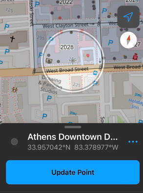
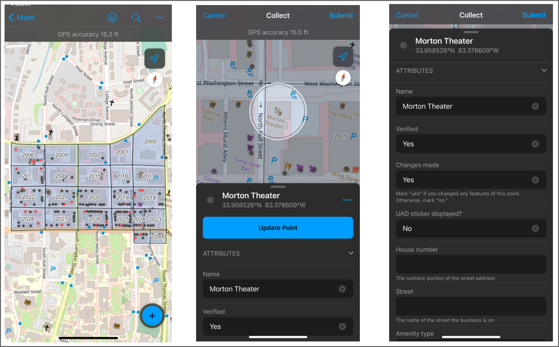
By Jared Grant, Student in Community GIS, Spring 2022 Cynthia Lewis once said, “Getting lost teaches you how to read a map.” I resonated with this quote because in order to understand a map, you must create one by questioning the landscape. In essence, canvassing everything in an area helps you realize that you might be lost and helps you develop your reasoning to find a solution. There are many reasons to create a map: to seek direction, to seek perspective, or to seek information. You can even map for a cause. This quote is also interesting when you realize how canvassing or reading a map has evolved over time. Back in the day, people would have to canvas an area using stencils and paper to create a physical static map. Nowadays, we can canvas an area using mobile apps such as ESRI ArcGIS Field Maps that features an ever-changing map. In my Community GIS course, we actually used Field Maps for a project with the Athens Anti-Discrimination Movement (AADM). The objective was to map out the businesses that had a sticker supporting their 2016 United Against Discrimination campaign. The campaign’s objective is to encourage business owners to stand in solidarity against discrimination regardless of race, gender, age, sexual orientation, or immigration status. As we started working on this project, we immediately realized there were many questions that arose when thinking how to map out the area such as “how many businesses are in downtown Athens?”, or “Do these businesses still have a sticker?”. We focused on answering these questions by using Field Maps to canvas downtown Athens. Using Field Maps, we divided downtown Athens into blocks. Every student was assigned a block of downtown Athens and had to ask all businesses in the block if they had an AADM sticker. We then verified and updated the attribute fields for each business point on the app. if the location did not appear on field maps, we had to create the point and fill in all information. The map (as shown below) was formatted so that points with a sticker were red and those without a sticker were black. I really enjoyed working on this project because I had to learn how to create and read a map using Field Maps. We initially did not know how many businesses were located in downtown Athens but by using Field Maps, google sheets, OpenStreetMap and QGIS, we were able to answer all of our mapping questions. This project was efficient because at the click of a button we were able to update or customize the map as we walked around the blocks of downtown Athens. I also liked how Field Maps allowed multiple users to collaborate on a project. This means each student could focus on a specific block and spread the working load of the project.
Prior to canvassing my block, I expected there to be 3 businesses, but I was not 100% sure of the actual number. While canvassing, I found there were 8 businesses in my block. Ironically, I actually got lost while canvassing because I was near an area that I never ventured to and found businesses that I either never entered or didn’t know existed. While canvassing my block, I entered the Chase bank for the first time. I’ve always driven past it, but I never had a reason to enter before working on this project. I also didn’t realize that next to the bank was building that offered community office spaces for small companies to work at. Overall, the major lesson I learned from canvassing was that I gained a new enhanced perception of downtown Athens simply by getting lost. I have lived in Athens for five years and I had no idea the number of businesses that could be located in single block of downtown. Through canvassing, not only did I gain this enhanced perception, I also helped create a map for the AADM that can be used to help people know what business support the United Against Discrimination campaign. So after working on this project, I highly encourage every geographer to enjoy the map making process. Also, Field Maps is an excellent software for your map making needs if you would like to canvas an area at the convenience of your phone. By Rachael Glenn, Community GIS student in Spring 2022 I was introduced to the Athens Anti-Discrimination Movement (“AADM”) the summer when the Black Lives Matter movement was in full force. They hosted multiple rallies that successfully culminated in the removal of a confederate monument that once stood in front of the UGA Arch and only feet away from the Holmes-Hunter academic building, named after the first African Americans to attend UGA. There is still a sign behind the Arch naming the Civil War a “war for southern independence,” but I digress. I was happily reintroduced to AADM through our Community GIS course to partner in support of their “United Against Discrimination” sticker campaign. This campaign in particular was sparked by reports of downtown bars racially discriminating against students and local residents of color back in 2016. AADM is a local non-profit here in Athens, GA that focuses on initiatives to advocate for racial and social justice. Some of their work includes hosting community discussions, events, workshops, and resources designed to help people protect their civil and human rights (AADM). Currently, AADM has a sticker campaign called “United Against Discrimination” where businesses in Athens are able to participate with 3 easy steps laid out on their website. 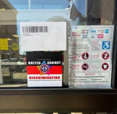 “United Against Discrimination” Sticker on the CVS Downtown Athens “United Against Discrimination” Sticker on the CVS Downtown Athens
The point of the campaign is to commit business owners in the downtown and surrounding area to stand in solidarity against discrimination regardless of race, gender, age, sexual orientation, or immigration status. This campaign highlights a simple yet outstanding way that businesses can create a more inclusive culture. Displaying the sticker, as pictured above, is a physical reminder that everyone is welcome in their establishment. Our Community GIS course has partnered with them to help with the campaign data and to create a web map of the downtown area of businesses that have joined the campaign. Our first step in getting this sorted was verifying which businesses were still participating in the campaign based on the list they provided us. In order to create an updated list for our map, we participated in canvassing downtown, speaking directly with businesses and seeing if they were still participating. Canvassing involves soliciting people, often by going door-to-door for personal contact in an effort to raise awareness, fundraise, politically campaign, and, in our case, collect data and support a local movement. The Athens downtown area is comprised of 170+ businesses, so in the spirit of collaborative work, each student received a block to complete. We used the ArcGIS field maps app so we could directly update business information. The field map app lets users directly update and edit data as they are collecting it during fieldwork. I quickly learned how useful canvassing could be to get accurate data about a community and, in the same vein, how important it is to ensure everyone is on the same page when it comes to community work to produce accurate and usable data. Before starting this process, our class took class time to plan the canvassing. When engaging in collaborative community work, this is such an important step so that 1) everyone understands the goal and definitions involved in the project, 2) knows the process, and 3) how the technology works. In our case, the process was visiting each business in our block, checking who was participating in the campaign, and marking their status. Using the field maps app, I was able to directly update the data into the app for my block, “block 2021.” This is where the planning from before came in hand. I was able to understand which types of businesses we were including, what verified meant, how to add new businesses, what to do with old ones, etc. Going from business to business was a bit daunting, thinking I could face rejection and even worrying about saying the right words to market the campaign. However, my worries were settled after proposing the campaign to the first business. I found they were open and eager to hear about the campaign and how they could join.
Moreover, from this process, I was able to understand how fieldwork and collaborative work can be managed and facilitated to benefit a community. Our class's work canvassing showed us an easy way to organize and reach many businesses in a short amount of time. However, for this small commitment, multiple people and community members will see the Anti-Discrimination stickers on businesses and perhaps see a more welcoming environment. As UGA students, I think it is incredibly rewarding to do work that is directly benefiting the local Athens community. In most cases, many of us come to Athens to enjoy the city and all it has to offer but fail to give back. This project enabled us to counter this imbalance and participate in a positive social campaign that benefits Athens to learn how to facilitate community work and all the mishaps that can come with it. |
Archives
June 2024
Categories
All
|



 RSS Feed