
Exploring the boundaries of esri's web appbuilder: a reflection on what i lost and what i gained3/31/2019
Aileen Nicolas As the saying goes: you can’t have your cake and eat it too. In a project for the Community Mapping Lab, I worked with a representative for the United Way of Northeast Georgia’s 2-1-1 program to develop a web application that allows for visual interaction with services offered in Athens, Georgia. Along the way, I had to weigh the pros and cons such as reproducibility and ease of use of different web application development software. I found that it was impossible to have everything I wanted in a single web framework for software development. The United Way of Northeast Georgia is a non-profit organization that aims to ensure access to quality education, financial stability, and healthy lifestyles for residents of its service region. They work with stakeholders from different sectors such as schools, businesses, financial institutions, and local governments across the state to promote and improve community conditions. Their 2-1-1 program offers residents the opportunity to speak with or text a representative of United Way about services they may be looking for. In the fall of 2018, I worked with a representative for the United Way’s 2-1-1 program to develop a web application that allows users to locate services offered in Athens, Georgia through a map interface. Although the call line offers callers the ability to speak with someone who is knowledgeable about the services offered, a web application allows users to explore services at their own pace and see details about the services up front as opposed to hearing about them over the phone. The web application had 5 important requirements:
I looked for ways to meet the requirements listed above, managed data from United Way’s database, and researched the best way I could develop a web application. I did this through an internship with the Community Mapping Lab which actively works to provide students with the opportunity to work with community members as well as apply their knowledge to solve practical problems. It is important to carefully consider which software to use when developing a web application. In the development process of this web app, I considered using Leaflet or R Shiny. These programs would allow me the greatest flexibility in the development of the application, and it would be shareable for future use as well as reproducible. However, I don’t know JavaScript, so I couldn’t make a Leaflet map, and at the beginning of this project, I had no experience in R. To develop a web application using those tools would be to embark on a long journey of learning for which I did not have time. I chose to use ESRI’s Web AppBuilder to develop my web application because it was the best tool for me considering my skill set and complete lack of coding experience. I was able to develop a web application with unique visualization features and useful filtering tools. With this app, the users could explore the agencies in Athens, search for service by language availability, visualize the route(s) agencies are on, access contact information, and determine eligibility. One of the advantages of my web app is that all agencies which offer services for the general public are listed on its map. Unlike Google or other search engines, the web app shows all the services available from all service categories at once. Google is more likely to display agencies whose names match the keywords input in the search bar. Some of the agency names are not representative of all the services they offer, and because of that, a search engine can be limiting. Additionally, a search engine may not offer as much information as clicking on one of the service icons on my web application may offer. For example, by clicking on a service icon, I can see all the information shown in figure 1, and more. 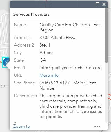 Image 1 In a previous blog post, Jiaxin developed her own web application using the Leaflet API to map areas in the state of Georgia that had high percentages of population eligibility for UGA SNAP-Ed programs. Like her, I wanted to develop a web application that allowed users to explore services and visualize eligibility geographically. I know about the importance of using open-source software for reproducibility of a project. I know that ESRI products are expensive to license and thus difficult to access for those who do not have hundreds of dollars to spend on licenses. So why did I choose the Web AppBuilder? In the end, we have to pick our battles. My app may not be easy to reproduce, but it had the basic features I needed. I wrote instructions on how to download data from United Way’s internal database. I used R to write scripts to prepare the data I had extracted. Even though I was not able to complete this entire project in a way that promotes accessibility to the entirety of my work due to limitations in my knowledge, I gained the skills that could help me produce a Shiny app in the future. It is interesting to consider how “open” open source data or software is if it requires a significant amount of time, knowledge, and experience to be able to use it. Some features I wish I could have expanded on with ESRI’s Web AppBuilder were fonts, the flexibility in positioning of certain elements and widgets, and further customization of widget features and capabilities (Figure 2). For example, the text below the filters blended in with the background of the filter widget, and I wish I could have chosen a darker color for the text to help it stand out. Additionally, I would have liked to have the legend be on the other side of the web application to allow users to more easily find that button. Finally, I had a difficult time with the filter feature since it only took data in the wide format instead of the long format. These are the sorts of limitations that we can experience when we don’t code our own applications. In conclusion, in developing a web application for United Way, I made the decision to use ESRI’s Web AppBuilder over R Shiny or Leaflet. There were benefits to ESRI that made developing the web app easy, but I missed out on the flexibility associated with coding my own web application. I struggled with the limits of the ESRI’s Web AppBuilder but learned valuable new skills that I can use to promote more reproducibility of my work in the future. 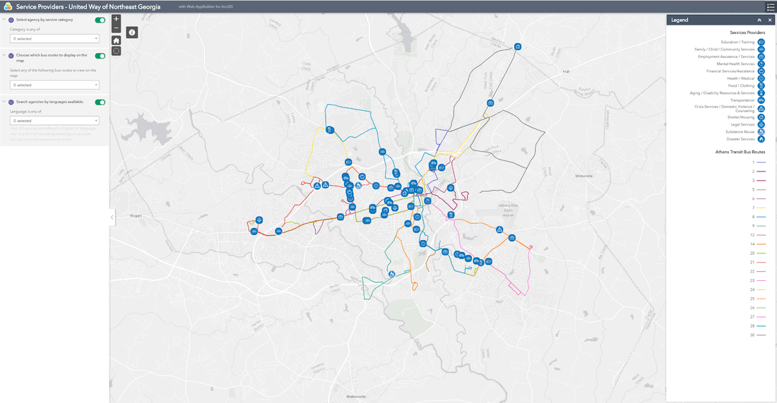 Image 2 AuthorAileen Nicolas is a fourth year Geography major at the University of Georgia. She will be pursuing her Master's degree in Geography starting this fall of 2019 also at UGA. Yangjiaxin Wei Over the decades, researchers have increasingly looked into the effect of neighborhood stores and other food options on residents' health (Caspi, Sorensen, Subramanian, & Kawachi, 2012). Many researchers have found that food environments play an important role in individuals’ health outcomes (Bleich, Jones-smith, Wolfson, & Zhu, 2015; Cummins, Macintyre, & Glasgow, 2002; Willett, 1994). The Supplemental Nutrition Assistance Program Education (SNAP-Ed), funded by the USDA’s Food and Nutrition Service, also aims to improve the nutrition and healthy lifestyle knowledge of individuals who are SNAP participants and low-income individuals eligible to receive SNAP benefits or other federal assistance. Agencies in each state contract with the USDA to provide classes in nutritional education and sponsor initiatives to encourage healthy food choices. The University of Georgia (UGA) SNAP-Ed program is a collaboration between the Department of Foods and Nutrition and Cooperative Extension that aims to help low-income populations in Georgia establish healthy eating habits and a physically active lifestyle through evidence-based nutrition education and local campaigns to promote consumption of healthy foods. This includes online content showing cooking and shopping tips, advertising campaigns, and outreach to K-12 schools.  Source: UGA’s Food Talk website During my Master’s degree work, I was a research assistant for the UGA SNAP-Ed program. I worked with Dr. Jerry Shannon to provide spatial analysis and mapping that supported UGA SNAP-Ed program. Using GIS technology, we mapped out areas with high percentages of eligible populations where more than half the population’s income was below 185% of the poverty rate, areas within one mile from Free and Reduced Meal School, Georgia Promise Zones and Georgia Strike Force zones. Sites intersect with any of these areas above are considered as qualified nutrition education sites and are eligible for SNAP-Ed programming. In this article, we present an open source interactive web tool using leaflet JavaScript library for UGA SNAP-Ed to locate eligible outreach sites and obtain qualification results. These years, there has been a shift from “closed” environment to “open source” environment both in academia and industry. Open source usually refers to a product includes permission to use its source code, design documents, or content for free. Comparing to traditional commercial or “closed” software, open source tools provide reproducibility of knowledge, open access of data, adaptability to similar applications, affordable cost, and they are usually contributed by a community of people (Singleton, Spielman, Brunsdon, & Singleton, 2016). The Leaflet API is a leading open-source JavaScript library for mobile-friendly interactive map visualization, and it provides us a powerful set of mapping features. Compared with other online mapping application such as ArcGIS Web App Builder, Leaflet is more lightweight, customizable and extendable. In addition to basic functions and map visualization features, it also has extended open-source plugins which allow you to customize your own application easily and at no cost. We can also integrate it with other JavaScript libraries such as D3.js to achieve better visualization results and functionalities. This tool provides basic map visualization functions for different SNAP-Ed qualification layers, functions for determining nutrition education site eligibility, and an info box updating site qualification information. Details on the application Leaflet has detailed documentation and fundamental hands-on tutorials helping you get familiar with the API. For those unfamiliar with JavaScript and HTML, w3schools is a good place to learn such web technologies. Since Leaflet is code based, we also needed a robust text editor, such as Sublime Text or NotePad++. Since we can only create customized map vectors from GeoJSON objects, we also need to prepare our geographic data into GeoJSON format. GeoJSON is a lightweight and straightforward format for encoding a variety of geographic data structures and it’s also a common format for geographical data in Javascript. There are many tools available online to convert ESRI shapefiles to GeoJSON such as Mapshaper, and you can also do it natively in QGIS. Our web tool has five fundamental features:
Basic functions such as adding basemaps, layer controls, and adding info window are well-explained in the tutorials and documentations. For me, the major challenge of this map was determining site eligibility and creating the Geo-locator. While Leaflet is a powerful map visualization API, it has limited features on spatial analysis functions. Luckily, we have plugins contributed by other people to realize those functions. This is one of the many advantages of open source software. To determine whether a point is intersected with a layer, we used the “Leaflet-pip” plugin which provides us point-in-polygon calculation support. For the Geo-locator, we used “Leaflet GeoSearch” plugin which is an easily extensible plugin supports address searching and real-time geocoding in Leaflet. This web tool is hosted on GitHub’s online repositories using GitHub Pages. GitHub is an open source web-based version control hosting service, it is free and very convenient for project collaboration and distribution. Click on this link to see it live. For more detailed information and actual code, please visit the GitHub page on this project.  Conclusions
Overall, this web tool using geospatial data can help UGA SNAP-Ed determine nutrition site eligibility more efficiently without communicating with GIS experts. The GitHub repositories can also help UGA SNAP-Ed manage the tool in the long run. Also, the open source code and public accessible data can be easily extended and replicated for SNAP-Ed in other states. Although Leaflet has many advantages compared with other commercial platforms, it still has some drawbacks: it requires a basic understanding of JavaScript and HTML languages and it is also relatively weak on spatial analysis functions. One thing worth mentioning here is that even though we provided this tool for UGA SNAP-Ed program, they seldomly used it due to various reasons: First, they still feel better having GIS experts directly confirm eligibility manually. Also, the map is not an adequate stand for specific circumstances. It raised my concern that while our lab has talked a lot about Public Participatory GIS and Community GIS, how to gain public acceptance and further public engagement to it still remains a question. References
Author Yangjiaxin Wei is a first year Ph.D. student at the University of Georgia in the Department of Geography. Xuan Zhang Research has found that retirement is one of three major time points that the elderly (aged 65 and up) tend to move (Litwak and Longino Jr 1987). The reasons for moving may vary: going to a place with better weather, being closer to family members, going to more affordable areas, going to a place with a slower pace, etc. The moving decision is not only related to individual characteristics, such as marital status, presence of children, education level and more, but also associated with the destination community’s characteristics, including the cost of living, climate, amenities, accessibility, and more (Clark, Knapp, and White 1996). The United States is part of a global trend of counties facing significant aging populations. With the largest elderly population (aged 65 and over) among all developed countries, the U.S. is projected to double its elderly population in 2060, compared to 2014 (Northridge 2012). By 2030, more than 20% of U.S. residents are projected to be elderly, compared with 13% in 2010 (Ortman, Velkoff, and Hogan 2014). The increasing elderly population and proportion of the population generate questions of where and how seniors will spend their last chapter of life. For seniors who choose to move to a new location, what characteristics of the destination are associated with their move? This blog will focus on the southeastern US state, Georgia, to answer the questions about the migration pattern and the migration-related characteristics of the destination. Using the Census Bureau American Community Survey (ACS) 2013-2017 data, I looked at the elderly migration within the 159 counties in Georgia. The ACS provides data about how many people moved to individual counties from the counties within the same state, from outside of the state, and from foreign countries with age breakdown. Within the five-year period, there were over 47,000 elderly people settled in Georgia, with 24,120 from other states or abroad and the rest moving within Georgia. Figure 1 shows the patterns that the elderly migration in general favor some particular areas, especially the north side of Georgia, including the Atlanta region (29 counties defined by the Atlanta Regional Commission. Other popular destinations are Macon, Augusta, Columbus, Savannah, and other coastal regions. The distribution matches up with the total population distribution. 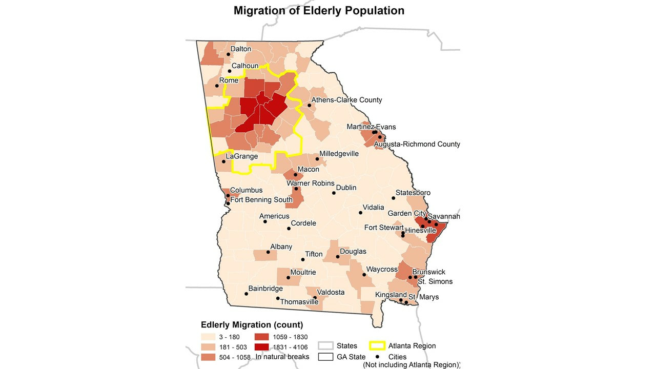 Figure 1 Migration of Elderly Population in Georgia using 2013-2017 ACS Data Next, we then took one step further to look at the proportion of migrant population in the total elderly population for each county. This shows how much of the elderly population recently moved in, and helps to determine what places attract the seniors more after controlling the base population. Counties with high in-migration rates are labeled by name in Figure 2. In general, counties on the south side, especially some edge or neighboring counties of the Atlanta region are with the highest proportion. It may be a result of a balance of affordable living and convenience. The coastal area also attracts seniors. Long County is part of the Hinesville-Fort Stewart Metropolitan Statistical Area, and Mclntosh is included in the Brunswick Metropolitan Statistical Area. 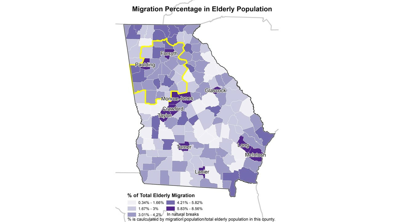 Figure 2 Migration Proportion in Local Elderly Population We also apply the multiple linear regression to identify those sociodemographic characteristics and other variables most associated with high migration rates. We included the long-term care facility capacity (number of beds), total population, hospital availability, percent with disabilities, low education (less than college or equivalent) percentage, low racial diversity (using the entropy of race diversity), and more (see the full list of variables in the note). Among all four statistically significant variables (significant level < 0.01), the hospital availability has the biggest positive effect on the migration count, followed by the median house value and total LTC capacity, while the crime rate has a negative influence on the dependent variable. The disability proportion is significant at 0.1 level with a negative impact on migration. Those variables explain about 92.2% of the dependent variable, the raw count of migration population (Adjusted R2 = 0.922). By understanding the associated characteristics of elderly migration, local government and policymakers can better plan the regional development to meet the needs of elderly migrants. More analysis can be done to separate interstate and intrastate migration since they may be attracted by different regions and different aspects of the destination. Including other variables, such as tax structure of the destination, may add more flavor to this as well. However, it is important to keep in mind that there is information not in the map or available data, thus, there are known unknown parts in this research. Data can only tell the story about numbers, and it will be necessary to have some community engagement to better understand the situation. For example, I will talk with seniors about their needs and concerns in some neighborhoods. As the starting point of my dissertation, these ideas can lead to further dive into the reasons that lying behind these patterns. Note: The considered independent variables for each county include: total LTC facility count, total LTC capacity (total LTC facility beds), LTC facility beds per 1,000 elderly people, total population (at 1,000), total elderly population (at 10,000), elderly population proportion, hospital availability (hospital count within 10 mile buffer of that county ), male proportion of all age, citizenship proportion of all age, disability proportion, low education (less than college or equivalent) percentage, labor force participation rate, wealthy proportion (ratio of income at or above 400% of the poverty threshold), poverty proportion (ratio of income below 100 percent of the poverty threshold), entropy of diversity, percent rural, crime rate (per 100,000), and the median home value (at $1,000). Reference: Clark, D. E., T. A. Knapp, and N. E. White. 1996. Personal and location-specific characteristics and elderly interstate migration. Growth and Change 27 (3):327–351. Litwak, E., and C. F. Longino Jr. 1987. Migration Patterns Among the Elderly: A Developmental Perspective. The Gerontologist 27 (3):266–272. Northridge, M. E. 2012. The strengths of an aging society. American journal of public health 102 (8):1432. Ortman, J. M., V. A. Velkoff, and H. Hogan. 2014. An Aging Nation: The Older Population in the United States. http://bowchair.com/uploads/9/8/4/9/98495722/agingcensus.pdf. AuthorAuthor Xuan Zhang is a Ph.D. student at the University of Georgia in the Department of Georgia. Her research uses GIS to investigate the elderly migration and long-term care facility accessibility issues under the umbrella of Health Geography.
|
Archives
June 2024
Categories
All
|
 RSS Feed