|
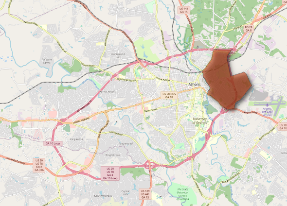
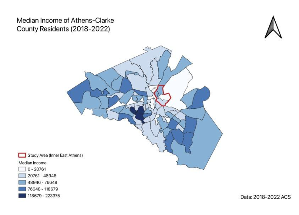
By Logan Wiley Last month, my labmate Annie and I presented our research on the Athens eviction landscape at UGA’s annual Center for Undergraduate Research (CURO) Symposium. We had spent many of our research hours in two places: at the Athens Magistrate Court Office digitizing eviction files or in the Community Mapping Lab entering data into our online dashboard. So, discussing our work with professors, community partners, and other student researchers offered a refreshing and rewarding culmination of our effort during the semester. Our poster focused on the relationship between eviction filing and non-local property ownership, visualized by our map of eviction hotspots in the county and filings identified by non-local and local ownership. Through my work on the project this year, I developed my understanding of mapping’s role in analyzing housing inequities but also realized that our maps lack many of the causes and contexts necessary for addressing these issues. Our updated map of eviction filing hotspots and rental property ownership showed four eviction hotspots dispersed in west, east, and north Athens. Most of these hotspots concentrate around apartment complexes including Lexington Heights, Arbor Ridge Apartments, and Hidden Pines Apartments. Based on my readings of the files, tenants often receive an eviction affidavit after being late or partially behind on rent due to job loss or temporary illness. From my perspective, eviction filings exacerbate housing insecurity in impoverished areas of Athens and perpetuate income inequality. Along with updating our visualization of the eviction hotspots, we wanted to analyze how nonlocal property speculation affects housing insecurity in Athens by investigating the business locations of evicting property owners. This analysis was overdue after the purchase of duplexes by non-local investment company Prosperity Capital Partners led to rent increases and displacement for low-income Athens tenants in June 2022. I would like to expand analysis of nonlocal property ownership to include some statistical analysis, but for this poster we conducted preliminary examination and visualization of nonlocal speculation. Out of the twelve property owners with more than fifty evictions filed within their properties, nine of them are based outside of Georgia (75%). Prosperity Capital Partners dominates the list with more than 350 filings across their many Athens properties, equating to more than 10% of all eviction filings recorded within our period of analysis. The next highest evicting owner, Filmore Capital Partners, has about 175 filings recorded, half the amount of Prosperity Capital Partners. Even from these first analytical steps, it’s clear that non-local property speculation plays a role in displacement and must be considered for future policies and housing activism. The updated hotspot and nonlocal property ownership analysis produced engaging discussion before and during the conference, but I believe the next phase of the project must find a new community partner or expand our local network to properly use our data and inform organizations addressing the housing crisis. Mapping where evictions occur has been an important foundation for the project; now, we must expand analysis on why evictions occur and how we can address displacement in our community.
So far, we have worked well with the local government and the activist group Athens Housing Advocacy Team (AHAT), but I feel that the project lacks the experiences of tenants experiencing the housing crisis. Although still vague, I hope to help include more community perspectives in further analysis, possibly through alternative mapping methods or explorations of the roles of gender, race, and language in the experience of housing insecurities. After developing a strong research network in the Community Mapping Lab and learning practical skills through geospatial analysis and visualization, I feel confident to identify and fill in the blind spots of our current eviction analysis. Logan Wiley is an undergraduate at UGA majoring in Geography and Psychology. He has been working in the CML for the last two years. By Margaret Hersey, Community GIS student Spring 2023
The Community GIS course functions similarly to other GIS courses by strengthening students’ technical skills in popular software such as ArcGIS Pro, QGis, and ArcGIS online. However, the scope extends far beyond the glowing monitors and classroom walls. During this course students are given the rare opportunity to step out of the classroom and collaborate in meaningful and equitable partnerships for community-based research. Our course instructor (Dr.Shannon) provides students with theoretical frameworks that illustrate the context in which we work with the community and enable us to work collaboratively and meaningfully towards community empowerment. Topics include Critical GIS, situated mapping, community geography, and counter-mapping. This semester we focused on two projects, each involving members of the Athens-Clarke county community. For the second half of the semester, our class worked with the Athen’s Housing Advocacy Team (AHAT), whose goal is to empower the tenants of Athens-Clarke county to fight for housing justice by providing access to information and resources. Rather than simply documenting evictions, they actively challenge inequalities and the processes that produce them, leveraging maps to draw attention to and alter public perception of evictions within Athens, Georgia. AHAT team members spoke with our class and shared their experiences working with Athen-Clarke County tenants. Their willingness to share these experiences allowed us to gain new perspectives of social and spatial inequalities within Athens that an ‘objective’ map alone could not. We learned that AHAT emerged shortly after the COVID-19 pandemic, following mass evictions of immigrant communities within Athens-Clarke County. Three years later, in 2023, many community members are still dealing with financial instability and economic hardships caused by the pandemic–now, without the protection of the CDC’s eviction moratorium (An order that allowed additional time for rent relief and prevented persons from being evicted from their homes). In addition to COVID, the county has faced increased housing demands due to an influx of students enrolling in the town's local college, the University of Georgia. The university has, on average since 2014, admitted 625 additional students per year– and doesn’t show signs of slowing anytime soon. Despite this, the university has only built one dormitory since 2014– causing many students to seek housing off-campus and compete for homes with permanent residents. The community has seen drastic rent increases followed by the displacement of community members who cannot accommodate the rising prices. In recent years real estate companies have responded to this growing student market. One of these companies– Prosperity Capital Partners, purchased hundreds of working-class units in lower-income areas of Athens-Clarke County to renovate and sell at a higher price point. In some cases, they increased rent by as much as 93%. Many residents also received a 30-day notice to vacate their properties– a violation of Georgia law. Breaches like these are not uncommon in eviction cases, and AHAT aims to identify those violations and equip tenants to handle them through resources like their eviction defense manual. The eviction manual is designed to inform tenants of their rights and gives a brief walk-through of the eviction process. Our Community GIS class worked together to identify what questions we could answer with the data we had. From there, we decided which of those questions were the most relevant, helpful, and feasible. Feasibility was a factor since we had only two weeks to work on the projects. Each group was then given a topic that focused on either landlords, tenants, or the Athens Eviction Prevention Program. One group mapped how housing stress affected eviction patterns, while another worked on determining the cause behind most evictions and the average eviction timeline in Athens. My group examined the distribution of landlords at local and global scales, choosing to map the locations of landlords who own the most properties and landlords with the highest number of evictions. First, we filtered the Athens-Clarke County parcel zoning data to find parcels in residential zones without homestead exemptions. To be granted a homestead exemption, a person must occupy the home, which is considered their legal residence. So parcels without homestead exemptions were considered rental properties. For each remaining parcel, we obtained the owner's address and the number of properties they owned in Athens, Georgia. We then joined this dataset to our ArcGIS project and geocoded all owner addresses. We used a visualization technique referenced by Taylor Shelton in his article, “Situated Mapping: Visualizing Urban Inequality Between the God Trick and Strategic Positivism.” Using flow maps, Shelton mapped the relational geographies of vacant and abandoned properties in Louisville, Kentucky. We used flow mapping and proportional symbology to visualize the connection between landlord and tenant locations. Understanding the distribution of landlords can provide insight into housing and help inform decisions for zoning, housing policies, and rent control. It can also provide a source for future researchers to draw from. By Dy'Amond Mcghee, CML CURO student
The COVID-19 pandemic has increased the number of people at risk for eviction. Since January 2021, Georgia’s rent prices have increased by 22% per year, making Georgia the sixth highest rent increase in the U.S (United States) [1]. In Athens-Clarke County, we believe that there is inadequate data on the number of evictions that have occurred during the COVID-19 pandemic. The number of evictions in Athens-Clarke County is estimated to be higher than people would believe due to the COVID-19 pandemic. With no eviction data collection or research, a lot of residents cannot take advantage of several COVID-19 emergency relief rental assistance programs. If we can prove that there is a large number of people being evicted in the Athens-Clarke County area, then more people could get rental assistance and help from government programs. The Community Mapping Lab is currently working with community-based partners such as the Athens-Clarke County Magistrate court, to collect and visualize important data on the progression of evictions and levels of housing insecurity in Athens. While working with the Magistrate court we are able to go to the Magistrate court office once a week and scan up to 50 ACC eviction files per week. With this data we will be able to enter specific information from the file into a spreadsheet and an ArcGIS dashboard to see where and why people in ACC are getting evicted. Are people getting evicted for rent increases, loss of a job, or waiting on the GRA program? For scanning the eviction files at the courthouse, we used the CZUR Shine Pro scanner. The scanner attaches to a laptop with a USB cord and has a foot petal attached to the scanner. This instant scanner allows us to scan an average completed eviction file in minutes. After scanning the eviction files, we enter the necessary data into a spreadsheet. The spreadsheet includes the case number, the property owner, the tenant's name, code name, the date the case was filed, and the result of the case. We take the data for each case in the spreadsheet, and then enter more data into the ArcGIS dashboard. ArcGIS is a cloud-based mapping software that allows us to make maps, analyze data, and share our findings. Some additional information that we input in the ArcGIS dashboard is a code name for the tenant, the location of the rental property, the reason for the eviction case, the action taken by the tenant, the court date of the case, and the results of the case. Over the last ten weeks of working with the Athens Eviction Mapping project, I have found several interesting trends on evictions in ACC. First, the majority of the cases that were filled from January 2022 - February 2022 did not have an end result, meaning that we are unable to know if the tenant was officially evicted or if the voluntary vacated the premises. The second trend I found was that tenants that applied for the GRA program were sent a warrant to be evicted from their unit within a month or two of nonpayment. I realized that the GRA program is taking a long time to get back to tenants and rental properties on if they will grant assistance to a tenant or not. Lastly, I have seen a trend that people that were evicted in the beginning of 2021 were typically evicted from the same few apartment properties. If we continue with this eviction mapping project, we could find out why people are being eviction so much from these several apartments and try to get these tenants more help. The data that we have collected so far concludes that Athens-Clarke County does have a high eviction rate and that citizens here do indeed need funding for rental assistance from the State. References: [1] Raymond, Jonathan. 2021. “Rent Increases in Georgia This Year Were Sixth-Highest in the Country, According to Study.” 11Alive. By Matt Cassada
Student in Community GIS, Spring 2022 When we initially started the 1958 Athens Census Mapping Project, I had initially a good idea of what I wanted to do since I noticed two distinct features with the Athens Census Mapping Data: population of the entire area along with businesses around the area. Next, I considered the timing of when this mapping took place which was in 1958. During this time, segregation was still a lingering issue across the Deep South, and this was true in both major urban and rural areas. Finally, I noticed that this mapping data also included major businesses around the Athens area and this included pretty much everything that was a business: federal businesses, food, entertainment, religious groups, and many more. With these central ideas already placed for me, I decided upon the following observations:
With this plan, I decided to then form my central question/argument for the project which is: "Based on the location/concentration of either colored or non-colored owned businesses, does the population distribution of colored and non-colored residents seem different across Athens-Clark county area? Do you also see a population distribution difference based on if the particular resident was either a colored or non-colored resident? Is their a particular business that could be made out where we see the strongest correlation and is their one with the lowest correlation in relation to Athens population data and business location’s?" With these questions in place, I then progressed into making my own maps. We all started with a excel/point data of the Athens 1958 Census Data, which we got thanks to cleaning out the initial data. I knew that I had to create two initial data sets just for the residents of the area I made two different point data sets, one for colored residents and one for non-colored residents. This proved to be easy since each resident is listed out if they are colored or non-colored residents. I then inputted the point data into ArcGIS and I then signaling out/deleting the data that was needed for each point set. Thus, when I did this, I ended up with two different point data sets for both colored and non-colored residents. Initially, you do see some distribution differences in the point data. First, we see that the non-colored residents are more spread out across the Athens area and they are not as centralized. This is different for colored residents who were more centralized near downtown Athens and east of Athens. Colored residents were also less dispersed and more organized compared to non-colored residents. They we more organized in that they were more grouped together. When it came to making the business points, I must first start off and say that given that data wasn't 100% complete. We still had some business points that were not complete and plenty of businesses that were not registered in the excel data. But I still pressed on with my maps since I still had just about over 300-400 businesses I could look at. To make the point sets for the businesses, I first needed to make some distinctions between businesses. Since I wanted to look at what kind of businesses had the greatest correlation for residents, I needed to focus businesses out of each point data set and give them their own distinction. After looking through each business, I noticed four different business categories:
With these distinctions in place, I implemented the same overall process I did when it came for the residents in Athens. I cross referenced the points that were businesses and centered on those. I then went through each point individually to look at what category they would fall under based on the distinctions I made. I then repeated this process for all four different business categories. Finally, when it came to patterns that I noticed with the businesses and its correspondence to residents, the one business I noticed that had the most central concentration was near religious businesses, like churches. The one business that had the least appeared to be food businesses, with very little shown correlation between the two for either resident. In conclusion, this mapping project proved to be insightful to me. As someone who has never lived in Athens, its interesting to see how the demographics and businesses across the city has changed since the late 1950’s. This project showed not only how residential demographics has changed, but also how businesses across downtown Athens have shifted: from more of a rural area to a more college-themed town. By Elijah Humphries
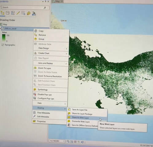
Student in Community GIS, Spring 2022 When discussing topics of racial justice, generational wealth is a topic of utmost importance, and land ownership specifically is well explored. The “land as liberation” ideal and the historical factors surrounding different movements towards and away from the accumulation of generational wealth in the form of land ownership for the African American population in the South has been tested by various movements. For example, Fannie Lou Hamer’s Freedom Farms sought to return land to Black people in the South and achieve a level of autonomy and independence from a political and economic system that shamelessly segregated and disadvantaged them. But the benefits of land ownership are multiplicative. A landowner gains a larger stake in their community and the ability to slowly build that wealth, then pass it on to their children. By 2021, 27% of American wealth was in the hands of the top 1.0% of the population, this gap has only grown since then, and about 40% of wealth in the US is inherited (Source). So when we consider how, despite movements to fix the divide, generations of African Americans were denied the ability to buy and own land, there’s a clearly forced inequality in that sphere which allows people to build generational wealth. It was intentional, too. The Housing Act of 1949 cleared the way, quite literally, for a clean sweeping of the urban poor, because it allowed governments to do away with poor or substandard housing in urban areas, called urban renewal, as more affluent citizens moved to the suburbs. With the advent of urban renewal projects, governmental officials had the toolset to clear “blighted” or “dilapidated” areas in their jurisdictions, but these overwhelmingly targeted Black populations and other minority groups. In more recent years, urban renewal practices are viewed as discriminatory across the board. The U.S. Commission on Civil Rights published a briefing report in 2014 titled The Civil Rights Implications of Eminent Domain Abuse, which analyzed two Supreme Court cases, Berman v. Parker and Kelo v. City of New London, looking at the decisions, critiques, and several studies and briefings that identified cases of eminent domain abuse and its effect on poor and minority communities and how that might be interconnected with civil rights. The report noted a 2007 study titled Victimizing the Vulnerable: The Demographics of Eminent Domain Abuse which found a disproportionate impact on communities with the least power: “more residents in areas targeted by eminent domain-as compared to those in surrounding communities-are ethnic or racial minorities, have completed significantly less education, live on significantly less income, and significantly more of them live at or below the federal poverty line. Here in Athens, one such area was Linnentown, a neighborhood adjacent to the University of Georgia campus. Starting in the 1950s, the University and the City of Athens began making moves to condemn land so that the University could expand. The University of Georgia campus was almost entirely surrounded by residential properties, and had plenty of land to look at for expansion, including through buying it at a fair price, but instead worked to have the Linnentown residents forcefully removed from their homes. First, by making it a completely unsafe place to live, and followed by more aggressive measures, until they were told that they simply could not live in their own homes anymore, that they had been bought by the University at a pittance, and that they would have to find new places to stay. The University refuses to acknowledge its role in these proceedings, or that it participated in what is widely known to be racially discriminatory practices for its own benefit. As students, and people interested in doing what is best for our community, we should keep pushing for recognition and reparation. Our class is working to create more recognition for the people who seek to right these wrongs. By offering our time and capacity as students, we help put together marketable information that will help more people understand what the University and the City did, and why those actions were detestable and worthy of condemnation. As more and more of the information we consume is transferred over a digital medium, it becomes more important to make history more accessible and clear to others. By contextualizing and narrating the circumstances and proceedings of the urban renewal project that destroyed Linnentown, we bring the issue back to the attention of our peers and contemporaries. I’ve been working on a storymap, a web page that allows anyone to scroll through a narrative experience curated by myself and the rest of the class, that will display much of the information surrounding both the historical events and the contemporary actions we and others have taken. By Claudia White Community GIS student and CML research assistant, Spring 2022 This semester, I am taking Community GIS with Dr. Shannon and working with the Community Mapping Lab on various projects, including creating a StoryMap of Linnentown (a Black residential community in Athens displaced by urban removal in the 1960s), digitizing a street network, geocoding addresses, and cleaning data records from a 1958 Athens directory. One of our assignments was to create a map using the 1958 Athens directory and the street network that we digitized. The city directory included a listing of residents, businesses, and organizations in 1958 and their addresses. Data on residents included several variables, such as occupation, race, the number of dependents, home ownership status. Using the address data and resident data, I decided to create a map about the commute time of maids to look at patterns of travel (time, length, etc.) clustering of living vs working addresses. The current map is hosted on ArcGIS Online, but I first tried to make it in ArcGIS Pro. Here be the practical things I have learned while making this map. 1) Creating Maps for the Public There are a million tiny decisions to make when creating maps from scratch. Creating visualizations for yourself is one thing, but creating maps for the general public is another. When creating maps for others, make sure you are creating visuals that are both easy to understand and easy to look at. Keeping design principles in mind is key. My first map draft had colors that were difficult to distinguish, lines that were hard to separate from the background streets, and symbols that were too small to see (Figure 1). With Dr. Shannon’s help, I thought about figure-ground, visual contrast, and legibility. To make the map easier to read, I made the background road network more transparent, set route colors to very contrasting colors and put a drop shadow on the routes to make them more discernible from each other and the background. I also made the symbols larger so they were more visible. I then made each maid’s route, living, and working address the same color, so that the viewer could easily see which route and addresses corresponded with each maid (Figure 2). 2) ArcGIS Pro a) Use snap when digitizing in ArcGIS Pro. Digitizing images in any GIS software can be tedious, but if you are using ArcGIS to turn an image into features. I highly recommend using the “snap” setting. Turning on snap allows you to minimize topological errors as you digitize (making sure your lines meet up and your polygons are closed. This setting was very helpful when digitizing the 1955 street network for Athens. It made sure that I only created lines that connected to a point on another existing street line. You can turn the snap setting on and off through the dashboard. b) Depots are origins and orders are destinations. When creating a driving route in ArcGIS Pro using street networks, you can use the Make Vehicle Routing Problem Analysis Layer. This function will only create a network analysis layer. After creating the layer, you then have to input points that you want to be used to create routes within the network analysis layer. When using sets of origin and destination points (ex: if you want to calculate your commute from your home address to your working address), it is important to note that “depots” are origin points and “orders” are destination points. c) You can create tiles from raster data using the Create Map Tile Package. This function uses data from a map pane and compresses it into a tile package that can be used in ArcGIS Online. Make sure the only data on your map pane is the data that you want to tile. Before using this function, you have to add a description, summary, and tags to the data that you are tiling. You must then input the corresponding summary and tags into the geoprocessing pane for the Create Map Tile Package function. d) You can share map layers as Web Layers for ArcGIS Online. If you right click on a layer in your map, you can share that layer as an online web layer that can be used in ArcGIS Online. This tool can be used on raster and vector data. You must add a summary and tag(s) of the layer. Once you share the layer as a web layer, the layer is automatically uploaded to your ArcGIS Online content and can be opened, viewed, and stylized in ArcGIS Online. This is particularly useful if you have styled a layer in a particular way because it maintains the layer’s symbology. 3) ArcGIS Online
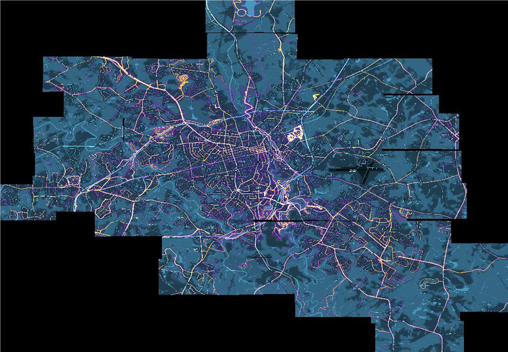
a) Map Viewer Classic is picky about data users can upload. When using ArcGIS Online to create a map based on the 1958 Athens directory for this class, I learned that ArcGIS online only accepts certain types of data. In Map Viewer Classic, users can only upload a zipped shapefile, CSV or TXT files, GPX, or GEOJSON files from their files. Of course, users can also use data that is hosted by ArcGIS Online, but the types of data the user can add and manipulate is limited. b) Map Viewer Classic vs New Map Viewer: Uploading data In Map Viewer Classic, users are able to add data directly from a file. In the new Map Viewer, users have to jump through a couple more hoops. When using the new viewer, users must first upload their data from file to their content page in ArcGIS Online. When uploading data, you should check the box that adds the desired file AND creates a hosted feature layer. This ensures that you will be able to easily add uploaded data to the map viewer. c) It does not like raster data. ArcGIS Online is not a fan of raster data and is not compatible with tiff files. If you are using raster data, first look for any datasets that are already hosted on ArcGIS Online that display the information you are looking for. If you can’t find desired data and must upload an original raster dataset, the best way to do this is by converting your raster data set to tiles and then uploading the tiles to ArcGIS Online. Final thoughts In creating this map, I learned technical skills related to using different analysis toolboxes in ArcGIS Pro. I also learned how to navigate bounds of ArcGIS online. Most importantly I learned what factors to consider when creating maps for a public audience, including color contrast, symbology, and clear labeling. These skills will help me create more accessible and intuitive visualizations in the future. By Emilie Castillo For the past two semesters, I have worked as a CURO Research Assistant in the service of the Community Mapping Lab and BikeAthens towards the goal of creating a comprehensive cycling map of Athens-Clarke County (ACC). While the project will most likely continue into next fall, as of the end of this semester we have succeeded in creating a web-based map of biking routes throughout the county with classifications noting the safety/preference level of each route, bike lanes, multi-use trails, slope, points of interest, and bus stops. This project was undertaken at the request of BikeAthens for the purpose of making cycling in Athens an easier and safer alternate form of transportation. Alongside Olivia Gilliam, a fellow CURO Research Assistant, I worked as an aid to Dr. Jerry Shannon, who headed up this project in the Fall of 2019. In recent years, Athens-Clarke County Government as well as several community organizations have been interested in building up and refining the cycling infrastructure and resources of ACC. BikeAthens in particular operates with the mission of creating equity in transportation; when they requested the Community Mapping Lab undertake this project, they hoped the map would assist both novice and seasoned cyclists in planning rides throughout the county. That being said, this project was not concerned with classifying the safety level of every existing road or path in ACC, nor was its purpose to showcase recreational rides. The web map, as it is today, displays and classifies those routes necessary for travel throughout the county along with destinations determined as useful or necessary for those using a bike as their main form of transportation. When Olivia and I began working on this project in Fall 2020, a former student, Regina Nasrallah, had already worked with Dr. Shannon to determine some points of interest and classify some existing road data. Olivia and I began our research by collecting more points of interest (POI). First, we had to determine what were “useful and necessary” destinations for the people in this community and for cyclists in general. Grocery stores, healthcare clinics, bike shops, bike repair stations, bike parking, pharmacies, dollar stores and coffee shops were some of the categories we discussed; we needed to make sure we were being as inclusive as possible when compiling this list because we did not want our map biased towards any particular demographic, rendering it useless to large portions of the Athens community. After determining this list, we needed to collect the location, name, and service type of all the destinations in ACC falling under these categories. I relied heavily on Reference USA, a database of businesses located in the U.S. available through UGA’s Library website. We also extracted several locations from OpenStreetMap. In some cases, a list had already been partially compiled for some destination types, but for the most part we had to search around to make sure we were getting everything. We then organized all these collected data points into a single spreadsheet and mapped it. At this point, we noticed how few points of interest are located to the East of the Loop/ SR10 and we added random location points occurring on the eastside in order to ensure our routes were not missing large chunks of the county. With the comprehensive POI data mapped, Dr. Shannon used R software in conjunction with Google, HERE, and Mapbox routing APIs to generate approximately 1,500 routes for each routing service between all our identified POI’s (over 600 points). We identified common streets used by those three services and aggregated them to make our first draft routes. At this point we began to classify the routes, relying heavily on speed limit as an indicator of safety. Later, BikeAthens helped us better classify routes as safe and unsafe from their personal experiences as cyclists in Athens. We were using Strava Heatmap data as a point of reference to determine if the routes we had were ones actually travelled by cyclists and to identify routes we may have missed entirely. I georeferenced screenshots of the Strava Heatmap for the entire county so we could easily compare and edit our data within QGIS. A large portion of this spring semester has been focused on editing the existing bike routes. Dr. Shannon generated slope data for all the road routes from elevation data provided by Athens-Clarke County. We attempted to gather public feedback through a Survey123 form that allows the user to comment on specific locations of our draft map; however, as the COVID-19 pandemic persisted, public feedback became challenging and often disappointing.
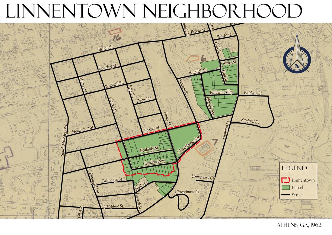
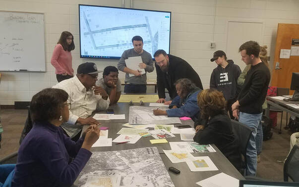
Once we had edited our draft routes to some degree of satisfaction, we began transferring our data from QGIS to ArcGIS Online to begin configuring the web app. We focused on cleaning things up to ensure the map would be easy and intuitive to read. We trimmed down our initial POI data to a smaller pool of points and set the transparency level of that data as smaller than that of the routes so as not to overwhelm the reader upon opening the WebApp. We also began to discuss the best way to color routes, bike lanes, and trails. Further, we determined the best symbols to denote our points of interest and slope. Daniel Sizemore, Bicycle, Pedestrian, and Safety Coordinator from ACC Unified Government, assisted us and is still in the process of organizing data to provide our map with a more comprehensive list of bike lanes. We reviewed several other similar bike route maps of other cities such as Vancouver, Portland, Madison, etc. to get a better idea of how to visualize the data. Dr. Shannon and I worked on creating a print map for BikeAthens staff and patrons to mark up physically, but again, community feedback was difficult and less fruitful than we hoped. Now, as the semester is ending, we feel that we have a solid draft to start distributing to the public, with the understanding that the routes will continue to be refined and updated throughout the rest of the year. In our final meeting with BikeAthens, we discussed the possibility of one more semester’s worth of work in collecting that much-need feedback from the community. BikeAthens is interested in creating some formats of the map that can be easily printed, possibly even some pocket size maps to be kept at BikeAthens and other biking resource locations. I really enjoyed working on this project and feel I learned a lot about GIS project management. It was extremely valuable to see first-hand what it is like to work with local organizations and utilize those available resources in showcasing data. Before this experience I would not know how to even start, and now I feel confident in my ability to organize the steps of a project like this and be a part of the construction. The COVID-19 pandemic kept us from meeting in person and facilitating more community events where we could have generated feedback and creative collaboration, and that setback was felt by all of us. Zoom fatigue and generally busy schedules made me feel like I did not engage with this project as whole-heartedly as I could have. A part of me wonders if we had been able to meet in person whether we would have gotten more done in that first semester, giving us more space for creativity in the second semester. All things said, I am really proud of our final product and I hope to stay in the loop about the future of this map and its impact. Emilie Castillo recently received an undergraduate degree in Geography alongside a certificate in GIS at the University of Georgia. By Jerry Shannon Related posts: Aidan's reflection | Katrina's reflection Many southern universities have faced increased calls to deal with complicated histories of racial exclusion. At the University of Georgia, pressure for the institution to explicitly address the historical legacies of slavery was increased by the 2015 discovery of 105 remains near Baldwin Hall on campus, unearthed during construction of a building expansion. Subsequent testing revealed that many of these individuals had African ancestry, and given the historical period of use for the adjacent city cemetery, this implied that most were likely enslaved. These bodies were reinterred by the university at a nearby active cemetery, but without consultation with leaders from the local African-American community, which caused further tension. In response, the university has made efforts to acknowledge its historical complicity with enslavement, creating a memorial that honors those buried at the Baldwin Hall site and sponsoring two related research initiatives. The first resulted in the online Athens Layers of Time portal, which provides materials about the Baldwin Hall burials specifically and the historical expansion of campus. The second, currently ongoing, is examining the role of enslaved people in the university’s life from its founding through 1865. UGA also joined the Universities Studying Slavery consortium in December 2019. Both efforts are the result of advocacy by community members and faculty for the university to address historical legacies of enslavement. Still, the university’s relationship with the local African-American community remains fraught. Only 7.5% of undergraduates and 5% of faculty identify as African-American, while nearly half of service and maintenance staff do. The numbers for student and faculty are far below rates in Clarke County (29%) and Georgia (32%). Specifically, there are rising concerns that new student housing is displacing low-income African-American residents, raising property taxes and putting upward pressure on rents. The Linnentown Project is one local effort to call attention to these issues. It focuses on the Linnentown neighborhood, a historically black area just west of campus that was demolished in the early 1960s to make space for new student dormitories.Residents of this neighborhood--many of whom were home owners--were most often forced out through the use of condemnation findings and eminent domain. Through public forums and public protests, residents have told the story of their forced removal from the neighborhood, advocating for compensation for financial losses, and further research around the university’s role in slavery and displacement. Joey Carter, who has helped lead the Linnentown Project, had previously identified multiple records about this redevelopment in special collections at UGA Libraries. These included maps of the neighborhood used to plan property acquisition, correspondence from UGA administrators and legislators about the urban renewal funding used for construction, and detailed records about each property acquired. While he was able to do initial analysis of some of these data, the scanned records had more data than the group could easily enter and analyze. This spring, students in the Community GIS course offered by Dr. Shannon sought to support this effort through digitizing and analyzing these archival records. More specifically, students in the class focused on the following tasks:
The goal of this project was to crowdsource some of the data entry aspects of this analysis as well as to build a database that could supplement residents’ existing narratives of their displacement. As former resident Hattie Whitehead noted at the beginning of the project, Linnentown was for decades a neighborhood that existed primarily in the memories of those who lived there. By putting it literally “on the map,” our class aimed to provide materials that preserved those memories and provide visual representations that could be used for future education and activism. To adapt Baudrillard’s famous quote, our mapping helped “engender” the territory of Linnentown--giving physical representation to an already existing social reality.
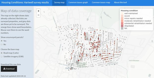
This was, of course, an especially challenging semester for all university classes. In addition to the already existing challenges of coordinating this work among a class of 18 students, we spent a full third of the semester communicating only digitally through Zoom and online discussion boards. Digitizing records for neighborhoods and streets that no longer exist was also a challenging task for the class. Two graduate students in this course--Aidan and Katrina--have written blog posts about their experiences in the course. In final reflections, other students were clearly impacted by learning about this history and being part of the larger project. Many students have lived in the dorms built on this land, which made it especially personal, and talking with former residents about their experience gave life to the archival data they had been working with. Overall, the goal of our work as a class was to make this chapter of the university’s complicated history more legible and help amplify the experiences and perspectives of Linnentown residents. We hope to further refine these records in the future in coordination with the Linnentown Project. Author Jerry Shannon is an Assistant Professor at the University of Georgia in the Departments of Geography and Financial Planning, Housing, & Consumer Economics. He is the director of the Community Mapping Lab. Jerry Shannon A few weeks ago, I and roughly 8,000 other geographers attended the annual American Association of Geographers (AAG) meeting in Washington, D.C. While it can be exhausting--AAG has dozens of sessions going on at any given time--these meetings are a great chance to see friends and colleagues and meet new folks whose work I’ve only read or who I’ve only met online. (Despite the platform’s very real problems, I personally have benefited a lot from participating in #academictwitter). One moment that stuck out: I was talking with Peter Johnson, a faculty member at the University of Waterloo, a morning reception hosted by the Digital Geographies Specialty Group. Peter does great work with open data and governance. For example, here’s one of his recent articles on the costs of open data, including the ways it subsidizes private enterprise and corporate influence on policy. Over the last decade, there’s been a strong push for open data initiatives across multiple levels, from cities up through international bodies such as the UN, which makes this work particularly salient. Companies such as ESRI and Socrata have created platforms for hosting and sharing these datasets, and the rhetoric around these tools emphasizes transparency and community engagement. Socrata’s page, for example, references a goal of “fully connected communities,” while ESRI touts its “two way engagement platform.” In my classes, I’m particularly fond of letting students analyze NYCOpenData’s records of yellow cab taxi trips, including more than 100 million trips with details down to the tip given for each one. Peter’s work, along with many others including Renee Sieber, Muki Haklay, Rina Ghose, Taylor Shelton, and Rob Kitchin, has examined how these projects play out on the ground, focusing on whether they live up to claims of citizen engagement and empowerment. As one might expect, results have been mixed. The people most likely to use these data are the ones with the education, training, and expertise to do so--a fairly select group. In my Community GIS class, I use this article on Data Driven Detroit as one example of this dynamic, where open data records on housing only strengthened investors’ ability to buy up vacant property. The alternative model presented in that article is one I’ve been thinking through as well, community-based projects that facilitate residents’ ability to interact with and make meaning from public data. I asked Peter about this dynamic in our conversation, and he mentioned a project conducted by the Canadian government where trained staff would work with remote rural and indigenous communities, helping them interpret census and other government data and understand their relevance to local concerns. In recent years, the Canadian government has increased the online availability of these data, but it has cut the number of trained staff who can work with local communities. In effect, open data portals replaced these staff, providing more “access” to data but curtailing the work needed to understand and interpret it. Recent developments in both open source and proprietary software have provided a number of tools for community-based data collection and open data for government records. But, as Alex Orenstein said at our recent community geography workshop, you also need to “check yourself before you tech yourself.” These platforms provide interfaces for accessing and visualizing these data, but they cannot fully replace the important work of helping community members articulate how the data may (or may not) match their own experience. I’ve been thinking about this in light of my now years-long work with Georgia communities through the Georgia Initiative for Community Housing. Along with my colleague Kim Skobba, I have been helping develop a toolkit for community-based housing assessments, one that uses free and open source software such as OpenDataKit and RStudio’s Shiny platform. These technological tools make it possible for even small rural communities to collect and map out detailed data on individual housing conditions, identifying common issues and facilitating outreach to specific property owners. At the same time, communities struggle with what to do with these data once it’s collected beyond simply noting patterns on the map. Similar to Taylor Shelton’s work in Lexington, I’ve been thinking about ways to work with communities to visualize drivers of problems identified through these data. By talking about landlords, zoning, and other historical factors, we can beging to talk about the problematic history of blight as a metric and its ramifications for community development. This isn’t work that can be solved by a platform or visualization software. It involves time and “soft skills”--listening, thinking, reading, and many conversations, before the work of data collection even gets started. Community members themselves often want to jump right into the technology, and so it is sometimes difficult to communicate the need to move more deliberately. This is hard labor, but as folks working in public participatory GIS (PPGIS) have long emphasized, it’s crucial to fostering sustainable, just change in communities.
Author Jerry Shannon is an Assistant Professor at the University of Georgia in the Departments of Geography and Financial Planning, Housing, & Consumer Economics. He is the director of the Community Mapping Lab. Recognizing Indigenous Cultural Ecosystem Services through Participatory GIS in Southeast Ecuador4/14/2019
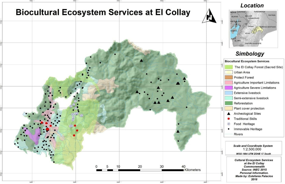
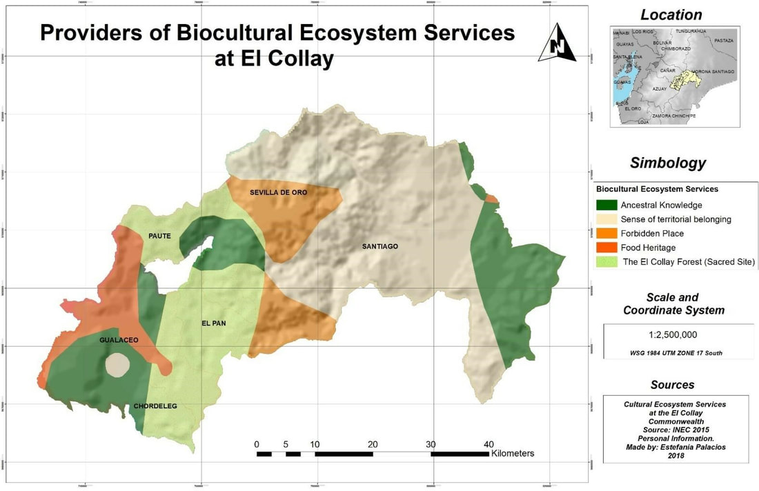
Estefania Palacios-Tamayo "We do not have weapons, but now we have GIS to protect our territory. We plan to conserve our natural resources for present and future generations through the maps, our maps." Domingo Ankuash, Shuar Indigenous Leader During the last five years, campesinos* (peasants) and indigenous people from Southeast Ecuador have started to use maps as a powerful tool for protect their territory against mining companies. Local people believe by mapping their biocultural ecosystem services and territorial boundaries, they are avoiding being cheated by mining companies or by the government. Between Amazon and Andes Ecuadorian region, there is located El Collay Territorial Association, that it is set up by campesino and Shuar indigenous population. 15 years ago, the Shuar communities were the first ecuadorian indigenous population in Ecuador to used participatory GIS. In order to go deeply into campesinos and indigenous Shuar's GIS experience defending their territory, I participated in some community participatory mapping workshops in the El Collay Territorial Association, for the past four years . In this article, I will talk about methodological experiences I have gained over these years and I will show a few maps about biocultural services identified by local communities actors. Background El Collay Territorial Association is a political and administrative entity formed by six local municipalities. All six are autonomous, decentralized governments: Paute, Gualaceo, El Pan, Chordeleg, Sevilla de Oro and Santiago de Méndez. This Territorial Association is in the northeastern corner of the Azuay Province in Southern Ecuador. One of the most important inhabitants of this Territorial Association is the Shuar indigenous people. They represent one of the most prominent ethnic group in the Amazonian Region, with around 35,000-40,000 living mainly in the Ecuadorian provinces of Pastaza, Morona Santiago and Zamora Chinchipe, in the southeast of the country. Since 2000, Shuar’s ancestral lands have been assigned for copper mining concessions “for the sake of development”** and, as a result, indigenous communities have suffered persecution and violence. The expropriation of the Shuars’ lands and resources has forced the indigenous community to fight off industrial-scale copper mine and oil extraction and threats to their lands and way of life. The Shuars struggle to protect their land despite peaceful marches, legal actions, and an international pressure campaign. However, in the last ten years, the Shuars have turned to mapping as a strategy in this effort. Four years ago, as part of my research process to obtain my master’s degree, I started working with campesinos and Shuars indigenous communities. In several conversations, local people pointed out that it is a need to establish community mapping workshops that allow them to delimit their ancestral territories and recognize biocultural services. Later and thanks to local governments and some Shuar leaders support, I managed few meetings and workshops where we gathered an important group of participants that contributed significantly to the project. My experience in Participatory GIS and Indigenous communities First, I had some meetings with local actors to explain them the objectives of this project and how Participatory GIS methodology works. There were around 30 participants between indigenous and peasants leaders, that they came from each small villages of El Collay. In a second meeting, I asked the community leaders to make a sketch of their nearest territory, that is, neighborhood or Municipality. Local people had to identify important cultural and natural sites. They used colors, pins and stickers to identify the different types of assets in the community. Once, first workshop finished, I realized that there were major criteria to characterize each small village. Therefore, we used the largest number of responses and create biocultural categories and then units of ecosystem services. As a result, we identified together the categories for important values by local people (i.e. arts, crafts and sacred sites). This outcomes helped me out to make the first map (fig 1). In addition, those decisions over their territory allowed me to integrate each biocultural category as a landscape units in order to give each small village a biocultural unique identity (see fig 2). The last workshop, I used a local map. In order to avoid bias about indigenous boundaries, I used data from the National Institute of Statistics and Census. I asked them to locate conflict points, that is, environmental, social and cultural problems affecting their territory and changing the landscape. According to local people, the principal territorial problemas are mining companies activities and deficiente local governments administrations. Third, once I finished workshops, I moved to geocoding some biocultural assets exposed by local actors, using ArcGIS 10.5. Finally, I made two maps about biocultural assets and biocultural ecosystem services. The first map (see fig 1) represents what local actors considered the five essential biocultural elements in their land: archeological sites or sacred sites, traditional skills, food heritage, immovable heritage, and forest (natural elements). Using the biocultural assets map base, I made a map about ecosystem services. So, I grouped characteristics of each small community and made ecosystem services landscape. However, each category can overlap each other, since each village could has all biocultural category in its territory. There are five landscape units: El Collay Forest, Ancestral Knowledge, Sense of Territory, Forbidden Place and the Heritage Food Place (fig 2). The criteria for the cultural ecosystem services classification are the following: El Collay Forest - This area represents an important element for the El Collay inhabitants, since in addition to be a zone of protection, it is considered a sacred space. Ancestral Knowledge - It refers to all the knowledge that has been acquired from generation to generation. As for example, the elaboration of crafts, textiles, food preparation, among others. Sense of Territory - It implies a closeness and an intimacy that is a product of experience, history and time. It demands that people develop an aesthetic sensibility that one gains only when population lives in one place for a long time. This service is mostly located in the Shuar indigenous territory, because for them the sense of territory is linked to the land where their ancestors were born and where future generations will belong. Forbidden Places - They are sacred places and therefore forbidden to carry out any human activity against natural resources. Heritage Food - They are characteristic places at local and national level for their gastronomy. Conclusion and Future projects There is still much left to do. I plan to continue working over this process in this summer 2019, using counter-mapping approach. The main future objectives are to map sites at risk and conflict, and resilience and resistance areas lead by local communities to mining companies impacts. In conclusion, the maps that have been generated from this participatory GIS process with indigenous and campesinos communities, provide a new way of understanding the world from different worldviews. PGIS maps also demand the integration of these new conceptions of territory, in local territorial planning and national protect biocultural heritage politics of ancestral populations. Notes *I use campesinos in Spanish because the word peasants has a negative connotation in English language **This phrase was part of the neo-extractivism speech by ecuadorian government, during 2014 Author
Estefania Palacios-Tamayo is a PhD student in Geography at the University of Georgia. Her research focuses on biocultural landscape dynamics for territorial planning and conservation of local heritage. |
Archives
June 2024
Categories
All
|


 RSS Feed