|
By Logan Wiley Last month, my labmate Annie and I presented our research on the Athens eviction landscape at UGA’s annual Center for Undergraduate Research (CURO) Symposium. We had spent many of our research hours in two places: at the Athens Magistrate Court Office digitizing eviction files or in the Community Mapping Lab entering data into our online dashboard. So, discussing our work with professors, community partners, and other student researchers offered a refreshing and rewarding culmination of our effort during the semester. Our poster focused on the relationship between eviction filing and non-local property ownership, visualized by our map of eviction hotspots in the county and filings identified by non-local and local ownership. Through my work on the project this year, I developed my understanding of mapping’s role in analyzing housing inequities but also realized that our maps lack many of the causes and contexts necessary for addressing these issues. Our updated map of eviction filing hotspots and rental property ownership showed four eviction hotspots dispersed in west, east, and north Athens. Most of these hotspots concentrate around apartment complexes including Lexington Heights, Arbor Ridge Apartments, and Hidden Pines Apartments. Based on my readings of the files, tenants often receive an eviction affidavit after being late or partially behind on rent due to job loss or temporary illness. From my perspective, eviction filings exacerbate housing insecurity in impoverished areas of Athens and perpetuate income inequality. Along with updating our visualization of the eviction hotspots, we wanted to analyze how nonlocal property speculation affects housing insecurity in Athens by investigating the business locations of evicting property owners. This analysis was overdue after the purchase of duplexes by non-local investment company Prosperity Capital Partners led to rent increases and displacement for low-income Athens tenants in June 2022. I would like to expand analysis of nonlocal property ownership to include some statistical analysis, but for this poster we conducted preliminary examination and visualization of nonlocal speculation. Out of the twelve property owners with more than fifty evictions filed within their properties, nine of them are based outside of Georgia (75%). Prosperity Capital Partners dominates the list with more than 350 filings across their many Athens properties, equating to more than 10% of all eviction filings recorded within our period of analysis. The next highest evicting owner, Filmore Capital Partners, has about 175 filings recorded, half the amount of Prosperity Capital Partners. Even from these first analytical steps, it’s clear that non-local property speculation plays a role in displacement and must be considered for future policies and housing activism. The updated hotspot and nonlocal property ownership analysis produced engaging discussion before and during the conference, but I believe the next phase of the project must find a new community partner or expand our local network to properly use our data and inform organizations addressing the housing crisis. Mapping where evictions occur has been an important foundation for the project; now, we must expand analysis on why evictions occur and how we can address displacement in our community.
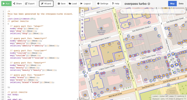
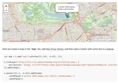
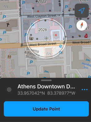
So far, we have worked well with the local government and the activist group Athens Housing Advocacy Team (AHAT), but I feel that the project lacks the experiences of tenants experiencing the housing crisis. Although still vague, I hope to help include more community perspectives in further analysis, possibly through alternative mapping methods or explorations of the roles of gender, race, and language in the experience of housing insecurities. After developing a strong research network in the Community Mapping Lab and learning practical skills through geospatial analysis and visualization, I feel confident to identify and fill in the blind spots of our current eviction analysis. Logan Wiley is an undergraduate at UGA majoring in Geography and Psychology. He has been working in the CML for the last two years. By Nemin Wu, Student in Community GIS, Spring 2022 Imagine that you had to create an interactive map of points of interest (POI). What if that map had to have pop-up windows to display all the essential information? Where to find the base map? How to get the precise coordinates of the potential POI? What codes control the zoom-in and zoom-out functions of the map? How to publish the web map? If you’ve never had any open GIS experience, these may be all tricky problems. However, with open-source, you may be surprised to find that all the data and techniques are more transparent and accessible to the average audience than you thought. Towards the end of the semester, we started our final project in the Community GIS class: mapping businesses in the Unite Against Discrimination Movement (UADM) list in downtown Athens. Our goal is to update the list of businesses of the United Against Discrimination campaign and create an interactive map showing these businesses on the Athens Anti-Discrimination Movement (AADM) website. In this project, we leverage the power of data and techniques from lots of open sources such as OpenStreetMap, QGIS, Leaflet, and GitHub). OpenStreetMap To update the AADM’s business sites through field canvassing and confirm all these businesses are displaying AADM’s list sticker in their windows, the primary step is to get the locations of the relevant businesses. OpenStreetMap, as the name suggests, is a collaborative open geographic data source. Since it’s not owned by anyone, there are no legal restrictions on its use. Everyone has permission to download and employ the latest data of their research area. Fig.1 shows the codes we used to search for business sites in downtown Athens. The queries may be a little bit confusing to read, and you might be concerned about how to code these. However, the truth is that we didn't type a single line of code manually, because they were all generated automatically through the wizard window. Editing the data in OSM is also incredibly user-friendly. After the field canvassing, we updated the OSM map since some stores have moved (Fig. 2a, Eye Candy moved to the South Milledge) and others were not previously displayed on the map (Fig. 2a, Rook and Pawn is newly added to the map). Once you are satisfied with your changes on the OSM website, you can upload them to the servers, and the map will be updated. It’s also very convenient for the users to check the editors and the version history on the history tab. In this way, OSM offers the public to draw the features efficiently and accurately on its map. QGIS Similar to the OSM, QGIS is not owned by anyone, so it won’t hold people back from using them in creative, productive ways like other GIS closed source software. In this project, we used the QuickMapServices plugin to find the appropriate base maps, we employed the QuickOSM plugin to import OSM data based on the Overpass API, and we installed the qgis2web plugin to generate web maps based on Leaflet from current projects. All the codes of QGIS are accessible on GitHub. In addition, free access is also very attractive for researchers with tight budgets. Leaflet At the end of the project, we needed to generate a web map of all the businesses listed on the AADM’s list. To get around this, we chose the open-source JavaScript library, “Leaflet,” to generate the interactive maps. It has tons of interactive mapping functionalities. Fig. 3 shows the readability and simplicity of the source codes in Leaflet. It also provides lots of base maps choices on the Leaflet Provider website. I used to be a little biased, assuming that open-source databases and services might be difficult to use and maintain because they are accessible to everyone. I had heard of and downloaded OSM data many times, but I had never tried editing it prior to this class. This project opens my eyes to open-source data and methods. The fact turns out that the "difficult registration, uploading, and updating process" that I had assumed took me only less than a minute. I realize open GIS has great potentials to foster collaboration and innovation; QGIS provides the same or even more flexible methods of publishing web maps as ArcGIS Pro. There are diverse open-source plugins available that provide great solutions to your problems. For example, we wanted to change the symbology of the points in AADM’s list and we discovered the SimpleSvg plugin written by other community members that supports for SVG icons; The Leaflet tutorials provides significant flexibility on the choices of base maps and the marker.
This also reminds me of the previous readings Being a ‘citizen’ in the smart city (Cardullo et al. 2018) and Citizen Science (Haklay 2013) because people show different levels of participation while using or contributing to the open GIScience, some participates in data collection(e.g., updating the features on OSM), some engage in the problem definition (e.g., posting thoughts/ issues in the QGIS repository on GitHub, some provides interpretation or solutions (e.g., pull requests/ upload plugins). As the article Opening GIScience: A process-based approach (Shannon 2018) says, there are some tensions and tradeoffs in open GIScience: between standardized and flexible tools, between expert driven and community driven designs; between single and multiple audiences; between established and emerging metrics. However, whether you're an enterprise systems integrator, a GISer wishing to share any geographic information, or a user looking to engage with others, open GIS provides a variety of options for getting your work done efficiently and effectively. By Eli Vinson, Student in Community GIS, Spring 2022
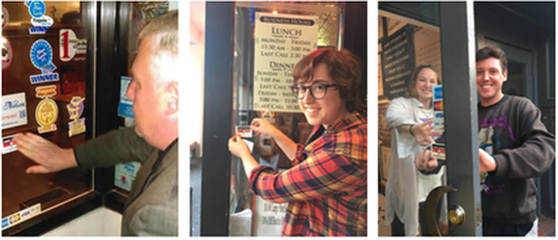
“I study Geography and Graphic Design; I know it’s kind of a random mix.” - A line I have used the majority of my time at UGA when introducing myself, until this year. For a long time, I failed to realize that two of my biggest interests were far more intertwined than I had thought. This semester I took a class called Community GIS where I actively learned real-world applications for GIS concepts and methods. One of these concepts was ‘qualitiative’ GIS. Qualitative GIS incorporates non-quantitative data into GIS in an effort to give perspective and narrative to a research topic. A great example of qualitative GIS that the class was first introduced to was a project by Meghan Kelly (2019) titled, “Mapping Syrian Refugee Border Crossings: A Feminist Approach.” In her project, Kelly wanted to provide a fuller representation of Syrian peoples’ border experiences using cartography, as opposed to Western media’s cartographic practices that aggregated refugees into flow lines, proportional symbols, and frequently simplified border experiences into homogenous, black line symbols. Kelly wanted to discover both how can the cartographic portrayal of Syrian border experiences be improved to more fully represent their lived experiences and further, how can a feminist perspective inform an alternative mapping of borders and border experiences. Kelly states, “Through a feminist lens, I have developed an alternative mapping technique that emphasizes borders as a theoretical and conceptual advancement in cartographic design and border symbolization.” At this point, while reading through Kelly’s methods, I began to recognize the deeper relationship held between Geography and Graphic Design. By projecting Syrian stories and experiences through cartography, Kelly’s qualitative GIS work gives Syrians a geographic voice unavailable to them through conventional cartographies. Up until this reading, I viewed design within geography/cartography as nothing more than functional, with little room for creativity. The kind of formulaic and simple, generalized designs that I had attributed to the whole of research-based cartography, did very little to grab my interest. I knew there could be aesthetically pleasing or thoughtful and uniquely designed maps, but I thought the only place for these designs would be on the wall above your couch rather than in a serious research paper. Kelly’s cartographic design wanted to give a fuller and unique value to borders. Kelly describes that, typically, cartographers place borders near the bottom of the visual hierarchy, receding into the background as part of the base map or reference material. The designs for borders typically default to thin, solid black lines and symbolize them homogeneously. These design choices remove the true image of a border including individual experiences, such as the danger and legal issues involved with crossing borders. To achieve a more robust symbolization of borders and to move towards qualitative/narrative GIS, Kelly presents a design technique that aggregates the border experiences of seven Syrian interviewees. After immersing herself in the stories of each experience, Kelly used ArcMap to create the design that served to symbolize a truthful and emotional depiction of the stories. Kelly defined spaces and borders abstractly by bounding them with an abstract square shape that could be easily applied to a variety of non-traditional borders found in Syria. Kelly describes that this design choice enabled her to bring both non-traditional space and non-traditional borders, such as the human body, into the maps. The most interesting design choices to me were that each border in the map is symbolized according to the intensity of individual experiences and the border’s passibility. A line of a border increases in size if the emotional toll of the experience increases and becomes thinner if the experience is understated or minimal. To distinguish her own voice and to elevate the voice of the interviewee, Kelly utilized different typographic choices. The interviewee’s voice was identified in a black, sans serif typeface called Myriad Pro, while Kelly’s voice was written in a gray, serif typeface named Garamond. I think the color and individual typefaces place each voice at different volumes and formalities, (Serif = more formal, gray = lower volume, black = higher volume/more importance). Discovering this combination of Graphic Design and Geography and recognizing their importance to each other in creating a meaningful research project was very impactful for me. I now have an entirely new thought process in creating maps moving forward where I will utilize my design experience and creativity more so than following a general map template. I hope that any geographers reading this will consider a creative and thoughtful approach to their map designs in the future as well in order to help create more engaging and impactful maps. By Amber Orozco, Student in Community GIS, Spring 2022 What do you think of when you hear the word “open access” in relation to research or community-based work? Perhaps it brings to mind programs, tools, and academic publications that have no paywall? Or maybe you think of a community that shares resources, such as software code? But in what ways can the approach of open access be a way to support local community organizations? In our Community GIS class, we have spent the last few weeks of the semester thinking through these questions as we work to support the campaign of a local organization, the Athens Anti-Discrimination Movement (AADM). AADM “advocates for racial and social justice and strives to combat discrimination through education and activism”. Part of their efforts includes their “United Against Discrimination” sticker campaign where they ask local businesses to pledge to creating a more diverse and inclusive work environment. If the business decides to participate, they receive a AADM sticker (see photo below) to place on their business’s front window. As a class, our goal is to create a map that will be hosted on AADM’s website, showing the businesses in downtown Athens that are supporters of the campaign. For this project, open access can be understood in two different ways. First, open access for our work takes the form of a process-based approach (Shannon & Walker, 2018), meaning our class is working collaboratively with AADM to gather input on the project, including the timeline, goals, exchange of resources (i.e. AADM provides our class the list of business supporters of the campaign from 2019), and how the map will be both stored and accessed. Our collaboration with AADM is consistent throughout the process, which included us meeting with Denise Sunta (AADM Administrative Assistant and Events/Community Outreach Coordinator and also UGA alumna) at the beginning stages of the project and we will be ending the project with presenting our final map designs to AADM for their approval.
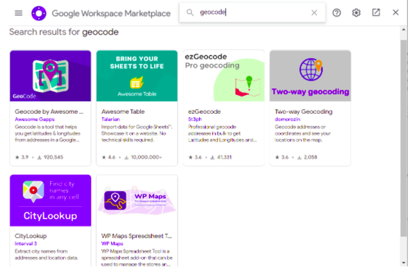
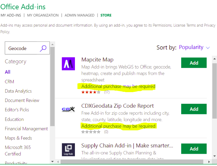
Second, our class is leveraging our technical skills to create this map through an open access mapping program (QGIS) and coding library (Leaflet). Our class was tasked with verifying whether the list of businesses provided by AADM were still participating in the campaign. To do this, our class divided up sections of downtown Athens to assess which businesses had the AADM sticker displayed on their front window. We used ArcGIS’s Field Map data collection application to update this information, including adding new business supporters of the campaign. Our class was able to utilize our university membership to access paid GIS applications, such as Field Map, for this project. Once this list was updated, our class added the geographic coordinates to each business. We were then able to upload this list through excel to QGIS and map out the businesses. Using Leaflet for codes to customize the functionality and appearance of the map, our task is now to develop a map that serves the needs and goals of AADM. Our class is currently divided into different teams, and we are working to develop different options for AADM. For example, my group is working to use codes from Leaflet to develop a pop-up label that will appear when someone clicks on a business that is a supporter of the campaign. We intend to include information on each business, such as the hours of operation, website link, a photo of the business. Additionally, we are developing an option on the map that allows a visitor to filter for the type of business, such as “restaurant, bar, and retail shop”. Once we decide on the format on the map, it will eventually be uploaded and hosted on Github. Personally, this process of transitioning from ArcGIS to QGIS and Leaflet has been challenging because some coding knowledge is required to format the map in my group’s vision. The last time I encountered html was in high school, but I think getting comfortable with these open access programs are a matter of practice and will require more time learning compared to more user-friendly programs, such as ArcGIS. From this experience, I have learned that open access is more than free programs and resources. It can mean leveraging technical expertise as students to support the efforts of community organizations, while engaging the community organization through the process to ensure the organization’s perspectives are centered as the tool becomes developed. Open access extends to the programs we used with no paywall and those programs that we had access to through our university membership. Each of these elements play an important role when partnering and supporting the GIS work of community organizations. By Miles Montello, Student in Community GIS, Spring 2022 ...ranked in no particular order, here are five new nuggets of information that stuck out to me since starting this class in January of 2022... 1) Know how to plan a task with a group In my experience, the group projects that go the most efficiently are the ones where there’s one dominant person who is the most passionate about the task and can get the less passionate group members smoothly convinced of their vision early in the timeframe given. Groups where all the members are either too shy or too indifferent wind up with a wishy-washy concept of a final product and it’s awkward for everybody. If there are two dominant people with conflicting visions then their egos may clash, but usually a resolution is reached early on. Just because there’s a space for someone to step up doesn’t mean anybody necessarily will- until the deadline gets close enough that either someone caves in or everyone comes to an agreement. In my opinion, it’s apt evidence for the 80-20 rule, which is a principle that says that roughly 80% of consequences come from 20% of causes- 80% of the work/planning is done by 20% of the participants. Clearly defining tasks from the beginning makes it the least stressful, and the tasks don’t even necessarily need to be divided equally because the quality of every member’s work is proportional to how invested they are in the topic. I’m proud of my group’s contributions to the Linnentown Storymap, which was a web map the class produced describing a black neighborhood in Athens doomed by Urban Renewal to be replaced by freshman dormitories. Each group of 4-5 students were given a section to create on our own. I would describe the first half of our time given as sheepishly figuring out what we should do, the second- executing the original agreed upon vision which was subsequently revised, and the last fifth- creating most of what would be on the final product. 2) Teams make monotonous tasks go quicker This lesson from the class also applies to life in general. Having multiple people assigned to a creative task as opposed to one or two people creates the awkward scenarios I previously described. On the other hand, if you have human capital, having multiple people assigned to a clearly defined repeatable task that is too big for one person is super-efficient. I recall Dr. Shannon remarking on how the task of geolocating all of Athens’ downtown businesses on the AADM list (of which there were around sixty) would’ve taken hours for one person to do but was shortened to two minutes by each student being assigned four businesses to add coordinates to on a shared cloud document. If you tell a random set of eight people to paint a twenty-yard wooden fence a certain color or pattern, it’s going to be finished in an hour or two if they have the materials. If you tell them to paint a mural on the fence, it’s going to take way longer and the result will have very noticeable gaps in artistic ability between the painters. 3) Text mine efficiently The 1958 Athens City Directory existed only as a physical book, yet the Community Mapping Lab was working to digitize the information listed inside- from names, addresses, occupation, race, home ownership, etc. To do so, the entire directory was scanned- but to be able to manipulate the data it needed to be recorded on a digital spreadsheet. When trying to collect data from a scanned paper document, transferring what is on the page into manipulable digital text is a big challenge. Your saving grace in this Herculean task are programs that “text mine”- using artificial intelligence to read the scanned text for you and transcribe it in plain text into the program you tell it (Word, Excel, etc.). There are various ones, from paid to free and open source. Knowledge of coding is often necessary, mostly to tell the program how to separate lines of text. Keep in mind that there can be a lot of room for error, and you might be disappointed to find the resulting text is littered with problems. Data cleaning is tedious, but it was a necessary part of our classes’ digitization of the 1958 Directory. If the dataset is small enough (hundreds of lines of dozens of pages instead of tens of thousands of lines of hundreds of pages) consider manually typing the lines of info as you read them (which is what I did for the pages I data cleaned). Something which accelerates this task leads to my next point... 4) Two monitors are better than one When you have a task involving cross-referencing (like data cleaning), it can break your train of thought to have to be constantly opening and closing the same two or three tabs. Opening the wrong tab by accident making you forget the short line of info you just memorized can make you grind your teeth. Even a simple action like that can break your flow. So, I’m grateful that the GIS lab has two monitors to a desktop. I find it so much easier to not have to move my hand and simply glance from one fully visible document to another. This also makes it easier to keep up with web tutorials among many other tasks. 5) Google Sheets ...excels your work Both Google Sheets and Excel are great for data organization related to GIS. I made a map using the data from the 1958 Athens City Directory where I showed the locations of the residences of blue collared workers (blue dots) and white collared workers (yellow dots). This was not a distinction made by the directory itself. I took the top 300 occupations listed and categorized them myself using a pivot table to create a new column with a new value. If this option were not available, the task would’ve been too big for me. Knowledge of these two applications helps you work with data more efficiently. I prefer Google Sheets due to how easy it is to apply and use add-on tools from the Google Workspace Marketplace, paired with the ease of sharing the document with others. Offline Excel cannot be edited live by multiple people, and while online Excel documents can- the plugins available for geocoding are more limited and take extra steps to add... Google has SIX paid options: Versus FOUR paid options for Office Three extra tips? No way!
By Jared Grant, Student in Community GIS, Spring 2022 Cynthia Lewis once said, “Getting lost teaches you how to read a map.” I resonated with this quote because in order to understand a map, you must create one by questioning the landscape. In essence, canvassing everything in an area helps you realize that you might be lost and helps you develop your reasoning to find a solution. There are many reasons to create a map: to seek direction, to seek perspective, or to seek information. You can even map for a cause. This quote is also interesting when you realize how canvassing or reading a map has evolved over time. Back in the day, people would have to canvas an area using stencils and paper to create a physical static map. Nowadays, we can canvas an area using mobile apps such as ESRI ArcGIS Field Maps that features an ever-changing map. In my Community GIS course, we actually used Field Maps for a project with the Athens Anti-Discrimination Movement (AADM). The objective was to map out the businesses that had a sticker supporting their 2016 United Against Discrimination campaign. The campaign’s objective is to encourage business owners to stand in solidarity against discrimination regardless of race, gender, age, sexual orientation, or immigration status. As we started working on this project, we immediately realized there were many questions that arose when thinking how to map out the area such as “how many businesses are in downtown Athens?”, or “Do these businesses still have a sticker?”. We focused on answering these questions by using Field Maps to canvas downtown Athens. Using Field Maps, we divided downtown Athens into blocks. Every student was assigned a block of downtown Athens and had to ask all businesses in the block if they had an AADM sticker. We then verified and updated the attribute fields for each business point on the app. if the location did not appear on field maps, we had to create the point and fill in all information. The map (as shown below) was formatted so that points with a sticker were red and those without a sticker were black. I really enjoyed working on this project because I had to learn how to create and read a map using Field Maps. We initially did not know how many businesses were located in downtown Athens but by using Field Maps, google sheets, OpenStreetMap and QGIS, we were able to answer all of our mapping questions. This project was efficient because at the click of a button we were able to update or customize the map as we walked around the blocks of downtown Athens. I also liked how Field Maps allowed multiple users to collaborate on a project. This means each student could focus on a specific block and spread the working load of the project.
Prior to canvassing my block, I expected there to be 3 businesses, but I was not 100% sure of the actual number. While canvassing, I found there were 8 businesses in my block. Ironically, I actually got lost while canvassing because I was near an area that I never ventured to and found businesses that I either never entered or didn’t know existed. While canvassing my block, I entered the Chase bank for the first time. I’ve always driven past it, but I never had a reason to enter before working on this project. I also didn’t realize that next to the bank was building that offered community office spaces for small companies to work at. Overall, the major lesson I learned from canvassing was that I gained a new enhanced perception of downtown Athens simply by getting lost. I have lived in Athens for five years and I had no idea the number of businesses that could be located in single block of downtown. Through canvassing, not only did I gain this enhanced perception, I also helped create a map for the AADM that can be used to help people know what business support the United Against Discrimination campaign. So after working on this project, I highly encourage every geographer to enjoy the map making process. Also, Field Maps is an excellent software for your map making needs if you would like to canvas an area at the convenience of your phone. By Molly Dunn
Student in Community GIS, Spring 2022 GIS has the ability to tell a powerful story by legitimizing the perspective of an individual or group that has struggled to be taken seriously. In Sarah Elwood’s book Qualitative GIS, she says “many of the powerful actors and institutions whom they seek to influence treat GIS-based data and maps as illustrations of what is real or true about a place, and as evidence of an expert (and therefore, legitimate) portrayal of that place” (Chapter 4: “Multiple Representations, Significations And Epistemologies In Community-Based GIS”, page 70). Throughout my time in our Community GIS class, I have learned the importance of making maps with caution and consideration, especially when they will be used to persuade or provoke. For the past few weeks, my class has been working on an informational StoryMap (a collection of public, multimedia web maps) about Linnentown, a Black community erased by UGA and the City of Athens to build dorm buildings in the 1960s. From the beginning steps of the project, it was evident that we had an important task to complete. We were not working with simulation data or practice labs. We were working with real stories, from real people, about real places. As the project developed and I heard more from Hattie Whitehead, a resident of Linnentown, I began to see the impact that our StoryMap could potentially have in aiding her mission to bring redress to the people who lived there. The importance of being cautious with each choice we made throughout the project was clear. In one of our meetings, she told us that when brainstorming the book she recently wrote about her experience, she wanted to compile the data together before she wrote and published it. It was then that I understood the point that Sarah Elwood was making - there is power in a visual representation with data behind it. It can be the tipping point that allows a movement or a story to be recognized as legitimate. One of the ways that a map can be made with consideration is by capturing the emotion in the place it is portraying. In Meghan Kelly’s article “Mapping Syrian Refugee Border Crossings: A Feminist Approach,” she walks the readers through the development of her map of Amal’s story, a man living through the conflict in Syria. She chooses symbology that alludes to the ways that he experienced the borders - for example, how difficult it could truly be to move from one place to another. This kind of information can be difficult to show through maps, but if done correctly it can add an entirely new layer that is meaningful and informational. She was able to transform his story into an immersive piece that showed the way he experienced life in Syria. She prioritized his voice over her own, a skill that makes a map center around individual experience within a physical place. We were able to use this in our own StoryMap by continuously meeting with Hattie Whitehead and others working towards Linnentown’s redress. We used their feedback and suggestions to ensure that the story we were telling was helpful, accurate, and focused. The point I want to make is that the work of people in GIS is important. It can inform people about issues that they were unaware of and inspire change based on their new knowledge. It can also provide evidence of reality to powerful people that have the resources to aid causes and fix problems. This is one of the first times that I have worked on a project with “real” data and the goal of being shared - the skills that I learned in classes prior to this only equipped me with technical skills. Community GIS requires the creator to be open-minded and adaptable. It is practical, it is effective, and it is real. It can back up the perspective of someone who may have gone a long time without it being taken seriously. In 2019, I went to the ESRI User Conference - an event hosted by the Environmental Systems Research Institute, a GIS company. They were launching a new campaign called “See What Others Can’t,” to promote the usefulness and potential of GIS. This phrase encompasses what I have learned in this class: when you can turn existing information into a compelling illustration, you are able to elicit worthwhile conversation and crucial change. By Jerry Shannon, Taylor Hafley, and Katrina Henn
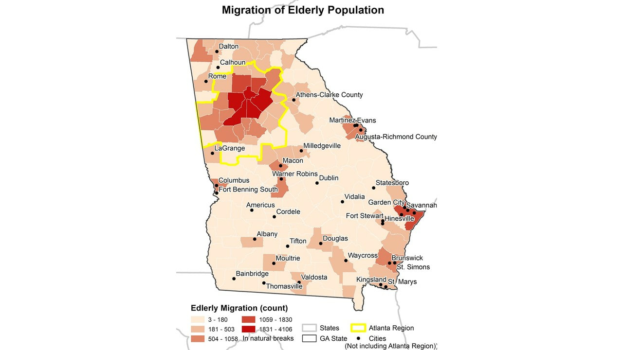
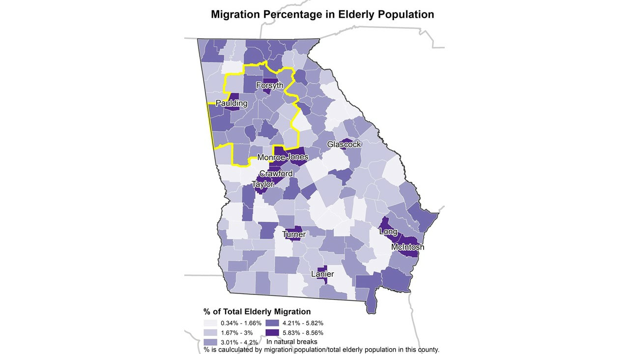
This summer, our lab has started a regular reading group, CML Reads. While students in the lab do research in a lot of different areas, the goal of CML Reads is to get us all on the same page, so to speak--reading, thinking, and responding to a common set of ideas and research practices. We hope to use this blog as a place to summarise these pieces and our reactions to them. At our most recent meeting, we discussed Matt Wilson’s new article, “GIScience I: Social histories and disciplinary crucibles,” published in Progress in Human Geography. As the title suggests, this article in the end is about the social histories we tell about GIScience as a discipline. This article is divided into two main sections. The first provides a survey of work published about GIScience within Progress, going back to Peter Gould’s 1969 survey of work on quantitative methods and mapping. Wilson divides these articles into three major periods: (1) 1977 through 1988, where computer driven mapping becomes increasingly common, (2) 1988 through 2002, when GIScience becomes a recognized field and critical responses are also recognized, and (3) 2002 through the present, when GIScience becomes a field distinct from cartography. The second half of the article draws from the work of Cindy Katz and other scholars to sketch out whether “minor GISciences” might aptly summarise an ongoing body of work that is not easily categorizable within this subfield. Giving several examples of “radical, critical, and ‘retrograde cartographies,’” (p. 7), Wilson describes how Sarah Elwood, Agnieszka Leszczynski, Biran Jordan Jefferson, and many others open lines of flight with the potential to disrupt and transform work in GIS. This, in our opinion, was the most valuable part of the article. It’s worth reading through Wilson’s description of what minor GISciences means in practice, as it’s difficult to summarise in a brief post (though Jerry did play a minor version of the national anthem to try to capture the basic idea). The article ends by arguing for the value of “minor” work to continually nudge GIScience out of its comfortable disciplinary boundaries, preventing epistemic closure around familiar histories. As a group, we appreciated Wilson’s arguments and the histories this piece highlights. That said, there were a few omissions in this article that struck us as curious. Scholars with a long history of critical engagement in this area--including Eric Sheppard and Mei-Po Kwan--were notably absent from Wilson’s history. Even so, we agreed this history was a valuable review and respected how the historical narrative put the six-decade origins of GIScience in conversation within Human Geographers. More strikingly, there were few explicit references to work in public participation GIS, a strange absence given the way that work in this area has tried to create new forms of research praxis that decenter technical expertise while amplifying voices outside the academy. In our work within community geography, this has been a main focus, and certainly acts as a “minor” form of GISciences. Indeed, some cited examples do rely heavily on participatory research methods, most notably the work of the Anti-Eviction Mapping Project. Yet these are praised for their contribution to topics of critical interest (e.g., mapping eviction) or attempts to blend critical theory with GIS methodology, without reference to the social context for this research. That said, all pieces have limited space, and we do not know what will be included in the next two progress reports. In addition, the three of us in this meeting all came in with clear commitments to critical GIS as a way to define our work. While we were sympathetic to the “minor” label, we struggled to identify clear areas where it was easy to differentiate it from other threads of work in this area (e.g., qualitative GIS, feminist GIS, and 'doing' critical GIS). The article itself didn’t attempt to do so, perhaps again because of limited space. but justifying the need for yet another brand of critically informed geoscience research would have been helpful. In the end, Wilson rightly notes that we need more diverse histories of GIScience within our discipline and that it is crucial that we resist the drive to “reduce geography to a dashboard” (p. 8). We appreciated reading this piece and look forward to future entries within the series. Authors Jerry Shannon is an Associate Professor at the University of Georgia in the Departments of Geography and Financial Planning, Housing, & Consumer Economics. He is the director of the Community Mapping Lab. Taylor Hafley is a PhD student in the Department of Geography at the University of Georgia. Katrina Henn is a Master's student in the Warnell School of Forestry and Natural Resources at the University of Georgia Xuan Zhang Research has found that retirement is one of three major time points that the elderly (aged 65 and up) tend to move (Litwak and Longino Jr 1987). The reasons for moving may vary: going to a place with better weather, being closer to family members, going to more affordable areas, going to a place with a slower pace, etc. The moving decision is not only related to individual characteristics, such as marital status, presence of children, education level and more, but also associated with the destination community’s characteristics, including the cost of living, climate, amenities, accessibility, and more (Clark, Knapp, and White 1996). The United States is part of a global trend of counties facing significant aging populations. With the largest elderly population (aged 65 and over) among all developed countries, the U.S. is projected to double its elderly population in 2060, compared to 2014 (Northridge 2012). By 2030, more than 20% of U.S. residents are projected to be elderly, compared with 13% in 2010 (Ortman, Velkoff, and Hogan 2014). The increasing elderly population and proportion of the population generate questions of where and how seniors will spend their last chapter of life. For seniors who choose to move to a new location, what characteristics of the destination are associated with their move? This blog will focus on the southeastern US state, Georgia, to answer the questions about the migration pattern and the migration-related characteristics of the destination. Using the Census Bureau American Community Survey (ACS) 2013-2017 data, I looked at the elderly migration within the 159 counties in Georgia. The ACS provides data about how many people moved to individual counties from the counties within the same state, from outside of the state, and from foreign countries with age breakdown. Within the five-year period, there were over 47,000 elderly people settled in Georgia, with 24,120 from other states or abroad and the rest moving within Georgia. Figure 1 shows the patterns that the elderly migration in general favor some particular areas, especially the north side of Georgia, including the Atlanta region (29 counties defined by the Atlanta Regional Commission. Other popular destinations are Macon, Augusta, Columbus, Savannah, and other coastal regions. The distribution matches up with the total population distribution. Next, we then took one step further to look at the proportion of migrant population in the total elderly population for each county. This shows how much of the elderly population recently moved in, and helps to determine what places attract the seniors more after controlling the base population. Counties with high in-migration rates are labeled by name in Figure 2. In general, counties on the south side, especially some edge or neighboring counties of the Atlanta region are with the highest proportion. It may be a result of a balance of affordable living and convenience. The coastal area also attracts seniors. Long County is part of the Hinesville-Fort Stewart Metropolitan Statistical Area, and Mclntosh is included in the Brunswick Metropolitan Statistical Area. We also apply the multiple linear regression to identify those sociodemographic characteristics and other variables most associated with high migration rates. We included the long-term care facility capacity (number of beds), total population, hospital availability, percent with disabilities, low education (less than college or equivalent) percentage, low racial diversity (using the entropy of race diversity), and more (see the full list of variables in the note). Among all four statistically significant variables (significant level < 0.01), the hospital availability has the biggest positive effect on the migration count, followed by the median house value and total LTC capacity, while the crime rate has a negative influence on the dependent variable. The disability proportion is significant at 0.1 level with a negative impact on migration. Those variables explain about 92.2% of the dependent variable, the raw count of migration population (Adjusted R2 = 0.922). By understanding the associated characteristics of elderly migration, local government and policymakers can better plan the regional development to meet the needs of elderly migrants. More analysis can be done to separate interstate and intrastate migration since they may be attracted by different regions and different aspects of the destination. Including other variables, such as tax structure of the destination, may add more flavor to this as well. However, it is important to keep in mind that there is information not in the map or available data, thus, there are known unknown parts in this research. Data can only tell the story about numbers, and it will be necessary to have some community engagement to better understand the situation. For example, I will talk with seniors about their needs and concerns in some neighborhoods. As the starting point of my dissertation, these ideas can lead to further dive into the reasons that lying behind these patterns. Note: The considered independent variables for each county include: total LTC facility count, total LTC capacity (total LTC facility beds), LTC facility beds per 1,000 elderly people, total population (at 1,000), total elderly population (at 10,000), elderly population proportion, hospital availability (hospital count within 10 mile buffer of that county ), male proportion of all age, citizenship proportion of all age, disability proportion, low education (less than college or equivalent) percentage, labor force participation rate, wealthy proportion (ratio of income at or above 400% of the poverty threshold), poverty proportion (ratio of income below 100 percent of the poverty threshold), entropy of diversity, percent rural, crime rate (per 100,000), and the median home value (at $1,000). Reference: Clark, D. E., T. A. Knapp, and N. E. White. 1996. Personal and location-specific characteristics and elderly interstate migration. Growth and Change 27 (3):327–351. Litwak, E., and C. F. Longino Jr. 1987. Migration Patterns Among the Elderly: A Developmental Perspective. The Gerontologist 27 (3):266–272. Northridge, M. E. 2012. The strengths of an aging society. American journal of public health 102 (8):1432. Ortman, J. M., V. A. Velkoff, and H. Hogan. 2014. An Aging Nation: The Older Population in the United States. http://bowchair.com/uploads/9/8/4/9/98495722/agingcensus.pdf. AuthorAuthor Xuan Zhang is a Ph.D. student at the University of Georgia in the Department of Georgia. Her research uses GIS to investigate the elderly migration and long-term care facility accessibility issues under the umbrella of Health Geography.
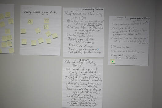
By: Jerry Shannon At the end of last month, I and several students from the Community Mapping Lab were able to help run the first international workshop in community geography, or #commgeog19 for short. This two day workshop, supported through a grant from the National Science Foundation, was held on the campus of Georgia State University in downtown Atlanta. It featured presentations from 41 workshop fellows and collaborative breakout groups around topics of common interest. While we will eventually be posting more materials from the workshop, in this blog post I give a brief overview of some of the highlights of the workshop and what stood out to me as one of its organizers. Community geography is a relatively new subfield within our discipline. In a paper that I and others are working on, we currently define it as "a form of praxis, one rooted in collaborations between academic and public scholars resulting in mutually beneficial and co-produced knowledge. It draws from and contributes to geographic theorizations of space and place, engaging with research in fields including development, urban geography, political ecology, critical food studies, and health geography. Community geography employs a mix of qualitative and quantitative methods, often makes use of participatory research approaches, and has, as its epistemological framing, a commitment to address pressing social and environmental problems and work toward systemic change. A commitment to praxis entails a fundamental integration of research and action, one that explicitly values excluded and marginalized perspectives and fosters just and sustainable communities." Geography has a long tradition of participatory and engaged research, and we recognize our connection to past work in public participatory GIS (PPGIS), feminist and black geographies, and participatory action research. Organizing around community geography has provided a formalized way to recognize this work, particularly through the creation of positions explicitly devoted to it at Syracuse University, Columbus State University, University of Central Florida, Chicago State University, and at my institution, the University of Georgia. By recognizing community engagement as an explicit expectation for promotion and tenure, these positions provide a model of academic work that blurs lines between the university and broader publics. While often based at academic institutions, community geography also includes the work of community scholars who partner in research and teaching. The community geography program at Syracuse--the nation’s first--is now over a decade old, but thus far this group has been relatively small. Community geographers are predominantly academic faculty and staff, most of whom identify as White. To broaden the range of folks at this table, we successfully applied for a grant from the National Science Foundation to hold an international workshop for the full range of scholars interested in community geography. This grant allowed for the workshop to be offered without charge and provided significant travel assistance to many of the workshop fellows who presented their work. The call for participation to this workshop elicited a strong response. We received 91 applications, many of whom came from scholars new to community geography. From these, we invited 42 workshop fellows. Among these fellows, we had seventeen academic faculty/staff, sixteen graduate and undergraduate students, and none community scholars. Twenty three fellows identified as White, eight as African-American, three as Hispanic/Latinx, four as Asian-American, and two as mixed race. While still predominantly academic and White, this group was more diverse than both the planning team (almost all of whom were White academics) and the academic geographers as a whole. The workshop itself was structured to promote sharing and connection. The full program is available here. The first day was structured around a series of eight minute presentations, delivered in two concurrent tracks across three sessions. These presentations shared highlights from each fellows’ work while leaving room for questions and discussion of shared themes across presentations. Workshop fellows and other attendees identified these themes, sharing thoughts on large post-it sheets throughout the day. At the end of the first day, we identified multiple themes from these shared notes:
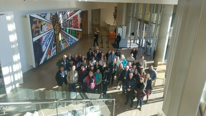
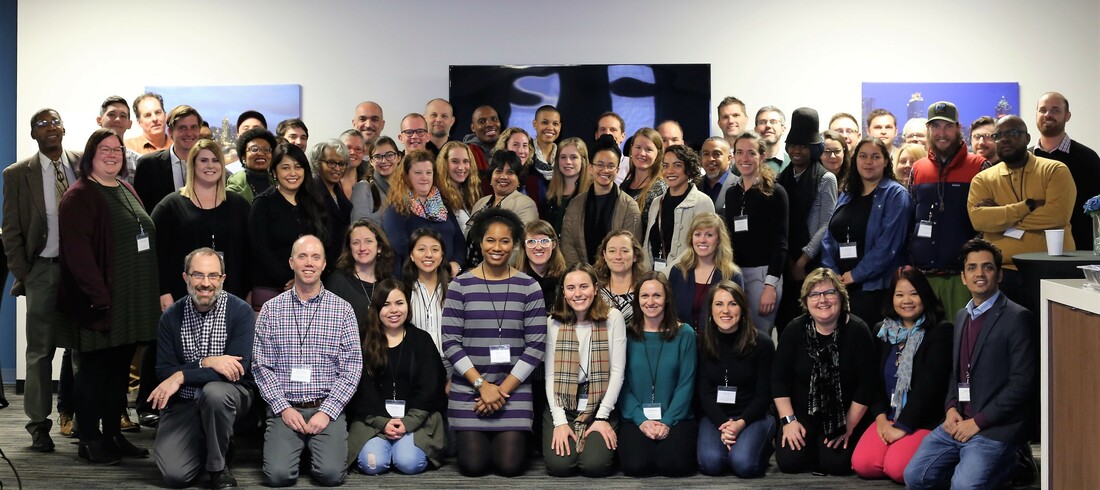
Workshop attendees then signed up for breakout groups, each focused on one of these themes. For much of the second day, these groups outlined potential shared collaborations that could be continued after the workshop. Summaries of these discussions are currently being compiled and will be shared on the conference page, linked at the top of this post. During the second day, we also took a field trip to the National Center for Civil and Human Rights, just a short walk away from our workshop site. This field trip got us out of the conference space and provided an opportunity to reflect on other struggles many of us address through our teaching and research. We are still working through evaluations and feedback from the workshop. Many participants expressed strong appreciation for the chance to connect with others doing similar work, and most also expressed a strong interest in continuing to participate in conversations around community geography and collaborating with others at the workshop. We will encourage this work in multiple ways: creating an email list for discussion of topics and events relevant to group interests, sponsoring sessions at conferences hosted by the American Association of Geographers (AAG) and similar groups, organizing a special journal issue for topics presented at the workshop, and securing funding for future events and collaborations for community geographers. I share a few other photos below, with special thanks to Dorris Scott for being our official photographer. Video from many workshop presentations will be available soon on the workshop webpage. As the principal investigator for this grant, I’m thankful for the work of others on this team who helped make this event happen. Most notably, Katherine Hankins and the Department of Geosciences at Georgia State University provided significant logistical and financial support for the workshop. The other planning team members were Danny Block, Amber Bosse, Tim Hawthorne, Jonnell Robinson, Dorris Scott, and Andy Walter. In sum, the first ever Workshop in Community Geography was a smashing success, welcoming many new voices to the conversation and spurring ideas for future work. Check back on the workshop page for more information and opportunities in the coming weeks and months! Author: Jerry Shannon is an Assistant Professor at the University of Georgia in the Departments of Geography and Financial Planning, Housing, & Consumer Economics. He is the director of the Community Mapping Lab.
|
Archives
June 2024
Categories
All
|






 RSS Feed