
|
Jerry Shannon My 15 minutes of fame happened a couple of years ago, courtesy of a tweeted map of all the Waffle House locations in the path of the 2017 total eclipse. It took maybe 45 minutes to put together, but has since gotten over 150,000 views. I was interviewed about it by CNN and the Chronicle of Higher Education, and CBS almost sent a film crew down to Athens. One local radio station played the University of Georgia fight song at the end of our interview. It was surreal. 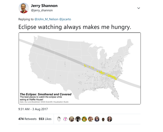 It’s a silly map. But in a just-published article with Dr. Kyle Walker at Texas Christian University, the two of us dug into what makes maps like this one go viral. In addition to developing the extremely useful tidycensus package for R, Kyle used Mapbox to create this interactive dot density map of educational attainment. In this article, published in the Professional Geographer (full text here), we analyzed reactions to the Waffle House and educational attainment maps to better understand the factors that make a viral map. Here’s our argument in brief. First, drawing from work in communication studies, we write about maps as a form of phatic communication, a form of small talk that may seem inconsequential but that builds connection and affirms certain social identities. Watching particular memes circulate through social media is another example of phatic communication, as each share or retweet affirms a shared experience or identification with particular ideological views (see Anthony Robinson’s excellent recent article for more on the latter point). In this sense, maps can be another “Which Harry Potter Character Are You?” quiz, but about space. Second, we noted the disjunction between the ways academics and the broader public use maps. While the former often focus on the big picture and general patterns, reactions to our maps showed how non-academic readers used maps to place themselves--to find the closest Waffle House for the eclipse, for example, or to understand the educational profile of their specific neighborhoods. These readers used maps as technologies that named the landscape and told them where they were and where they wanted to be. This is true not just in a utilitarian sense--maps are more than a way to get from point A to point B. Rather, the emotional reactions to our maps demonstrated the personal connection readers made to the stories each map told. The Waffle House map, for example, converted a cosmic event into a celebration and reaffirmation of southern identity by connecting it to this distinctively Southern chain. In this sense, it’s similar to the “Boo y’all” signs that show up around my Southern college town each October, ones that similarly “localize” Halloween. In contrast, Kyle’s educational attainment map received critical responses focused either on what readers saw as an overvaluing of higher education or on the literal accuracy of the map itself. In both cases, readers reacted to the ways these maps placed them and their identified community. To slightly adapt Haraway’s famous phrase, these maps were read from somewhere. Maps go viral when they provide readers a way to name the world and themselves in emotionally resonant ways. Depending on context, reactions to viral maps can vary from celebration to anger, from a celebration of shared experience and identity to a rejection of implied judgment and social differentiation. Decades of research in critical cartography provide examples of the power of maps to name the world. But, I would argue, the rapid rise of social media and online mapping alters the dynamics of this process. Maps can circulate like memes, and online mapping tools like the educational attainment map provide interactive and easily shared ways to craft spatial narratives. For aspiring viral cartographers (especially those of the critical bent), the trick is creating visualizations that facilitate the process of identification but also reframe pressing social problems--for example, improving access to housing and health care or mitigating the drivers of climate change--in unexpected ways. Maps like these don’t focus on the 30,000 foot view. Rather they provide ways for readers to see their ground level reality in a new context, creating moments of recognition and also reorientation.  I’ve thought about viral cartography primarily in work with the Georgia Initiative for Community Housing, where I’ve had the opportunity to work with groups throughout the state on community housing assessment. In creating tools to visualize the data collected by housing teams in those communities, I and my collaborators have been thinking about the ways we can contextualize and analyze those data in constructive and equitable ways. Taylor Shelton’s work in this vein with the city of Lexington has gotten some well-deserved attention, and this semester I’m using a similar approach working with an undergraduate to identify the role of rural landlords in shaping local housing conditions. The goal is to move beyond a broken windows framing, which tends to stigmatize marginalized communities, to something more structurally focused: policies and programs that are supportive and inclusive rather than punitive. This isn’t viral cartography, but there’s a similar need for mapping methods that support both recognition and reorientation. For local housing teams, this is their community and their data, but we’re working to build a process that helps them see both in new ways.
My waffle house map may be history, but research into viral cartography is still just getting started. As Kyle and I wrote at the end of our article, “As geographers develop ways to connect with broader publics over pressing issues such as racial segregation and climate change, developing tools and approaches for viral cartography could provide an effective (and affective) pathway to build trust, forge new partnerships, and foster productive conversations.” Author Jerry Shannon is an Assistant Professor at the University of Georgia in the Departments of Geography and Financial Planning, Housing, & Consumer Economics. He is the director of the Community Mapping Lab.
1 Comment
|
Archives
June 2024
Categories
All
|
 RSS Feed