
|
Xuan Zhang Research has found that retirement is one of three major time points that the elderly (aged 65 and up) tend to move (Litwak and Longino Jr 1987). The reasons for moving may vary: going to a place with better weather, being closer to family members, going to more affordable areas, going to a place with a slower pace, etc. The moving decision is not only related to individual characteristics, such as marital status, presence of children, education level and more, but also associated with the destination community’s characteristics, including the cost of living, climate, amenities, accessibility, and more (Clark, Knapp, and White 1996). The United States is part of a global trend of counties facing significant aging populations. With the largest elderly population (aged 65 and over) among all developed countries, the U.S. is projected to double its elderly population in 2060, compared to 2014 (Northridge 2012). By 2030, more than 20% of U.S. residents are projected to be elderly, compared with 13% in 2010 (Ortman, Velkoff, and Hogan 2014). The increasing elderly population and proportion of the population generate questions of where and how seniors will spend their last chapter of life. For seniors who choose to move to a new location, what characteristics of the destination are associated with their move? This blog will focus on the southeastern US state, Georgia, to answer the questions about the migration pattern and the migration-related characteristics of the destination. Using the Census Bureau American Community Survey (ACS) 2013-2017 data, I looked at the elderly migration within the 159 counties in Georgia. The ACS provides data about how many people moved to individual counties from the counties within the same state, from outside of the state, and from foreign countries with age breakdown. Within the five-year period, there were over 47,000 elderly people settled in Georgia, with 24,120 from other states or abroad and the rest moving within Georgia. Figure 1 shows the patterns that the elderly migration in general favor some particular areas, especially the north side of Georgia, including the Atlanta region (29 counties defined by the Atlanta Regional Commission. Other popular destinations are Macon, Augusta, Columbus, Savannah, and other coastal regions. The distribution matches up with the total population distribution. 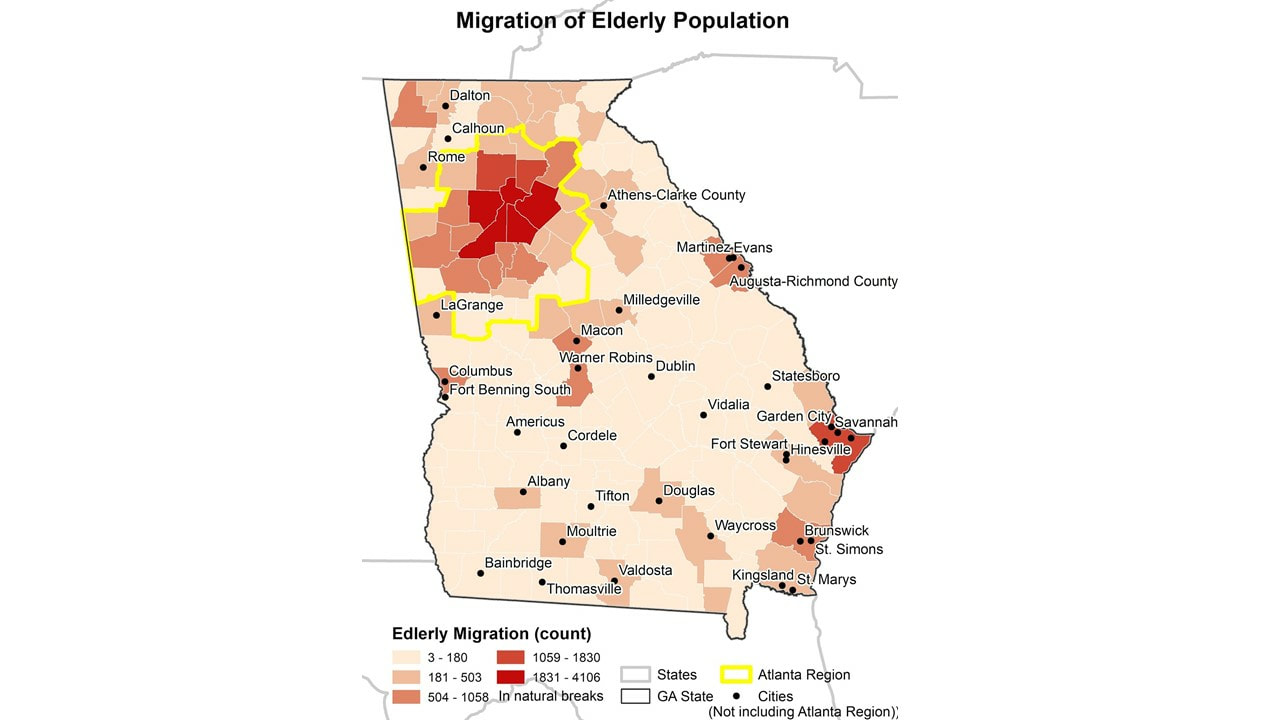 Figure 1 Migration of Elderly Population in Georgia using 2013-2017 ACS Data Next, we then took one step further to look at the proportion of migrant population in the total elderly population for each county. This shows how much of the elderly population recently moved in, and helps to determine what places attract the seniors more after controlling the base population. Counties with high in-migration rates are labeled by name in Figure 2. In general, counties on the south side, especially some edge or neighboring counties of the Atlanta region are with the highest proportion. It may be a result of a balance of affordable living and convenience. The coastal area also attracts seniors. Long County is part of the Hinesville-Fort Stewart Metropolitan Statistical Area, and Mclntosh is included in the Brunswick Metropolitan Statistical Area. 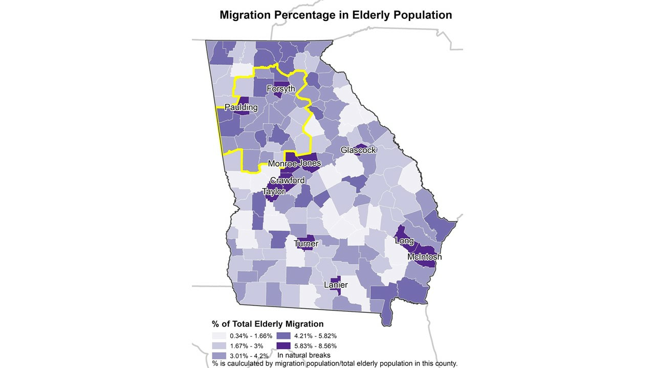 Figure 2 Migration Proportion in Local Elderly Population We also apply the multiple linear regression to identify those sociodemographic characteristics and other variables most associated with high migration rates. We included the long-term care facility capacity (number of beds), total population, hospital availability, percent with disabilities, low education (less than college or equivalent) percentage, low racial diversity (using the entropy of race diversity), and more (see the full list of variables in the note). Among all four statistically significant variables (significant level < 0.01), the hospital availability has the biggest positive effect on the migration count, followed by the median house value and total LTC capacity, while the crime rate has a negative influence on the dependent variable. The disability proportion is significant at 0.1 level with a negative impact on migration. Those variables explain about 92.2% of the dependent variable, the raw count of migration population (Adjusted R2 = 0.922). By understanding the associated characteristics of elderly migration, local government and policymakers can better plan the regional development to meet the needs of elderly migrants. More analysis can be done to separate interstate and intrastate migration since they may be attracted by different regions and different aspects of the destination. Including other variables, such as tax structure of the destination, may add more flavor to this as well. However, it is important to keep in mind that there is information not in the map or available data, thus, there are known unknown parts in this research. Data can only tell the story about numbers, and it will be necessary to have some community engagement to better understand the situation. For example, I will talk with seniors about their needs and concerns in some neighborhoods. As the starting point of my dissertation, these ideas can lead to further dive into the reasons that lying behind these patterns. Note: The considered independent variables for each county include: total LTC facility count, total LTC capacity (total LTC facility beds), LTC facility beds per 1,000 elderly people, total population (at 1,000), total elderly population (at 10,000), elderly population proportion, hospital availability (hospital count within 10 mile buffer of that county ), male proportion of all age, citizenship proportion of all age, disability proportion, low education (less than college or equivalent) percentage, labor force participation rate, wealthy proportion (ratio of income at or above 400% of the poverty threshold), poverty proportion (ratio of income below 100 percent of the poverty threshold), entropy of diversity, percent rural, crime rate (per 100,000), and the median home value (at $1,000). Reference: Clark, D. E., T. A. Knapp, and N. E. White. 1996. Personal and location-specific characteristics and elderly interstate migration. Growth and Change 27 (3):327–351. Litwak, E., and C. F. Longino Jr. 1987. Migration Patterns Among the Elderly: A Developmental Perspective. The Gerontologist 27 (3):266–272. Northridge, M. E. 2012. The strengths of an aging society. American journal of public health 102 (8):1432. Ortman, J. M., V. A. Velkoff, and H. Hogan. 2014. An Aging Nation: The Older Population in the United States. http://bowchair.com/uploads/9/8/4/9/98495722/agingcensus.pdf. AuthorAuthor Xuan Zhang is a Ph.D. student at the University of Georgia in the Department of Georgia. Her research uses GIS to investigate the elderly migration and long-term care facility accessibility issues under the umbrella of Health Geography.
Comments are closed.
|
Archives
June 2024
Categories
All
|
 RSS Feed